The ‘safe’ mount colour you’re considering might be the very thing holding your artwork back. It’s a familiar dilemma: you’ve found a beautiful piece, perhaps a spectacular print from one of our First4Frames Gallery artists, but now you’re stalled. Faced with an overwhelming wall of colour swatches, the fear of making the wrong choice is real. Should it match the wall? Should it pull a colour from the art? When you’re asking, “what colour mount should I choose?”, defaulting to a simple cream can feel like the only option, but it rarely does justice to the art.
We believe choosing a mount shouldn’t be a source of stress. It’s an art form in itself. With over 20 years of bespoke framing experience, we’re here to share our professional secrets and give you a clear framework for making the perfect choice. This guide will show you exactly how to select mount colours that enhance your artwork, creating a seamless bridge between your art and your home décor. We’ll explore the simple rules professionals follow, so you can feel confident creating a truly stunning, gallery-quality display at home.
Key Takeaways
Learn the professional technique of looking beyond the dominant colour in your artwork to find the perfect complementary mount.
Find a definitive answer to what colour mount should I choose by learning how to assess the artwork’s unique mood and energy.
Discover how a mount can act as the perfect design bridge, harmonising your chosen art with your room’s unique lighting and furnishings.
See these principles applied in practice with expert analysis of framing iconic Scottish artists like John Lowrie Morrison (Jolomo) and Jack Vettriano.
The Essential Role of the Picture Mount: More Than Just a Border
Choosing the perfect frame is an exciting step, but there’s a crucial element sitting between the art and the frame that deserves just as much attention: the picture mount. Before we explore the central question of what colour mount should I choose, it’s vital to understand why the mount itself is so fundamental. A mount, also known as a mat, is the precision-cut, premium card that creates a window around your artwork, sitting directly between the print and the protective glass. It’s far more than a simple border; it’s a key player in both the presentation and preservation of your art.
Think of the mount as providing essential ‘breathing space’. Without it, a piece of art can feel cramped and lost within its frame, its edges visually crashing into the frame moulding. A mount provides a quiet, neutral space that allows the eye to transition smoothly from the surrounding room into the artwork itself. At First4Frames, we see the mount as the perfect bridge connecting your room’s décor with the world inside the picture. It harmonises the colours of a vibrant abstract print, like those in our gallery, with the calm tones of your wall, creating a cohesive and professional display.
Why a Professional Mount Makes the Difference
The difference between a piece of fine art framed with and without a mount is instantly noticeable. A ‘bare’ frame can diminish the artwork, whereas a professionally selected mount elevates it, focusing the viewer’s attention and drawing them into the artist’s world. The width of the mount also has a profound impact. A generous mount can make a smaller print feel more substantial and significant, increasing its visual presence and perceived value. A standard A4 print, for example, can command the same wall space as a much larger piece when given a 3- to 4-inch mount, turning it into a spectacular focal point.
Archival Quality: Beyond Just Colour
The material of your mount is just as important as its shade. Low-quality, acidic boards will yellow over time and can cause irreversible damage to your print, a phenomenon known as ‘mount burn’. That’s why at First4Frames, we use only premium, acid-free, conservation-grade materials for all our picture framing services. This commitment to quality ensures your art is protected for decades. Part of this quality comes down to the core of the mountboard, which becomes visible as a fine line on the bevelled edge of the window cut. A white core offers a crisp, clean finish, while a black core can add a dramatic, sharp outline that works beautifully with monochrome photography. Understanding the role of the picture mount in preservation is key. In short, archival mounting is the non-negotiable industry standard for ensuring Giclée print longevity and colour fidelity.
Now that you appreciate the mount’s crucial role as a protector and a vital design tool, you’re ready for the next step. Answering the question of what colour mount should I choose is where your personal creative journey truly begins.
The Professional’s 3-Step Guide to Choosing Mount Colours
Choosing a mount colour can feel overwhelming, but it doesn’t have to be. With over 20 years of bespoke framing experience, we’ve refined the process into a simple, three-step method that ensures a spectacular result every time. This isn’t just about matching colours; it’s about creating a bridge between your room and the artwork, enhancing the piece without overpowering it. Our goal is to help you answer the question, “what colour mount should I choose?” with confidence and creativity.
Follow these steps to find the perfect partner for your print:
Step 1: Look Beyond the Obvious. Your first instinct might be to match the mount to the most dominant colour in the artwork. Instead, we advise looking for the secondary or tertiary colours. In a landscape by an artist like Anthony Barrow, you might ignore the dominant blue of the sky and instead pick up the subtle, warm ochre from a distant field. This technique creates a sophisticated, cohesive look that draws the viewer deeper into the image.
Step 2: Match the Mood. Every piece of art has its own emotional energy. Is it a vibrant, dynamic abstract bursting with life? Or is it a calm, muted photograph that inspires quiet contemplation? A bright, bold mount can amplify an energetic piece, while a soft, understated tone will preserve the serenity of a calmer one. The mount’s job is to support the artwork’s story, not to tell a different one.
Step 3: Consider Your Walls. The mount is the final link between the art and its environment. Hold your chosen mount samples against your actual wall paint or wallpaper. You’re looking for harmony, not an exact match. The colour should feel at home in the space, complementing your décor while allowing the artwork to remain the star.
Option A: The Neutral Approach (Timeless & Safe)
For a classic, gallery-quality finish, you can’t go wrong with neutral tones like off-white, cream, or pale grey. This approach is timeless for a reason: it provides breathing room, allowing the artwork to speak for itself without any competition. It’s the perfect choice for busy compositions or pieces you want to stand the test of time. For our premium Giclée prints, matching the mount to the specific white tone of the archival paper creates a seamless, professional transition from print to frame. This attention to detail is a key part of professional presentation, a topic covered well in this comprehensive guide to framing art.
Option B: The Accent Approach (Bold & Modern)
If you’re aiming for a more contemporary or dramatic effect, using the mount to create an accent is a powerful choice. By selecting a colour that picks up a tiny, almost hidden detail in the art, you can make that element pop and bring a new dimension to the piece. Dark mounts in charcoal, deep navy, or forest green work beautifully to add depth and drama, especially for light-toned prints or monochrome photography. Just remember the ‘Rule of Tones’: ensure your mount is either significantly darker or lighter than your wall colour to create a clean contrast and avoid a muddled appearance. You can see these principles beautifully applied when you browse the professionally framed pieces in our gallery.
Case Studies: Mounting Iconic Scottish Art from First4Frames
Theory is a great starting point, but the real magic happens when you apply it to actual artwork. To truly understand the impact of a mount, let’s explore how we approach framing for two of Scotland’s most iconic and stylistically different artists, both featured in our First4Frames gallery. Their work provides a perfect lesson in how a bespoke mount can either tame a riot of colour or deepen a dramatic narrative.
Framing Jolomo: Managing Intense Colour
John Lowrie Morrison’s (Jolomo) paintings are an explosion of expressionist energy. His depictions of the Scottish West Coast pulse with vibrant pinks, electric blues, and brilliant yellows. A single, stark white mount can often feel jarring against such intensity. So, when customers ask us what colour mount should I choose for a Jolomo, our bespoke framing team often recommends a double mount. The top mount, a wider layer of a soft, neutral colour like ‘Hayseed’ or ‘Cloudy White’, gives the artwork essential breathing room. The second, thinner mount underneath provides a ‘sliver’ of colour. By carefully selecting a subtle secondary shade from the painting, like a pale yellow to echo a sunlit cottage wall, you create a beautiful, harmonious transition that pulls you right into the landscape. With this much happening in the art and mount, a simple, elegant frame in a matte black or light oak finish is all that’s needed to complete the piece.
Framing Vettriano: Enhancing the Narrative
Jack Vettriano’s work is the polar opposite of Jolomo’s. His art is cinematic, atmospheric, and steeped in a noir-inspired narrative. Here, a light, neutral mount can sever the connection to the piece’s moody interior world. To honour this aesthetic, we often guide clients toward deep, rich tones. A wide, dramatic mount in a deep burgundy, charcoal grey, or classic black can extend the painting’s atmosphere beyond its edges. While many an expert guide to framing and hanging art suggests playing it safe with white, Vettriano’s work often demands a bolder choice. This creates a powerful ‘window’ effect, making you feel as though you’re peering into a private scene from another era. A crucial consideration with dark mounts is reflection. We always recommend pairing them with one of our premium glazing options, like anti-reflective Artglass, to ensure the view remains crystal clear. It’s this attention to detail that our customers praise in their 5-star reviews, ensuring the final framed piece is nothing short of spectacular.
Understanding these different approaches shows that the answer to “what colour mount should I choose?” isn’t a single rule, but a creative decision based on the artwork itself. Whether you’re purchasing a print from our gallery or using our framing service for your own art, our expert team is here to help you make the perfect choice.
Matching the Mount to Your Interior Décor
A picture mount does more than just protect your artwork; it acts as a crucial design bridge, connecting the piece to your room’s décor. The right mount colour can harmonise with your wall paint, echo the tones in your soft furnishings, or create a deliberate, stunning contrast. It’s the final touch that transforms a simple print into an integral part of your home’s aesthetic. So, when asking yourself ‘what colour mount should I choose?‘, think beyond the artwork and consider the entire space.
This holistic view extends to all elements of the room’s architecture and design. For example, the way light enters a room through its windows plays a huge role. The clean, structured lines of high-quality window shutters, such as those designed by specialists like Shutters Factory, can create a particular style—be it modern minimalism or classic elegance—that you may want your framing choices to reflect.
The lighting in your room plays a significant role. A crisp, brilliant white mount might look spectacular in a room with abundant natural light, but under the warm, yellow glow of a 2700K tungsten bulb in the evening, it can appear jarringly bright. Conversely, a subtle off-white or cream mount can look dull under cool, blue-toned LED office lighting. We find that our ‘Minuet’ conservation-grade mount board, a soft and versatile off-white, works beautifully in over 90% of residential settings because it adapts gracefully to changing light conditions.
Your goal also dictates the choice. For a personal gallery wall at home, the selection is about your unique story. For commercial spaces, such as staging a new property development or designing a hotel lobby, the mount’s job is to create a cohesive and aspirational atmosphere that appeals to a wider audience.
The Gallery Wall Strategy
Creating a gallery wall is a beautiful way to display a collection, but it presents a key question: should all the mounts match? Using a uniform mount colour, like a consistent off-white, is a professional trick to bring order and sophistication to a collection of different art styles and frame types. It creates a visual rhythm that allows the eye to move seamlessly from a vibrant abstract by Sarah Hooper to a delicate botanical print. This approach is one we frequently recommend to our commercial clients, helping them curate a high-end, cohesive look across multiple rooms with precision and style.
Measuring and Proportion
Great mounting isn’t just about colour; it’s about proportion. Have you ever noticed how professionally framed art just looks ‘right’? The secret is often ‘bottom weighting’. This technique involves making the bottom border of the mount slightly wider than the top and sides, typically by 10-20%. This small adjustment counteracts an optical illusion that makes a centred object appear to be slipping down, giving the artwork a stable, perfectly balanced foundation. This level of detail is only achievable with a bespoke service, which allows for creative and precise proportions that standard off-the-shelf frames can’t offer.
Achieving this professional finish is embedded in our simple, three-step process. First, browse the beautiful fine art in our gallery. Second, choose your bespoke frame and mount combination, applying these expert principles. Third, place your order and let our craftsmanship bring it all together. Ready to find the perfect piece and apply these professional mounting principles? Explore the First4Frames gallery today.
Experience the First4Frames Bespoke Framing Service
Choosing the right mount is an art form in itself, but you don’t have to master it alone. For over 20 years, our family-run business in Falkirk, Scotland, has been the trusted partner for art lovers and creators. We combine a deep passion for craftsmanship with professional expertise to help you find the perfect finish for your artwork, ensuring every piece looks its absolute best.
Our unique advantage is the ‘one-stop-shop’ experience. You can explore our gallery’s stunning collection of fine art Giclée prints and have your chosen piece professionally mounted and framed right here. This seamless process means your art arrives ready to hang, with every element perfectly harmonised by our expert team. We handle all the details, so you can simply enjoy the beautiful result. This commitment to quality is why our customers have given us a 4.9-star rating on Google Reviews; we believe every frame should be a masterpiece.
At the heart of our service is an unwavering dedication to quality. We source only the best materials for every bespoke order, from premium, conservation-grade mount boards that protect your art from discolouration to high-clarity glazing. Our professional craftsmanship ensures precision-cut mounts and flawlessly joined frames that are built to last a lifetime.
Custom Framing for Your Own Treasures
Our expertise extends far beyond the prints in our gallery. We apply the same principles of colour theory and design to your own cherished items. Bring us your family photographs, military medals, or treasured memorabilia, and we’ll help you preserve and display them with the care they deserve. Our consultation process makes deciding what colour mount should I choose a creative and enjoyable experience, as we guide you through a spectacular range of options to find the perfect match.
Visit Our Falkirk Gallery
The best way to understand the impact of a mount is to see it for yourself. We invite you to visit our Falkirk gallery to experience our spectacular Giclée prints in person, where you can truly appreciate their rich texture and vibrant colour. Get hands-on with our extensive range of mount samples and see the ‘bridge’ effect in real-time as you pair different tones with beautiful artwork. Let us help you find the perfect combination. Start your artistic discovery and browse our gallery today.
Frame Your Art with Confidence and Craftsmanship
Choosing a mount is no longer a mystery. By remembering to serve the artwork first and considering how the mount acts as a bridge to your décor, you can select a colour that truly elevates your piece. You now have the professional insight to decide whether a neutral tone will let the art speak for itself or if a bolder choice will create a stunning statement. Armed with this advice, the question of what colour mount should I choose transforms from a daunting task into an exciting part of the creative process.
At First4Frames, we’ve channelled over 20 years of bespoke framing expertise into helping art lovers make these very decisions. Our passion for craftsmanship is reflected in our top-rated customer reviews for quality and service, particularly for the spectacular Scottish fine art and Giclée prints we specialise in. You’re not just buying a frame; you’re investing in decades of experience.
What is the most popular mount colour for art prints?
The most popular mount colour is overwhelmingly a shade of off-white or ivory. Classic choices like our ‘Snow White’ or ‘Antique White’ mounts are versatile and timeless. They create a clean, bright space around your artwork, allowing the piece itself to be the true focus without any colour distraction. This neutral approach complements the vast majority of art styles and interior decors, making it a safe yet professional choice for almost any print in our gallery.
Should the mount be lighter or darker than the wall?
A mount should typically be lighter than the artwork but distinct from your wall colour. This creates a beautiful, seamless transition from the wall to the art. If you’re wondering what colour mount should I choose to make a statement, a darker mount can make the colours in your print appear more vibrant and ‘pop’. However, for most pieces, a soft, neutral mount that is a few shades lighter than the most prominent colour in the art provides a classic, gallery-quality finish.
What is a double mount, and when should I use one?
A double mount features two layers of mountboard, with the bottom layer cut slightly larger to reveal a thin border of colour around the artwork. It’s a premium technique used to add depth and a bespoke, decorative finish. We often use a double mount to pick out a subtle secondary colour from one of our artist’s prints, creating a stunning, cohesive look. This small detail elevates the final piece, demonstrating true bespoke craftsmanship and drawing your eye into the image.
Can I change the mount colour if I change my room décor?
Yes, you can absolutely change the mount if your décor changes. It’s one of the simplest and most effective ways to refresh your framed art. Our professional picture framing service can easily replace an existing mount with a new one to perfectly match your updated colour scheme. This is a far more cost-effective solution than buying entirely new art, ensuring the pieces you love continue to look perfect in your home, a service reflected in our excellent customer ratings.
Does the mount colour affect the perceived size of the artwork?
Yes, the mount colour significantly affects the perceived size of your artwork. A light or white mount tends to open up the image, making the entire framed piece feel larger and more airy on your wall. In contrast, a dark mount, such as a deep grey or black, creates a more focused and contained effect. This can sometimes make the artwork itself appear slightly smaller, but it also adds a sense of drama and intimacy to the viewing experience.
Is there a ‘standard’ width for a picture mount?
There isn’t a strict ‘standard’ width, as the perfect mount is always proportional to the artwork. However, a common guideline for most A4 to A2 sized prints is a width between 50mm and 85mm. The primary goal is to give the artwork breathing room, preventing it from feeling cramped against the frame. For very large or small pieces, our bespoke framing experts adjust this width to achieve the perfect visual balance, ensuring a professional and harmonious result.
How do I choose a mount for a black and white photograph?
For a black and white photograph, classic mount choices are crisp white, off-white, or black. A pure white mount creates a sharp, high-contrast look that makes the blacks in the photo appear deeper and richer. An off-white provides a softer, more traditional feel. For a bold, contemporary statement, a black mount is superb, especially when paired with a thin white inner mount (a double mount) to cleanly separate the photograph from the dark surround.
Why should I choose an acid-free mount for my Giclée prints?
You should always choose an acid-free mount for Giclée prints to guarantee their preservation. Standard mounts contain acids that can seep into the paper over years, causing permanent yellowing and damage known as ‘mat burn’. Our conservation-grade, acid-free mounts are pH neutral. They protect your fine art print from deterioration, ensuring the archival inks and paper retain their vibrancy and quality for over 100 years, safeguarding your investment in beautiful, lasting art.
That moment of hesitation before ordering a bespoke frame is all too familiar. You’ve found a spectacular piece of art, but now the questions begin: have I measured correctly? Will it fit perfectly? The fear of a costly mistake can take the joy out of creating a beautiful display. But what if we told you that learning how to measure for a picture frame is a simple skill? As passionate artisans, we believe every artwork deserves a perfect home, and that journey begins with a single, confident measurement.
In this step-by-step guide, we demystify the entire process with the precision of true craftsmanship. We’ll walk you through exactly what to measure, whether you’re planning to use a beautiful mount or letting the art speak for itself. You’ll finally understand terms like ‘aperture’ and ‘rebate’ and gain the confidence to order your next custom frame flawlessly. Say goodbye to uncertainty and get ready to give your art the professional finish it truly deserves.
Key Takeaways
Learn the single most important rule for a perfect fit: always measure the artwork itself, not the wall space where it will hang.
Master how to measure for a picture frame with our simple, step-by-step process that guarantees accurate dimensions every time.
Uncover the secret to a professional gallery finish by understanding how a picture mount can both elevate and protect your artwork.
Understand the difference between artwork size and frame size to confidently place your bespoke order and avoid common, frustrating errors.
The Golden Rule: Why You Must Measure Your Artwork First
Embarking on the journey to frame a beloved piece of art is exciting. But before you fall in love with a particular style, there is one golden rule that guarantees a perfect, professional finish: always measure your artwork first, not the wall space. This simple step is the foundation of the entire process and the most critical part of learning how to measure for a picture frame. All frame dimensions are determined by the size of the piece it will house, ensuring the final result is balanced, secure, and beautifully presented.
To help you get started, this short video offers a clear visual guide on the correct measuring technique.
Getting it right doesn’t require complex equipment. You only need a few basic tools to ensure your measurements are spot-on:
A quality steel tape measure for accuracy.
A pencil for making light marks.
A piece of paper or a notebook to record your dimensions.
Defining the Terminology
When ordering a frame, you’ll encounter a few specific terms. Understanding them is key to a successful result. The Artwork Size is the exact edge-to-edge dimension of your print or canvas. The Aperture (or window) is the opening in the mount board that your artwork is viewed through; it’s usually slightly smaller than the artwork to create a neat overlap. Finally, the Rebate is the inner lip of the frame where the glass, mount, artwork, and backing board all sit. For a deeper look into the anatomy of a frame, this resource explaining What is a Picture Frame? offers a brilliant overview.
Ready-Made vs. Bespoke Frames: A Quick Comparison
While ready-made frames from high-street shops are convenient, they are produced in standard sizes that often don’t quite match your artwork, leading to awkward gaps or cropping. A bespoke frame, however, is crafted to your exact measurements. This is where your accuracy pays off, unlocking a truly professional finish that protects and enhances your art. Taking the time to measure correctly is the single most important step towards achieving that spectacular, gallery-quality look in your own home.
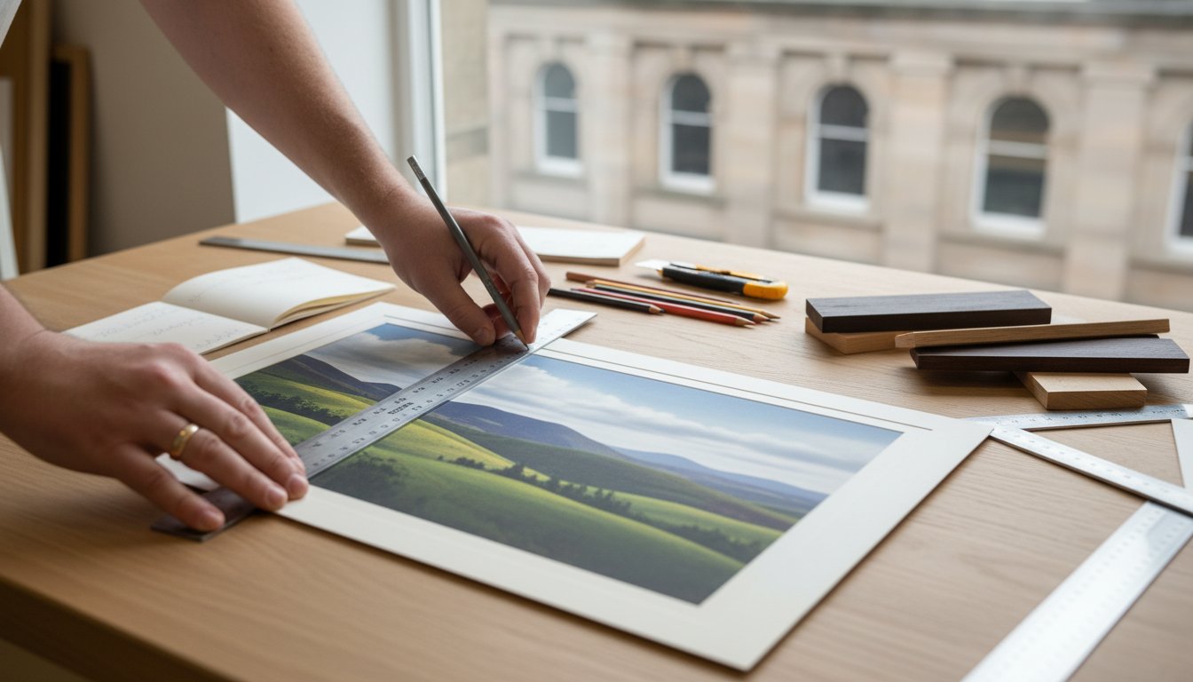
Your 5-Step Guide to Measuring Artwork Accurately
Achieving a flawless, professionally framed finish starts with one crucial element: accurate measurements. Taking a few moments to measure your artwork correctly is the most important step in understanding how to measure for a picture frame. This simple process ensures your bespoke frame will be the perfect home for your piece, enhancing its beauty without compromise. Follow these five steps for a perfect fit, every time.
Lay your artwork on a clean, flat surface. Before you begin, ensure the area is free from any debris that could damage your piece. A large, clear dining table or a clean floor works perfectly.
Measure the width. Using your tape measure, measure the full width of your artwork from the absolute left edge to the absolute right edge. This is your first critical dimension.
Measure the height. Next, measure the height from the very top edge to the very bottom edge. Be precise and ensure your tape measure is straight.
Double-check your measurements. This step is non-negotiable! We live by the craftsman’s motto: measure twice, order once. Re-measure both the width and height to confirm your numbers are correct.
Record your dimensions clearly. Write down your final measurements, making a clear note of which is the width and which is the height (e.g., Width = 400mm, Height = 600mm). This prevents any confusion when placing your order.
Technique Tips for Precision
To guarantee your measurements are as accurate as possible, follow the techniques used by experts. Always use a rigid steel tape measure; a fabric or plastic one can stretch and lead to inaccuracies. For the best results, measure the width and height in at least two different places to ensure your artwork is perfectly square. Following professional standards, as recommended by organisations like the Professional Picture Framers Association (PPFA), means recording your dimensions in millimetres (mm) for the greatest precision.
What If Your Artwork Has a Border?
Many prints and photographs come with a white border, which presents a creative choice. Do you want this border to be visible, or would you prefer it to be hidden beneath a mount? If you want to display the entire piece, including any signatures or edition numbers in the border, simply measure the full paper size as described above. However, if you plan to use a mount to overlap the edge, you only need to measure the image area you wish to be visible. This is a key detail in learning how to measure for a picture frame that truly complements your art.
Measuring Different Types of Artwork
Every beautiful piece you wish to display is unique, and the secret to a perfect, professional finish lies in taking the right measurements from the start. The method for how to measure for a picture frame changes slightly depending on what you are framing. Whether it’s a deep canvas, a delicate print, or a treasured piece of memorabilia, each requires a specific approach to ensure it is housed perfectly.
For Canvas Paintings and Stretched Art
A canvas painting brings texture and depth to a room, and its frame should honour that. To measure a stretched canvas, you’ll need two sets of dimensions:
Face Dimensions: Using your tape measure, find the width and height of the canvas face. Measure from the outer edge to the outer edge. It’s wise to measure in a couple of places to check for any slight variations in the stretcher bars.
Depth: Measure the thickness of the stretched canvas, from the front face to the back. This is the depth of the stretcher bar. This measurement is crucial for selecting a frame with a suitable rebate depth to hold the canvas securely, or for choosing a beautiful, bespoke floater frame that allows the canvas to sit proudly within it.
For Photographs, Posters, and Prints
When framing works on paper, the process is wonderfully straightforward. You simply need to measure the full paper size from edge to edge, both for width and height. Don’t measure just the printed image area, as the full paper dimensions are what determine the frame and mount size. Once you have these precise dimensions, you can start planning your display. For larger projects, this expert gallery wall guide offers some spectacular ideas on arranging multiple pieces. Getting this measurement right is the first step towards creating a professionally framed piece that looks spectacular on your wall.
For 3D Objects and Memorabilia
Framing three-dimensional items like sports shirts, medals, or family heirlooms creates a stunning and personal display. This requires a special type of frame, often called a shadow box, and three key measurements: width, height, and most importantly, depth. Measure the object at its widest, tallest, and deepest points to ensure the bespoke box frame has enough clearance. This allows your treasured item to sit comfortably without being compressed against the glazing, preserving it in a premium, gallery-worthy display for years to come.
The Mount Factor: How to Measure for a Professional Look
A picture mount, sometimes called a mat or passe-partout, is the elegant border between your artwork and the frame. It’s a signature of bespoke framing that does more than just look beautiful; it serves a dual purpose of visual appeal and essential preservation. A professionally cut mount creates a vital air gap, preventing your precious artwork from touching the glass, which protects it from potential moisture damage. Visually, it provides ‘breathing room’, drawing the viewer’s eye inward to the piece itself.
Getting this step right is a critical part of learning how to measure for a picture frame, as this is where mistakes can easily be made. A common and well-balanced starting point for a border is 50mm, but the perfect width depends on your art and personal taste. For more guidance on aesthetics, explore our detailed guide on Choosing Mounts & Glass.
Calculating the Mount Aperture
The ‘aperture’ is the window of the mount through which your artwork is seen. To prevent the artwork from falling through, the aperture must be slightly smaller than the paper it’s printed on. This creates a small overlap, typically around 5mm on each side, to securely hold the picture in place behind the mount.
Our simple guideline for this is to subtract 10mm from your artwork’s height and width. For example, if you have a print that measures 200mm x 300mm, your ideal mount aperture would be 190mm x 290mm.
Calculating the External Mount Size
Once you have your aperture dimensions, you can calculate the final, external size of the mount. This is the measurement that will need to fit perfectly inside your chosen frame. The formula is straightforward:
Aperture Size + (2 x Border Width) = External Mount Size
Let’s continue our example. With a 50mm border and a 190mm wide aperture, the calculation is:
(190mm aperture width) + (2 x 50mm borders) = 290mm external mount width.
After doing the same for the height, this final external dimension becomes the ‘artwork size’ you will use when ordering your frame. This simple calculation is key to how to measure for a picture frame to achieve a truly professional finish.
From Measurements to Frame: Finalising Your Order
You’ve done the hard work and your measurements are ready. This final step is crucial for turning those numbers into the perfect bespoke frame. The most important thing to remember is this: the frame size you order is the internal size of the frame, designed to fit your artwork or mount perfectly. This is often called the ‘glazing size’, as it matches the dimensions of the glass or acrylic front.
This is the golden rule of how to measure for a picture frame and ensures a snug, professional fit every time.
If you are not using a mount: The frame size you need to order is simply the exact height and width of your artwork.
If you are using a mount: The frame size you need to order is the external dimension of the mount you calculated in the previous step.
Putting It All Together: A Worked Example
Let’s transform your calculations into a final frame size. Imagine you have a beautiful A4 print and want to give it breathing room with a classic mount.
Artwork Size: A4 Print (210mm x 297mm)
Desired Mount Border: A consistent 50mm on all sides.
In this scenario, the perfect frame size to order is 310mm x 397mm.
Considering the Frame Moulding Width
The final piece of the puzzle is the frame profile, or ‘moulding’, itself. Every frame has its own width, which adds to the overall dimensions of the piece on your wall. For example, if you choose a sleek, modern frame with a 20mm wide moulding, you need to account for this.
To find the final wall space required, simply use this formula:
Final Dimension = Frame Size + (2 x Moulding Width)
Using our example, a 20mm moulding would make the final piece 350mm x 437mm. Considering this now ensures your perfectly framed art will have the ideal spot in your home. With your final measurements in hand, you are ready to find the perfect frame. Explore our gallery of premium, bespoke frames to bring your vision to life.
Common Mistakes and When to Ask an Expert
You’ve carefully followed the steps, but a few common pitfalls can turn a perfect project into a frustrating experience. Knowing what to avoid is just as important as knowing how to measure for a picture frame correctly. Here are a few frequent missteps we see and our advice on when to call in a professional.
To ensure a flawless fit, be mindful of these common errors:
Measuring the Old Frame’s Window: It’s tempting to measure the visible artwork area in an existing frame, but this is a mistake. You need the exact dimensions of the artwork itself, from edge to edge, as the frame’s inner recess is built to hold this size.
Forgetting the Mount Overlap: A window mount isn’t cut to the exact size of your art. It must slightly overlap the artwork (typically by 3-5mm on each side) to hold it securely in place and prevent it from falling through. Ignoring this overlap will result in unsightly gaps.
Mixing Up Units: A simple but costly error. Always double-check whether you are providing measurements in millimetres (mm) or inches (in). At First4Frames Gallery, we work in millimetres for ultimate precision, so ensure your figures are consistent.
For pieces that are particularly valuable, deeply sentimental, or unusually shaped-such as textiles, medals, or 3D objects-we always recommend seeking professional advice. The complexity of these items often requires specialised techniques that go beyond a simple measurement.
The First4Frames Gallery Promise: Perfect Fit Guaranteed
With over 20 years of experience handcrafting bespoke frames right here in Falkirk, we’ve seen it all. Our passionate team of experts is here to guide you, eliminating any guesswork and ensuring your measurements are spot-on. We work with your exact dimensions to create a premium, handcrafted frame that perfectly honours your art, guaranteed.
Ready to Get Started?
You’ve done the measuring; now let our craftsmanship do the rest. Your artwork deserves a frame that acts as the perfect bridge between it and your home décor. For a deeper dive into all your options, explore our Custom Picture Framing: The Ultimate Guide.
Bringing Your Vision to Life with the Perfect Frame
You’re now equipped with the essential knowledge for a flawless fit. Mastering how to measure for a picture frame is the crucial first step, and by remembering to measure your artwork first and carefully considering the mount, you’re well on your way to achieving a truly professional result. This precision is the bridge between your art and a spectacular display.
When you want to guarantee perfection, our expertise is at your service. Based in Falkirk, Scotland, the First 4 Frames team brings over 20 years of passion and craftsmanship to every project. We offer a hassle-free, bespoke framing service to the entire UK, ensuring your artwork is given the beautiful, high-quality presentation it deserves.
Perfecting Your Fit: Your Picture Framing Questions Answered
Should I measure in inches or centimetres/millimetres?
In the UK, while inches are common for standard-size frames, we recommend using millimetres (mm) for the greatest accuracy. At First 4 Frames, our bespoke craftsmanship relies on precision, and millimetres eliminate conversion errors. When you measure, choose one unit and use it consistently. For the most professional, perfect fit, especially with custom mounts and frames, millimetres are the preferred choice of expert framers and will ensure a spectacular result for your artwork.
What size frame do I need for an A4 or A3 print?
This depends on whether you wish to include a mount. For an A4 print (210 x 297mm) without a mount, an A4 frame is the perfect fit. To create a more premium, gallery-style display, place your A4 print in a larger A3 frame (297 x 420mm) with a mount. The mount provides a beautiful visual border, drawing the eye directly to the artwork and elevating its presence on your wall.
How much smaller should the mount opening (aperture) be than the artwork?
The mount opening, or aperture, should always be slightly smaller than your artwork to secure it neatly. We recommend an overlap of 5mm on each side, meaning the aperture should be 10mm smaller than your artwork’s height and width. For an A4 print (210 x 297mm), the ideal aperture would be 200 x 287mm. This ensures the paper’s edges are hidden and the art is held securely in place.
Do I measure the image itself or the entire piece of paper?
Always measure the full dimensions of the paper your artwork is on, not just the printed image area. Frame and mount sizes are determined by the overall paper size they need to contain. This is a critical step in understanding how to measure for a picture frame correctly. Measuring the entire sheet ensures that any white borders are properly accounted for and your artwork fits flawlessly within the mount and frame.
How do I measure for a frame if my picture is not a standard size?
For any non-standard or uniquely sized piece, our bespoke framing service is the perfect solution. Simply use a tape measure to find the exact height and width of your artwork in millimetres. Once you have these precise dimensions, you can order a custom frame and mount crafted to your exact specifications. This ensures that even the most unusually shaped art receives the beautiful, professional presentation it deserves.
Can I measure my old frame to find the size for a new one?
Yes, but you must measure correctly. To find the right size, turn the old frame over and measure the inside opening at the back-from one inside edge to the opposite inside edge. This measurement is the ‘glazing size’ and indicates the size of the artwork it holds. Do not measure the front or the exterior dimensions, as the width of the frame moulding will give you an incorrect size for your new frame.
How thick can the artwork be to fit in a standard frame?
Our standard frames are designed to comfortably house artwork on paper or card, a mount, and a backing board, accommodating a total depth of around 3-4mm. For thicker pieces, such as canvas boards, textiles, or 3D memorabilia, a deeper frame profile is required. These are often called ‘box frames’ or ‘canvas frames’. If your art is thicker than standard paper, please contact us for bespoke advice to ensure a perfect and secure fit.
Have you ever been captivated by the raw, vibrant energy of a painting, only to find original artworks come with a daunting price tag? It’s a common frustration for art lovers, especially when you discover a truly special talent like contemporary Scottish artist Fiona Matheson. Her breathtaking landscapes pull you into the heart of the Highlands, but how do you bring that spectacular beauty home without the gallery cost, or the worry of choosing the right piece and the perfect frame? We believe everyone deserves to own art that moves them, and the process should be inspiring, not intimidating.
This guide is your personal journey into the world of Fiona Matheson. We will explore the passion and inspiration behind her colourful, emotional style and reveal how her connection to the Scottish scenery is woven into every brushstroke. Crucially, we will provide expert advice on selecting a premium Giclée print that speaks to you and a bespoke frame that acts as the perfect bridge to your home’s décor. Prepare to find an affordable, beautiful, and professionally framed piece of art that you can welcome into your home with complete confidence.
Key Takeaways
Discover what makes Fiona Matheson a leading contemporary Scottish artist and how the Highlands inspire her vibrant work.
Understand the key elements of her signature style, particularly how she uses bold, expressive colour to capture the emotion of a landscape.
Gain practical advice on how to select the perfect framed print for your space, matching its mood and palette to your existing décor.
Learn why high-quality Giclée prints offer an accessible and lasting way to bring a piece of the Scottish Highlands into your home.
Who is Fiona Matheson? The Artist Behind the Canvas
At the heart of contemporary Scottish art, you will find the spectacular work of Fiona Matheson, an acclaimed landscape artist whose soul is deeply intertwined with the Highlands. Celebrated in prestigious galleries across Scotland and internationally, her paintings offer a powerful, emotional connection to the wild, untamed beauty of her homeland. She translates the dramatic light, shifting weather, and ancient terrain into vibrant, expressive artworks that resonate with collectors and art lovers alike.
To truly understand the passion and inspiration behind her craft, hear from the artist herself in this short film:
Highland Roots and Artistic Beginnings
Born and raised amidst the rugged landscapes of the north of Scotland, Fiona’s perspective is intrinsically shaped by her environment. This profound connection to place was honed through formal training at Gray’s School of Art in Aberdeen. From these foundational years, she embarked on a dedicated artistic journey, evolving her unique style and building a formidable reputation. Her commitment and talent have led to numerous accolades, cementing her status as an award-winning professional artist with a distinct and compelling voice.
The Creative Process: From Inspiration to Artwork
Fiona’s work is not a mere depiction of a landscape; it is an emotional response captured on canvas. Rather than painting en plein air, she absorbs the atmosphere of a location, carrying its memory and feeling back to her studio. There, she employs a dynamic mix of media-oils, acrylics, inks, and collage-to build layers of texture and colour. This process allows her to convey the very essence of the Highlands, where memory and emotion guide the brush to create pieces that are both deeply personal and universally resonant.
Decoding the Signature Style of Fiona Matheson
To view a painting by Fiona Matheson is to instantly recognise her unique artistic language. Her signature style is a powerful fusion of vibrant colour, rich, tactile texture, and a deep emotional resonance with the Scottish landscape. She masterfully balances abstraction with recognisable forms, creating work that is both evocative and grounded. Her paintings are not just seen; they are felt.
A Master of Expressive Colour
Colour is the lifeblood of Matheson’s work. She employs a bold and expressive palette, often featuring jewel-like tones of deep crimson, vibrant teal, and fiery orange to translate the raw emotion of a scene. These choices are never arbitrary; they reflect the shifting light and moods of the seasons, from the cool, crisp blues of a winter loch to the warm ochres of an autumn glen. By juxtaposing warm and cool tones, she creates dramatic tension and powerful focal points, masterfully guiding the viewer’s eye through the composition.
The Role of Texture and Mixed Media
Matheson’s canvases are dynamic surfaces, often built up with thick layers of oil paint, collage, and other mixed media. This technique adds a tangible, almost sculptural quality that invites a closer look. The resulting texture is a direct echo of the rugged, weathered terrain of the Highlands-the rough bark of a Scots Pine or the craggy face of a Munro. This layering creates a visual history within the painting, where glimpses of underlying colours and materials peek through, adding a beautiful sense of depth and complexity.
Capturing the Soul of the Scottish Landscape
Ultimately, Matheson’s work is more than a simple depiction of a place; it is an interpretation of its very soul. In a departure from traditional, photorealistic landscapes, her art captures the feeling of a moment-the wild energy of a storm, the profound peace of a misty morning, or the breathtaking drama of a mountain pass. As you can explore further on Fiona Matheson’s official website, her art is a dialogue between herself and the environment. She distills the landscape down to its most potent emotional elements, creating a spectacular experience that resonates long after you look away.
Key Themes in Fiona Matheson’s Paintings
The profound power of Fiona Matheson’s art stems from her deep, personal connection to the Scottish Highlands. Her portfolio is a vibrant and emotional exploration of this rugged landscape, consistently returning to a few core themes that capture its very soul. Through her unique lens, solitary buildings, wild coastlines, and rolling fields are transformed into spectacular visual narratives that feel both timeless and contemporary.
The Iconic Scottish Croft
The humble croft is perhaps the most recognisable motif in her collection. In her paintings, it is more than just a building; it symbolises shelter, history, and a resilient human footprint against the untamed wilderness. Matheson often portrays these cottages as solitary beacons, their whitewashed walls providing a stark, beautiful contrast to the brooding hills and dramatic skies. Popular works featuring this much-loved theme perfectly capture a sense of place and quiet endurance.
Dramatic Coastlines and Shifting Tides
Inspired by locations from the Moray Firth to the Hebrides, the ever-changing character of the Scottish coast provides endless inspiration. Her paintings masterfully capture its duality, from the serene, reflective waters of a calm shore to the raw, untamed energy of a stormy sea. With dynamic brushwork and a keen eye for light, Fiona Matheson conveys the ceaseless movement of water and sky, pulling you directly into the scene. Each piece is a testament to the power and beauty of the British coastline.
Abstracted Fields and Rolling Hills
When depicting the rural landscape, her style often leans towards a beautiful semi-abstraction. She represents the patchwork of fields and moorland not with photographic precision, but with bold, expressive blocks of colour and rich, tactile texture. This technique breaks the landscape down into its fundamental shapes and hues, creating a modern and highly emotive interpretation. The strong composition and vibrant palettes of these pieces make them a stunning focal point, working beautifully in modern and traditional interiors alike.
Across all these themes, a consistent thread emerges: an artist who sees beyond the surface to capture the feeling of a place. Whether it’s the quiet solitude of a croft or the wild energy of the sea, her work invites you to experience the heart of the Scottish landscape.
How to Choose and Style a Fiona Matheson Print
Bringing a piece of the Scottish landscape into your home is a deeply personal choice. A print by Fiona Matheson offers more than just decoration; it brings an atmosphere, a story, and a connection to nature. To ensure your chosen artwork feels perfectly at home, consider how its mood, scale, and presentation will harmonise with your space.
Matching Art to Your Interior Design
The versatility of Fiona’s work allows it to complement a wide range of styles. In a minimalist or contemporary setting, her pieces with clean horizons and subtle colour palettes introduce organic warmth without overwhelming the space. For rustic or traditional interiors, her more textured, earthy landscapes feel like a natural extension of the decor. Consider using a bold, vibrant piece as a spectacular focal point above a mantelpiece or sofa in your living room, or choose one of her calmer, more contemplative scenes to create a tranquil sanctuary in a bedroom.
When selecting the right size, think about the artwork’s role. Do you want it to command attention or be a subtle addition? Before you decide, we recommend measuring your wall and considering the following:
Orientation: A landscape-oriented print works beautifully above long furniture like a sofa or sideboard, while a portrait-oriented piece is perfect for narrower walls or alcoves.
Scale: A large print can make a room feel bigger, while a smaller piece can create an intimate focal point. Don’t be afraid to go bold on an empty wall.
The Importance of Quality Framing
A great frame doesn’t just border the art; it completes it. It acts as a bridge between the artwork and your room’s decor, enhancing the colours and mood of the print. A simple, slim black frame can lend a modern, gallery-like feel, while a natural wood frame will echo the organic subject matter and add a touch of rustic warmth. The right frame protects your investment and elevates the entire viewing experience.
Our bespoke framing service is the perfect partner for your new print. With over twenty years of experience, we use premium materials and expert craftsmanship to ensure your artwork is presented beautifully and preserved for years to come. Find the perfect frame for your chosen print.
Owning Her Art: Giclée Prints as an Accessible Choice
The joy of connecting with a piece of art is a powerful experience. While an original painting is a singular, one-of-a-kind treasure, fine art prints offer a beautiful and accessible way to bring an artist’s vision into your home. They are the perfect entry point for new collectors and an excellent way for seasoned art lovers to acquire work from artists they admire, like Fiona Matheson.
Unlike standard posters, fine art Giclée prints are created with the specific intention of being an identical, lasting reproduction of the original artwork. This process uses sophisticated technology to honour the artist’s craft, ensuring every detail, colour, and texture is faithfully preserved for you to enjoy for decades to come.
The Unmatched Quality of Giclée Prints
The term Giclée (pronounced “zhee-clay”) is a hallmark of superior quality in the fine art world. It refers to a meticulous printing process that uses specialist equipment and premium materials to create prints of the highest standard. The result is a piece that is virtually indistinguishable from the original painting.
Archival Pigment Inks: We use a complex system of up to 12 light-fast pigment inks, which resist fading and ensure the colours remain vibrant and true for over 100 years.
Premium Fine Art Paper: Each print is produced on heavyweight, acid-free art paper, which provides a beautiful texture and ensures the longevity of the artwork.
Incredible Detail: The Giclée process captures an astonishing level of detail, from the most subtle tonal shifts to the texture of the artist’s brushstrokes.
Building Your Collection with First4Frames Gallery
We believe that owning beautiful Scottish art should be simple and rewarding. That’s why we have curated a spectacular collection of Giclée prints that represent the very best of Fiona Matheson’s evocative work. Each piece is chosen to capture the unique energy and colour that defines her style.
As a one-stop-shop for professionally framed art, we handle everything with care. Your chosen print is prepared and perfectly framed by our expert team right here in our Falkirk workshop. We use only the best materials to protect and enhance your artwork, delivering a gallery-quality piece that is ready to hang and transform your space.
The art of Fiona Matheson is more than a simple depiction of a place; it is a profound and emotional gateway to the untamed spirit of the Scottish Highlands. We’ve explored how her signature semi-abstract style breathes life into landscapes and how her powerful themes of nature and memory can transform any space. Her work invites you not just to see the Highlands, but to feel them. And thanks to modern printing, owning a piece of this spectacular vision is an accessible and lasting joy.
At First 4 Frames, our passion is connecting you with art that resonates. We share a commitment to making exceptional Scottish art accessible through our premium, lightfast Giclée prints, which preserve every nuance of the original masterpiece. Our in-house team of experts provides bespoke framing, ensuring your chosen artwork is perfectly presented and protected for years to come. This is where craftsmanship meets creativity, all to help you find the perfect piece for your home.
What medium does Fiona Matheson primarily use in her art?
Fiona Matheson works primarily with acrylic paint, a medium she masterfully uses to capture the vibrant energy and texture of the Scottish landscape. Her technique involves building up layers of rich colour to create paintings that are full of depth, light, and emotional intensity. This approach allows her to convey the ever-changing mood of the Highlands, from its dramatic skies to its rugged coastlines, in a way that is both powerful and deeply personal.
Where in Scotland is Fiona Matheson from?
Fiona Matheson is based in the Scottish Highlands, and this spectacular environment is the primary source of inspiration for her work. Living and working in such a wild and beautiful landscape allows her to directly experience the elements she so brilliantly portrays on canvas. Her deep connection to the area is evident in every piece, capturing the unique spirit and dramatic beauty of the north of Scotland with authentic passion and a remarkable eye for colour.
Are Fiona Matheson prints a good investment?
While the primary return on any art is the daily joy it brings, a high-quality Giclée print is an excellent way to begin a fine art collection. Unlike standard posters, our archival prints of work by an acclaimed artist like Fiona Matheson are created to last a lifetime without fading. They hold their aesthetic and financial value far better over time, making them a beautiful and lasting addition to your home that you can treasure for many years to come.
How can I buy a framed Fiona Matheson print for my home?
We make it simple to own a beautiful piece of framed art. First, browse our curated collection of Fiona Matheson’s spectacular prints and select your favourite. Next, choose from our range of premium, bespoke frames to find the perfect match for your artwork and your home’s décor. Finally, simply place your order. We will professionally frame your print and deliver it directly to your door, ready to hang and enjoy. It’s a truly hassle-free, one-stop-shop experience.
What is a Giclée print and why is it better than a standard poster?
A Giclée print is the gold standard in fine art reproduction. The process uses specialist archival inks and premium, acid-free paper to create a flawless copy with incredible colour accuracy and detail. Unlike a standard poster which can fade and discolour quickly, a Giclée print is a museum-quality piece designed to last for over 100 years. It offers the perfect combination of quality, longevity, and value, ensuring your art remains as vibrant as the day it was printed.
How do I choose the right frame for a Fiona Matheson artwork?
The perfect frame acts as a bridge between the artwork and your room’s décor. For Fiona’s vibrant and expressive paintings, a simple, slimline frame in black, white, or natural oak often works beautifully, allowing the artwork’s colours to take centre stage. Consider your existing interior style-a modern room may suit a crisp black frame, while a more rustic space could be enhanced by a warm wood finish. Our bespoke framing service ensures a perfect, professional result every time.
That beautiful shaft of sunlight streaming into your living room brings life and warmth to your space. But for the cherished artwork on your walls, it can be a silent, slow-motion threat. Do you ever worry that your favourite pieces are losing their vibrancy, or feel you must choose between a bright, airy home and the preservation of your art? It’s a common dilemma for art lovers, but the solution is simpler and more elegant than you might imagine.
Thankfully, understanding how to protect art from sun damage doesn’t mean sacrificing your light-filled rooms. In this expert guide, we will walk you through the essential techniques to keep your collection safe. From the secrets of strategic placement to demystifying the world of UV-protective glass and bespoke framing, we’ll provide clear, actionable steps. You will gain the confidence to display your art beautifully and the knowledge to ensure its colours remain rich and true for a lifetime, safeguarding the pieces you love.
Why Sunlight is Art’s Greatest Enemy: Understanding the Damage
That beautiful stream of sunlight pouring into your room may feel warm and inviting, but for your cherished artwork, it’s a silent and persistent threat. The primary culprit is invisible to the human eye: ultraviolet (UV) radiation. This high-energy light is the single greatest cause of irreversible damage to art. The harm is cumulative, building up slowly over time until one day you notice that the vibrant colours you fell in love with have become a pale, faded memory. Understanding this process is the first step in learning how to protect art from sun damage effectively.
To see how different solutions can mitigate this damage, this video offers a helpful visual guide:
The Science of Fading: How UV Rays Break Down Pigments
Think of UV rays as tiny, energetic bullets that constantly bombard your artwork. When they strike the surface, they trigger chemical reactions that break down the molecular bonds in the pigments and dyes. This process, known as photodegradation, is what causes colours to fade. Certain pigments are more fragile than others; vibrant reds, yellows, and purples often fade much faster than earthy tones like browns and blues. Even our premium Giclée prints, which use archival-quality inks for longevity, are not immune and require proper protection to preserve their spectacular detail.
Beyond Fading: Heat and Visible Light Damage
UV radiation isn’t the only danger lurking in sunlight. The heat from direct sun causes materials to expand and contract, a cycle that puts immense physical stress on your art. Over time, this can lead to oil paint cracking, canvases sagging, and paper or photographs becoming warped and distorted. Furthermore, even intense visible light contributes to the decay, causing paper and mounting boards to yellow and become brittle. Managing these environmental factors is a core part of the preventive conservation techniques used by museum professionals to ensure a piece’s longevity.
Which Art is Most at Risk?
While all art is vulnerable to sunlight, some types are far more susceptible than others. It is crucial to know where your collection stands to provide the right level of care.
Highly Susceptible: Watercolours, photographs, and any works on paper are at the top of the list. Paper is absorbent and its fibres are easily broken down, leading to rapid fading and brittleness.
Textiles and Fabrics: Tapestries, quilts, and other fabric-based art can fade and their fibres can weaken and disintegrate very quickly when exposed to direct light.
More Robust (But Still Vulnerable): Oil and acrylic paintings are generally more resilient, as the pigments are suspended in a protective binder. However, they are still prone to cracking from heat and their colours will inevitably fade over many years of exposure.
Strategic Placement: Your First and Easiest Line of Defence
Before you even think about specialist glazing or frames, the most powerful tool in your art protection arsenal is completely free: the layout of your room. When learning how to protect art from sun damage, controlling the environment where your art lives is the foundational first step. A little planning when you first hang a piece can prevent a lifetime of irreversible fading and damage. It’s about working with your home, not against it.
Mapping the Sun in Your Home
Take a day to become a light cartographer in your own home. Observe which walls receive direct sunlight and, crucially, at what time of day. In the UK, north-facing walls are your safest bet, as they receive the least direct, most consistent light. Conversely, south-facing walls bear the brunt of the sun’s intensity, especially during midday, and require the most careful consideration for any valuable artwork.
The Best and Worst Walls for Hanging Art
With your new sun map in hand, choosing the right spot becomes much simpler. The goal is to minimise direct UV exposure as much as possible. Follow these key principles:
The Golden Rule: Never hang important or delicate art, like watercolours or photographs, in a location that receives prolonged, direct sunlight.
Avoid Direct Opposition: Walls directly opposite large, south-facing windows are high-risk zones. They receive both direct and intense reflected light.
Beware of Reflections: Be mindful of light bouncing off shiny surfaces. A polished wooden floor, a glass coffee table, or a mirror can redirect harmful rays onto a seemingly safe wall.
Using Window Treatments to Your Advantage
Your windows are the gateways for UV rays, but they don’t have to be an open invitation for damage. Simple, elegant solutions can make a spectacular difference. During peak sunlight hours, drawing curtains or lowering blinds is a highly effective tactic. For a more permanent and invisible solution, you can install professional window films that block UV rays, often rejecting up to 99% of them without obscuring your view. Even a simple set of sheer curtains can work wonders, diffusing harsh light and significantly reducing its damaging impact.
The Protective Power of a Professional Frame
While strategic placement and window films offer a great first line of defence, the single most effective, long-term solution for protecting your art is professional conservation framing. A beautiful bespoke frame is far more than a decorative border; it is a precisely engineered conservation tool designed to create a safe, stable environment for your treasured piece. This is the ultimate answer to how to protect art from sun damage, safeguarding it from multiple environmental threats for decades to come.
Choosing the Right Glazing: A Shield Against UV Rays
The glass or acrylic (glazing) is your artwork’s primary shield against light. Standard picture glass offers minimal protection, blocking less than half of damaging UV rays. To truly protect your art, you need specialist glazing. Invisible UV radiation is the main culprit behind fading, breaking down the chemical bonds in pigments. You can learn more about the science of how UV rays cause fading from university research, but the solution lies in choosing the right material:
Conservation Clear Glass/Acrylic: This is the industry standard for preservation. It is specially coated to block up to 99% of harmful UV rays, dramatically slowing down the fading process.
Museum Glass/Acrylic: The premium choice for both protection and viewing. It offers the same 99% UV protection but includes an advanced anti-reflective coating, making the glazing virtually invisible for breathtaking clarity.
The Importance of Archival Mounts and Backing
Light isn’t the only enemy. The materials touching your artwork are just as critical. Standard mount boards contain acidic compounds that, over time, can leach into the paper, causing irreversible yellowing and brown marks-a phenomenon known as ‘mat burn’. We only use premium, acid-free archival mount boards (made from pure rag mat or alpha-cellulose) that will never discolour or damage your art.
Furthermore, a professional frame is sealed with a sturdy, archival backing board. This creates a robust barrier against dust, moisture, pollutants, and even insects, ensuring the artwork remains pristine from all sides.
How a Bespoke Frame Provides a Complete Seal
An off-the-shelf frame rarely provides the perfect fit, leaving small gaps that allow dust and humidity to creep in. A bespoke frame is crafted to the exact dimensions of your artwork, ensuring a complete and secure seal. This creates a stable micro-environment, buffering your art from the damaging effects of fluctuating humidity that can cause paper to warp or ripple. It’s this complete, 360-degree approach that provides true, lasting protection.
Protecting your beautiful art doesn’t stop once it’s perfectly hung on the wall. The journey of preserving its vibrancy and value is an ongoing one, built on simple, consistent habits. By understanding how to protect art from sun damage and other environmental factors inside your home, you can safeguard your entire collection-from professionally framed prints to unframed canvases-ensuring they remain a source of joy for years to come.
The Hidden Danger of Artificial Lighting
While direct sunlight is the most obvious threat, it’s a common misconception that your art is completely safe indoors. All light sources contribute to gradual fading over time. To minimise this risk, choose your lighting with care.
Embrace LED Bulbs: Modern LEDs are the best choice for illuminating art. They emit negligible UV radiation and very little heat, which helps preserve the delicate pigments in your favourite pieces.
Avoid Direct Halogen Spotlights: Older halogen and incandescent bulbs produce significant heat and UV rays, which can accelerate fading and cause lasting damage. Never aim a powerful, hot spotlight directly at your artwork.
Maintaining a Stable Environment
Fine art, much like any object of premium craftsmanship, thrives in stability. Drastic fluctuations in temperature and humidity cause materials like paper, canvas, and wood to expand and contract. This can lead to warping, cracking, or even mould. To create a safe haven for your art, avoid hanging it in areas with extreme environmental shifts, such as:
Directly above radiators or near fireplaces.
In the direct path of an air conditioning or heating vent.
In rooms prone to high humidity, like bathrooms or damp conservatories.
A consistent, moderate environment is crucial for long-term preservation.
The Art of Rotation: Keep Your Collection Fresh and Safe
One of the best professional tips for collectors is also one of the most enjoyable: rotate your art. Periodically swapping the pieces on your walls with those you have in storage significantly limits the cumulative light exposure for any single work. This simple practice not only preserves your most treasured pieces but also gives you a wonderful opportunity to refresh your home’s decor and fall in love with your collection all over again. It’s the perfect excuse to find a spectacular new print to add into the mix. Why not explore our gallery for fresh inspiration?
Give Your Art the Lasting Protection It Deserves
Protecting your cherished artwork from the irreversible effects of sunlight is a vital part of being a collector. As we’ve explored, from strategic placement away from direct light to mindful long-term care, every step you take makes a difference. Ultimately, understanding how to protect art from sun damage is about combining these smart daily habits with the unparalleled security and aesthetic finish of professional conservation framing.
At First4Frames Gallery, we bring over 20 years of bespoke framing experience to every piece we handle. We are passionate about our craft and believe a frame does more than just decorate-it protects. Trusted by artists and collectors across Scotland, we use premium, high-quality conservation materials to build a beautiful shield that preserves colour and detail for generations to come. Your art is an investment in joy, and it deserves to be preserved with expert care.
Frequently Asked Questions About Protecting Your Art
Can sun-damaged art be repaired or restored?
Unfortunately, prevention is far better than a cure. Fading caused by UV light is irreversible, as the light has permanently altered the pigments in the ink or paint. While a professional art conservator may be able to treat issues like yellowing or brittle paper, the process is often complex and costly. The best strategy is always to protect your beautiful artwork from the very beginning to preserve its original vibrancy and integrity for years to come.
How can I tell if my artwork is already sun-damaged?
Look for tell-tale signs of UV exposure. The most obvious is fading, where colours appear washed out or less vibrant-reds and purples are often the first to go. You might also notice the paper or canvas has turned yellow or brown. In advanced cases, the material may feel brittle to the touch. A simple check is to carefully lift a corner of the art from under the frame’s lip and compare its colour to the exposed area.
Does UV-protective glass make the artwork look darker or change its colours?
This is a common concern, but rest assured, modern conservation-grade glazing is designed for optical purity. High-quality UV-protective glass is exceptionally clear and will not make your artwork look darker or alter its true colours. In fact, premium options often include anti-reflective properties, which can reduce glare and actually enhance the viewing experience, allowing the piece’s spectacular details and colours to shine through without interference from distracting reflections.
Is reflected or indirect sunlight still harmful to my art?
Yes, absolutely. UV rays are relentless and can bounce off walls, floors, and even furniture to reach your artwork. This means a piece hung on a wall opposite a bright window is still at significant risk. Understanding how to protect art from sun damage means recognising that any exposure to natural light, direct or indirect, contributes to cumulative and irreversible harm over time. Even on a cloudy day, harmful UV radiation is still present.
How much more does a frame with UV-protective glass cost?
Investing in UV-protective glazing is a wise choice for preserving your art. Typically, you can expect it to add between £20 and £60 to the cost of a standard-sized frame in the UK, depending on the size and the specific grade of protection. While it is an additional upfront cost, consider it a small price to pay for the priceless peace of mind that comes with safeguarding a valuable or sentimental piece from permanent damage.
Are LED lights completely safe for artwork?
LEDs are by far the safest lighting option for art, as they emit negligible UV radiation and very little heat compared to older incandescent or halogen bulbs. However, no light source is completely harmless. All visible light can cause fading over time, so it’s still best practice to use low-wattage LEDs, position them a sensible distance from the artwork, and only illuminate the piece when it’s being enjoyed rather than leaving lights on continuously.
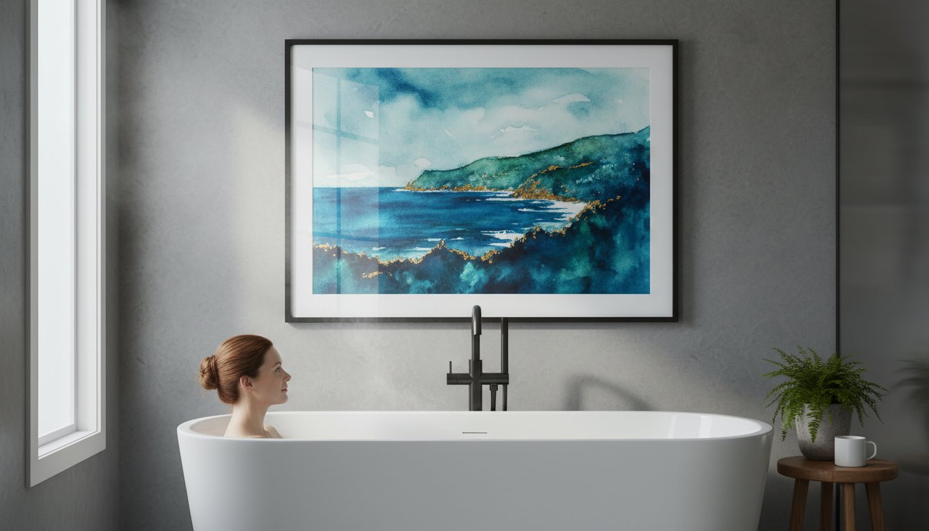
Does the thought of hanging a beautiful piece of art in your bathroom fill you with a sense of dread? The fear is a common one: that the steamy, humid environment will warp the frame, discolour the print, or worse, lead to dreaded mould. For too long, this has meant leaving bathroom walls bare and impersonal, a missed opportunity to inject personality into a space you use every day.
But it doesn’t have to be this way. Choosing beautiful and durable art for a bathroom is not only possible, it’s the key to transforming your functional space into a personal sanctuary. In this complete guide, we share our expertise, honed over two decades of professional craftsmanship. We’ll walk you through everything from selecting the right prints to bespoke, moisture-resistant framing techniques that protect your investment. Prepare to discover how to confidently create the stylish, spa-like bathroom you’ve always dreamed of.
Why Your Bathroom is the Perfect, Unexpected Place for Art
Often overlooked as a purely functional room, the bathroom holds incredible potential to become a personal retreat-a space designed not just for utility, but for rejuvenation and reflection. By introducing beautiful art for a bathroom, you move beyond the mundane and begin to curate an atmosphere that is uniquely yours. It’s an opportunity to set a specific mood, whether you envision a calming, spa-like sanctuary for unwinding after a long day or a vibrant, energising space to kick-start your morning.
For a dose of visual inspiration on how art can elevate modern bathroom design, take a look at the ideas in this video:
Transforming a Utility Room into a Sanctuary
The right artwork can instantly establish a theme and transport you elsewhere. Imagine a series of serene coastal prints that evoke a breezy seaside escape, or lush botanical illustrations that turn your space into a private garden. A single, spectacular piece can serve as the focal point, tying the entire room together with elegance and intention. While creating this oasis, it’s wise to consider the environment; a good understanding of Protecting Artwork from Humidity and Steam, combined with our premium framing, ensures your chosen pieces remain beautiful for years to come.
Making a Big Impact in a Small Space
In a compact bathroom or powder room where every centimetre counts, art is a designer’s secret weapon. It provides a powerful decorative element without consuming any valuable floor space. Consider these simple but effective techniques:
Draw the eye upwards: A vertically oriented print can create an illusion of height, making the ceiling feel further away.
Inject bold colour: Use a vibrant piece of art to create a stunning contrast against neutral tiles or walls, adding character and depth.
Show your personality: The privacy of a bathroom makes it the perfect place for more personal or humorous prints that might not fit in your main living areas.
Ultimately, choosing art for a bathroom is about making the space feel considered and complete. It’s a simple, effective way to infuse your home with personality, proving that beautiful design belongs in every room.
The #1 Challenge: Protecting Artwork from Humidity and Steam
Placing beautiful art for a bathroom can feel like a risky choice. The main concern we hear from customers is completely valid: moisture is the enemy of paper and wood. The daily cycle of steam from showers and baths can, over time, lead to devastating effects like warping, discolouration, and even the growth of mould on your cherished prints. This isn’t just speculation; you can find expert advice on protecting your art from leading institutions that highlights the critical role of humidity control.
But don’t be discouraged! The solution lies in a thoughtful combination of the right materials and professional, bespoke framing techniques. With proper protection, your artwork will remain a spectacular focal point for years, not just a few damp months.
Choosing the Right Print & Paper
The foundation of long-lasting bathroom art begins with the print itself. We strongly recommend premium Giclée prints on archival paper, which offer superior durability and fade resistance compared to standard options. For an even more robust choice, consider a canvas print. Once printed, canvas can be treated with a special varnish, creating an effective water-resistant barrier that shields the artwork from ambient moisture. It’s best to avoid standard, thin paper posters, as they are highly susceptible to moisture damage and will quickly ripple and degrade.
The Crucial Role of Professional Framing
A professionally constructed, well-sealed frame is your best defence against humidity. It acts as a protective micro-environment for your artwork. When choosing your frame, it’s essential to consider these elements:
Moisture-Resistant Backing: We use high-quality, sealed backing boards to prevent moisture from seeping in from the wall behind the frame.
Durable Mouldings: Choose high-quality wood mouldings with a resilient finish or modern Polcore frames, which are made from recycled polystyrene and are completely unaffected by moisture.
This level of craftsmanship ensures every layer works together to keep humidity out. See how our bespoke framing service creates a perfect, protective seal for your art.
Selecting the Best Glazing and Mount
The final pieces of the protective puzzle are the glazing and the mount. While traditional glass is an option, we often recommend acrylic glazing (Perspex) for bathrooms. It is less prone to condensation, lighter, and shatter-resistant. Equally important is the mount (also known as a mat board). A premium, acid-free mount creates a vital air gap between the print and the glazing. This small space is crucial; it prevents the artwork from sticking to the inside of the glazing if any condensation does form, preserving the print’s pristine condition.
Inspiring Art Themes and Styles for Your Bathroom
The bathroom is your personal sanctuary, making it the perfect place to choose art you truly love. Whether you want a piece that seamlessly complements your existing decor or a spectacular statement print that defines the space, the right art for a bathroom can transform its entire atmosphere. Consider the colour palette of your tiles, towels, and accessories to create a cohesive look. For more detailed advice on integrating art into your space, this A Practical Guide to Size, Scale, and Placement offers expert tips. To help you get started, we’ve curated four beautiful themes that work wonderfully in any bathroom.
Calm & Coastal: Seascapes and Nautical Scenes
A classic choice that beautifully enhances the room’s natural connection to water. This theme is all about creating a tranquil, spa-like escape. Think of serene ocean views that stretch to the horizon, abstract prints capturing the movement of waves, or charming harbour illustrations. This style works in perfect harmony with colour schemes of soft blues, crisp whites, gentle greys, and warm sandy tones, evoking a peaceful day by the British seaside.
Fresh & Natural: Botanical and Floral Prints
Bring the rejuvenating power of the outdoors into your bathroom for a clean and organic feel. Botanical art adds a touch of life and freshness to your daily routine. Popular choices include finely detailed leaf prints, elegant floral watercolours that add a soft, artistic touch, or even lush jungle scenes for a more dramatic effect. These prints are a perfect match for bathrooms with green, neutral, or pastel colour palettes, creating a space that feels both vibrant and calming.
Modern & Minimalist: Abstract and Line Art
For a chic and contemporary look, embrace the simplicity of abstract forms and clean lines. This style is about making a sophisticated statement without overwhelming the space. Simple monochrome line art, geometric patterns, or abstract pieces with a carefully limited colour palette are ideal. This aesthetic is particularly effective in modern bathrooms with sleek fixtures and uncluttered surfaces, adding a touch of gallery-worthy elegance and thoughtful design to your private retreat.
Fun & Quirky: Humorous and Typographic Prints
Your bathroom is a fantastic place to show off your personality and make guests smile. Witty quotes, funny illustrations, and playful typographic prints can inject a dose of character into an often-overlooked room. Consider bold, graphic typography or charming animal portraits to create an unexpected focal point. This is a brilliant way to add a splash of vibrant, unexpected colour and start your day with a touch of humour.
You’ve chosen the perfect materials and style; now it’s time for the finishing touch. Selecting the right size and placement for your art for a bathroom is what transforms it from an afterthought into a deliberate, beautiful feature. Before you pick up a hammer, consider the key sightlines-what will you see from the doorway, the bath, or reflected in the mirror? Always hang art where it won’t be directly splashed, and ensure your room has adequate ventilation to manage humidity, protecting your cherished pieces for years to come.
How to Choose the Right Size
The scale of your artwork should complement the space it occupies. For the popular spot above the toilet, a good rule of thumb is to choose a piece that is about two-thirds the width of the cistern to create a pleasing balance. If you have a large, empty wall, embrace the opportunity to go bold with a spectacular statement piece. Alternatively, a small powder room can be completely transformed by a single, perfectly chosen small frame, proving that impactful art doesn’t have to be large.
The Best Places to Hang Bathroom Art
Certain locations in a bathroom are practically made for displaying art. Consider these prime spots for maximum impact:
The wall opposite the mirror: This clever placement allows you to enjoy your art from another angle, creating a beautiful reflection that adds depth to the room.
Above a towel rail or shelving: Hanging art here integrates it with your bathroom’s functional elements, creating a cohesive and styled look.
In a recessed nook: Transform an awkward or narrow wall into a deliberate point of interest with a single, elegant print.
Creating Pairs and Gallery Walls
For a truly curated feel, think beyond a single frame. A symmetrical pair of prints above a double vanity or bath can create a wonderful sense of calm and balance. On a larger wall, a gallery of smaller prints is a fantastic way to express your personality. To ensure the collection looks harmonious, stick to a consistent theme, artist, or colour palette. This simple step is the key to a professional, cohesive finish.
If you’re looking for a hassle-free way to start your collection, explore our ready-to-hang gallery sets for easy inspiration.
Transform Your Bathroom into a Personal Sanctuary
As we’ve explored, your bathroom is a space brimming with artistic potential, far too often overlooked. The secret to success lies in two key areas: selecting pieces that reflect your unique style and, crucially, protecting your investment from humidity. By understanding how to choose the right materials and placement, you can confidently turn this practical room into a spectacular and personal retreat.
Finding the perfect art for a bathroom is a simple and inspiring journey with First4Frames Gallery. We believe that exceptional art deserves exceptional protection. That’s why our curated collection of high-quality Giclée prints from talented Scottish and UK artists is paired with expert bespoke framing, designed to withstand humid environments and preserve the vibrant colour for years to come. It’s the peace of mind you need to decorate with confidence.
While it is possible, a standard canvas is not recommended as it can absorb moisture, leading to warping and mould. For better longevity, choose a canvas print specifically treated with a waterproof varnish. However, for a truly durable and premium finish, we believe a professionally framed print behind acrylic glazing offers superior protection from steam and humidity, ensuring your beautiful artwork remains pristine for years to come.
What type of frame is best for a high-humidity environment?
Metal and synthetic frames are the ideal choice for a bathroom’s challenging environment. Aluminium frames offer a sleek, modern look and are completely impervious to moisture, so they will not rust or warp. Similarly, Polcore frames, crafted from recycled polystyrene, provide the classic appearance of wood without the risk of swelling or deteriorating. We advise against using natural, untreated wood frames which can easily be damaged by humidity.
Should bathroom art be framed behind glass or acrylic?
We highly recommend acrylic glazing (often known as Perspex) over traditional glass for bathroom art. Acrylic is less prone to condensation and is shatter-resistant, making it a much safer option in a potentially slippery space. Most importantly, our expert framers can create a superior seal with acrylic, providing a robust barrier that effectively protects your chosen artwork from moisture damage, keeping it spectacular and safe.
How do you stop a picture frame from getting mouldy in the bathroom?
Preventing mould requires a combination of professional craftsmanship and good ventilation. The most crucial step is to have your art professionally sealed within its frame, creating a barrier against moisture. In addition, always ensure your bathroom is well-ventilated by using an extractor fan during and after a hot shower or bath. A quick wipe of the frame with a dry cloth from time to time will also help keep it perfect.
What art styles are most popular for bathrooms right now?
The most popular styles of art for a bathroom create a tranquil, spa-like retreat. Calming seascapes, delicate botanical illustrations, and minimalist abstract pieces in soft blues, greens, and neutral tones are exceptionally popular. For those looking to make a statement, bold geometric patterns or quirky, colourful prints are a fantastic way to inject personality and transform the space from purely functional to wonderfully unique and inspiring.
Is it safe to hang expensive art in a bathroom?
We would strongly advise against placing original or valuable artwork in a bathroom. The constant fluctuations in humidity and temperature create a high-risk environment that can cause irreversible damage like paper warping, mould spots (foxing), and fading. A far better solution is to choose a high-quality Giclée print. This allows you to enjoy a perfect, identical copy of a fine art piece without risking your precious original.