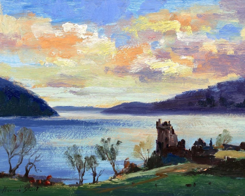
Scottish landscape art can give a morning room a sense of distance before the day becomes busy. Sunrise, Urquhart Castle by Joseph Maxwell Stuart combines early light with the structure of a historic site. The result feels rooted and contemplative without asking the room to become formal.
Let Scottish landscape art support the morning light
Start by studying where the first usable daylight reaches the room. Hang the work where soft light can reveal the landscape, but avoid a direct line to the window. Reflections will hide the quieter transitions that make a sunrise scene convincing.
Measure above the breakfast table, low sideboard, or reading bench.
Compare the 350 × 280 mm and 560 × 440 mm print options against that furniture.
Keep the artwork visually connected to the surface below, rather than centring it on the entire wall.
Check the view from the doorway and the seat used most often in the morning.
Keep heritage references selective
The castle already supplies history and place. Pair it with simple ceramics, linen, or timber rather than tartan patterns and miniature landmarks. This allows the image to feel relevant in both traditional and contemporary homes.
A quieter wall colour can help the sunrise remain the source of warmth. Soft grey, chalky blue, or muted stone will give the landscape definition while keeping the room restful.
Frame detail without hardening the atmosphere
The ruins need enough definition to remain recognisable, while the sky and distance need softer tonal handling. Colour-managed Giclée reproduction protects both qualities. In-house bespoke framing gives the horizontal view a precise finish without making its morning mood severe.
As Scottish landscape art for a morning room, Sunrise, Urquhart Castle offers light, history, and visual distance in a format that can make the start of the day feel more settled.
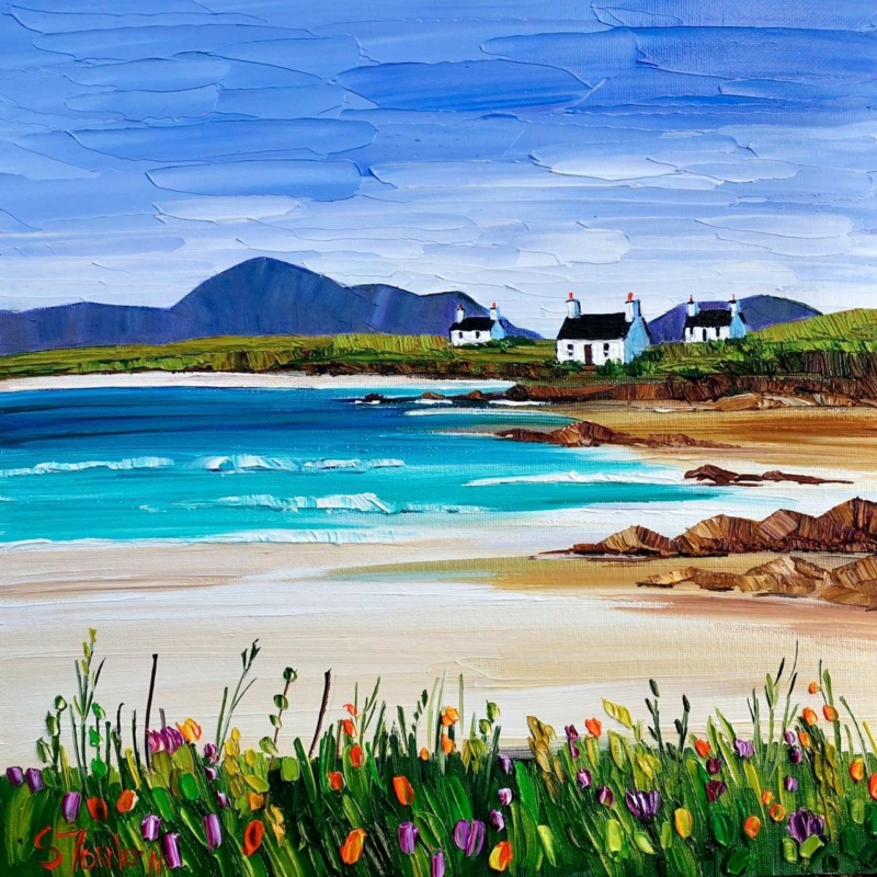
Art for a south facing room has to work with warm, changing daylight rather than simply looking bright in isolation. Summer Machair and Cottages, Harris by Sheila Fowler brings cottages, summer growth, and island atmosphere into that setting. Its fresh colour can hold attention while the square format keeps the effect controlled.
Place art for a south facing room beyond direct glare
Daylight issue
Practical response
Strong midday glare
Use a side wall rather than the wall directly opposite the main window.
Warm cream paint
Choose a frame edge that separates the landscape from the yellow undertone.
Large bright wall
Consider the 500 mm square option so the image does not look stranded.
Small sunlit corner
Use the 265 mm print above one compact piece of furniture.
Judge the position at more than one time of day. A wall that looks perfect at breakfast may catch a hard reflection in mid-afternoon. Mark the finished frame outline with low-tack tape, then check it while the sun moves across the room.
Bright rooms do not always need quieter art; they need colour with enough structure to stay readable.
Keep nearby fabrics and accessories restrained. Linen, pale timber, and a small amount of blue or green will support the island palette. Too many floral patterns could compete with the machair and make the room feel busier in strong light.
Keep island colour distinct in changing daylight
Sheila Fowler’s expressive brushwork and rich colour benefit from accurate separation between flowers, cottages, shore, and sky. Colour-managed Giclée production keeps those relationships clear. A bespoke frame provides a steady boundary as daylight changes across the wall.
When selecting art for a south facing room, Summer Machair and Cottages, Harris offers enough colour and depth to meet strong daylight, provided the position, scale, and frame are chosen with glare in mind.
A Scottish housewarming gift should feel connected to the person and the beginning they are making. Gaun Yersel by Stewart Bremner does that with a direct Scots expression of encouragement. It is warmer and more individual than a generic new-home message, yet practical enough to become part of the recipient’s everyday surroundings.
Choose a Scottish housewarming gift for the life ahead
Match the message
This works especially well for someone taking a first flat, relocating for work, or rebuilding a home after a major change. The phrase offers support without becoming sentimental or overly formal.
Plan the wall
The available A2 and A1 proportions need a clear vertical area. Check a hallway end, stair landing, home office, or the wall beside a dining table before choosing the larger option.
A typographic or graphic piece needs breathing room. Avoid surrounding it with several other sayings, which can dilute the message. Instead, repeat one colour from the print in a useful object such as a lamp, chair, or storage box. This connects the piece to the home without building a theme around it.
What should you write in the card?
Explain why the phrase made you think of the recipient and mention the new beginning you are celebrating. That small detail turns the artwork from an attractive object into a gift with a clear personal reason behind it.
Give bold graphic art a finish that will last
Stewart Bremner’s strong graphic style and contemporary use of colour depend on clean edges and consistent tones. Colour-managed Giclée production preserves that clarity. Bespoke framing completed in-house in Falkirk gives the print the presence needed to stand alone and arrive ready for its new wall.
As a Scottish housewarming gift, Gaun Yersel combines encouragement, cultural character, and a properly hand-finished presentation that can remain meaningful long after the boxes are unpacked.
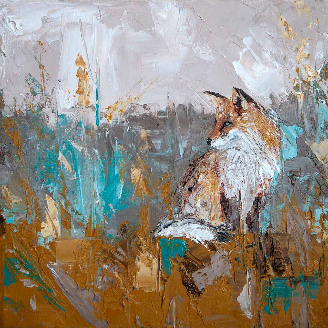
autumn wildlife wall art can make a home feel warmer as the days shorten, but a good piece should not become irrelevant when the season changes. Autumn Fox by Charlotte Strawbridge succeeds because the fox, movement, and textured natural colour matter more than an obvious autumn motif. It carries the atmosphere of the season while remaining a strong wildlife image throughout the year.
Start with the animal, not a seasonal decorating scheme
A fox brings alertness, independence, and movement to a picture. Those qualities give the image a clear subject beyond the time of year. If the recipient or household already enjoys British wildlife, countryside walks, or expressive animal painting, the connection will last longer than a palette chosen only for September and October.
The broad, textured handling in Autumn Fox keeps the work from feeling like a literal nature illustration. Brown, teal, and grey create an earthy base, while the animal supplies focus. This makes the print easy to combine with an interior that is contemporary, country influenced, or somewhere between the two.
Four places autumn wildlife wall art can work
Above a hallway console: the fox creates an immediate focal point without requiring several small seasonal decorations.
Beside a reading chair: textured colour adds warmth to a quiet corner and still feels appropriate in spring.
In a home office: the alert subject gives a workspace energy without relying on slogans or corporate imagery.
In a relaxed dining area: wildlife introduces character and conversation while remaining calmer than a busy gallery wall.
Whichever wall you choose, allow clear space around the finished frame. The fox should feel as if it has room to move through the composition. Crowding the piece with ornaments, artificial leaves, or several competing animal pictures can weaken that effect.
Change the surrounding accents, not the artwork
In autumn, a wool throw, warm lamp, or small piece of dark pottery can draw out the earthier notes. When winter arrives, deeper navy or charcoal textiles can make the teal and grey feel more prominent. In spring, pale wood and fresher greens will shift the picture towards its countryside character.
This approach avoids storing and replacing art every few months. The framed print remains the constant element, while practical textiles and a few small objects change around it. It is a calmer and more sustainable way to acknowledge the season than filling the room with short-lived themed pieces.
Choose a frame for the whole year
A natural timber can support the countryside subject and work easily with warm or cool accessories. A slim dark frame gives the expressive brushwork firmer definition and may suit a more modern room. Avoid choosing a finish solely because it looks autumnal. Compare it with the furniture, doors, and permanent surfaces that remain in every season.
Print and framing quality are particularly important when an image depends on textured marks and subtle shifts of colour. First 4 Frames uses colour-managed Giclée production and completes its bespoke framing by hand in Falkirk. The finished piece arrives ready to hang and is made as a lasting part of the room rather than temporary décor.
The most useful autumn wildlife wall art captures a seasonal feeling without becoming trapped by a calendar. View the framed Autumn Fox print for an expressive fox image that can warm an autumn room and continue to earn its place once the leaves, light, and textiles change.
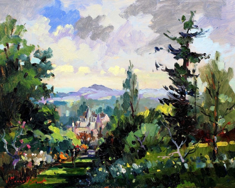
botanical wall art for an orangery should do more than repeat the planting visible through the glass. It needs to give the room a steady focal point when daylight changes and the garden moves through the seasons. Amongst the Azaleas by Joseph Maxwell Stuart offers that balance. Its layered garden subject brings colour and depth indoors, while the composition feels considered enough to stand apart from the view outside.
Why botanical wall art for an orangery needs visual structure
An orangery often contains several competing features: broad windows, strong sunlight, pots, patterned leaves, and routes into the garden. Artwork can disappear among those details if it is too pale or slight. At the other extreme, a very graphic piece may feel disconnected from the room’s softer purpose.
Amongst the Azaleas provides a useful middle ground. The azaleas relate naturally to a planted setting, yet the framed image creates its own boundary and sense of order. This makes it suitable for the solid wall above a console, between glazed doors, or near a dining table where the picture can be enjoyed at close range.
Choose the wall by watching the light
Before fixing the position, observe the room in the morning, at midday, and near dusk. Direct glare can hide colour and detail. A wall at right angles to the main glazing often gives a clearer view than one directly opposite it. If reflections remain a concern, discuss glazing and placement during the framing consultation.
Season matters too. A wall that seems quiet in summer may become much more prominent when leaves fall and daylight shortens. Place the artwork where it can hold the room during winter as well as complement abundant colour in spring. That year-round role is more valuable than matching one brief flowering period.
Build a restrained orangery palette
Room element
Useful connection
Common mistake
Painted walls
Soft mineral or warm neutral colour
Matching the brightest flower exactly
Furniture
Natural timber, cane, or one painted piece
Adding several competing garden motifs
Textiles
Plain linen or a small-scale texture
Using a large floral pattern beside the print
Accessories
One ceramic drawn from a quieter picture tone
Repeating every colour around the room
The artwork does not need exact colour partners. One or two quiet echoes will make it feel connected. Leaving some plain surfaces around the frame also helps separate the painted garden from real foliage. That breathing space is especially useful in a room where plants already provide texture.
Use scale to support the architecture
Measure the solid section of wall rather than the entire glazed elevation. A frame should relate to the furniture below it and retain a clear margin at each side. If the wall is narrow, the smaller available print size can create a deliberate pause. On a broader wall, the larger version can hold its own against tall windows and substantial seating.
A mount can give the detailed subject a calm transition into the frame. A warm timber may connect with natural furniture, while a refined painted or darker moulding can define the image more firmly. First 4 Frames produces colour-managed Giclée prints and completes bespoke framing in-house at its Falkirk workshop, allowing the presentation to respond to both the image and the room.
A garden subject that is not limited to one season
Well-chosen botanical wall art for an orangery should connect inside and outside while still giving the interior its own identity. View the framed Amongst the Azaleas print for a garden-led focal point that can remain rewarding through bright summer days and quieter winter light.
What if the artwork on your waiting-room walls could make the whole practice feel more considered? Selecting art for a dental practice waiting room isn’t simply about filling a blank space. The right subjects, colours and proportions can create a welcoming first impression and reflect your practice’s identity without making the room feel overly personal or visually busy.
This guide explains how to choose artwork for the room and its visitors, assess size and placement, and finish each piece with a suitable frame. Compare options such as coastal wall art, Scottish landscape art, photography prints and contemporary art prints, then consider how the frame relates to the image and the rest of the room. First4Frames Gallery offers Giclée fine art prints, bespoke framing and commercial artwork curation. Use the steps below to plan a cohesive display and make confident choices for your practice.
Key Takeaways
Start selecting art for a dental practice waiting room by deciding what impression the space should create, such as warm, professional or locally connected.
Compare landscapes, coastal scenes, photography and contemporary art by subject, colour and visual contrast to find a style that fits the room.
Measure usable wall space, consider viewing distance and test the layout before choosing a focal piece or a coordinated group.
Choose ready-to-hang framed art or bespoke framing, and check that the frame suits the artwork for a cohesive finish.
What Should Art for a Dental Practice Waiting Room Achieve?
Waiting-room art is a design choice, not a substitute for clinical care. It helps shape a practice’s first impression. You might want the room to feel calm, professional, warm, contemporary or connected to its local setting. Selecting art for a dental practice waiting room means considering that intended impression alongside the space, rather than choosing a picture in isolation.
Evidence-based design (EBD) is a broader approach to planning environments with research in mind. It can inform thoughtful decisions about a healthcare setting, but artwork is one part of the room’s design. It is not a guarantee of changes to health or treatment outcomes.
Start with the people and the room
Consider who uses the waiting room, how long they may wait and what the space already communicates. Children, adults and other visitors may have different tastes, so avoid assuming that one theme will suit everyone. Look for artwork that feels welcoming and considered for a varied audience. Comfort is a design aim, not a promised clinical result.
Define the atmosphere before browsing
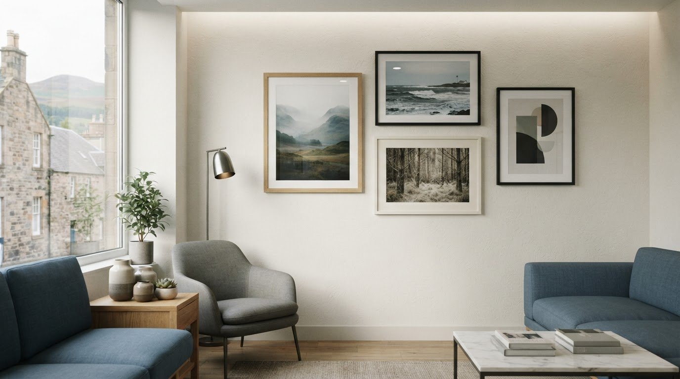
Write down a few words that describe the atmosphere you want, such as composed, welcoming or contemporary. Then note the wall colours, furniture finishes, lighting and practice branding. These details give you a practical basis for comparing artwork: a print might repeat a colour already in the room, complement its overall mood or provide a deliberate focal point. Explore art in the frame and compare how different prints and frames work together.
Decision rule: Consider the room, its audience and the atmosphere you want to create before choosing a subject. This keeps your shortlist connected to the practice’s identity and gives you a clear basis for comparing style, colour and scale.
Which Art Styles and Subjects Suit a Dental Waiting Room?
There’s no single style that suits every practice. Choose artwork that fits the room’s character and the impression you want to create, while remaining easy to view from the seats where patients spend their time. A consistent visual direction usually feels more considered than a group of unrelated pictures.
Compare landscapes, photography and contemporary art
Landscape wall art can bring a broad, open view to a wall. Coastal wall art offers a more specific sense of place through shorelines, sea and sky. For a practice with a Scottish connection, Scottish landscape art can express local identity without relying on overt branding. Photography prints offer realistic detail, fine art prints foreground an artist’s interpretation, and contemporary art prints can introduce a more graphic or modern note.
Choose landscape art for a spacious, natural feel, coastal imagery for a place-led palette, photography for recognisable detail, or contemporary prints for a modern character. Treat these as starting points, not fixed rules. When selecting art for a dental practice waiting room, choose a clear visual direction, such as nature-led, locally connected or contemporary, rather than mixing subjects without a reason.
Use colour and subject with intention
Compare each print’s colours with the wall paint, seating and other finishes. A piece that picks up an existing colour can help the scheme feel connected; a strong contrast can make the artwork stand out. Neither approach is automatically better. Consider the image’s level of detail, too. Ask whether its main subject is easy to make out from the usual seating positions, not just when viewed close up.
Before deciding, compare your shortlist with the room’s actual palette and layout. The gallery’s selection of framed artwork can help you explore different visual directions. Choose pieces whose mood, palette and scale feel at home in your practice.
How Do You Choose the Right Size, Layout and Frame?
Good proportions help artwork feel intentional rather than lost on a wall or crowded by its surroundings. Before selecting art for a dental practice waiting room, map the usable space and account for how people move through and use the room.
Plan artwork scale and placement
Use this sequence to make a considered choice:
Measure the usable wall space. Record its width and height, noting doors, furniture, signage and other features that may compete with the artwork or limit where it can go.
Consider viewing distance. Check what patients can see from the main seating positions. A detailed image may need to be larger or placed where its subject is easier to distinguish.
Test the layout. Mark the proposed dimensions on the wall with removable tape, then step back and assess the balance. Sketch a single focal piece and, if the wall allows, a coordinated group. Keep spacing and alignment consistent so a group reads as one arrangement.
Select the frame and glazing. Compare the frame’s profile and colour with the artwork and the room’s finishes. Consider how the framed piece will look from the seating area, including whether reflections affect the view.
Assess frame finish and glazing
A frame should be made to fit the artwork, not simply approximate its dimensions. First4Frames frames are individually crafted for each order using high-quality materials. When comparing framed options, look at the frame’s proportions and finish alongside the print, then check the glazing choices for the piece. The aim is to keep the image clear and create a finish that suits the room.
How Can a Practice Source and Finish Waiting-Room Art?
Once you’ve settled on the room’s style and layout, choose the sourcing route that suits your project. Ready-to-hang framed art offers a straightforward way to select a finished piece. Bespoke framing lets you bring a particular print, artwork or photograph and choose a frame to suit its dimensions and the room.
Choose an online, bespoke or print-and-frame route
Online picture framing lets you compare artwork and frame options. As you choose a frame and design your framed artwork, check the finished dimensions and how the frame relates to the image. Custom framed art prints can be a useful route when you have a specific wall or brief in mind. First4Frames Gallery offers fine art prints that customers can pair with a selected frame, as well as bespoke framing for prints, paintings and photographs.
If you’re looking for a wall art visualiser to preview artwork on your wall, confirm whether a preview tool is available before relying on it. A mock-up made to the artwork’s intended dimensions can also help you judge scale and placement. First4Frames frames are individually crafted for each order using high-quality materials, so compare the available frame options with the size and style of the piece you have chosen.
Make the next step straightforward
First4Frames Gallery offers Giclée prints from a range of artists, primarily from Scotland, alongside a selection of frames. Check the current artwork and framing choices before selecting particular pieces. If you’re furnishing several areas, consider whether a shared palette or subject will help the rooms feel connected. First4Frames also provides commercial artwork curation and custom framing for businesses.
Explore the framed art gallery to compare artwork and frame options, or contact First4Frames Gallery about commercial artwork curation and custom framing for a more tailored approach.
Make Your Waiting Room Feel Considered
Thoughtful artwork can help your practice make a polished first impression. Choose subjects and colours that suit the room, its visitors and the atmosphere you want to create, then check the scale and layout before ordering. Selecting art for a dental practice waiting room is a practical design decision: each piece should feel at home in the space and contribute to a cohesive whole.
Finishing matters, too. A frame made to fit the artwork can bring the print and its surroundings together. First4Frames Gallery offers bespoke framing and ready-to-hang framed art, so you can compare a finished piece with options tailored to your chosen print or photograph.
Start with a clear plan, then compare artwork and frames against the room itself. Browse framed artwork for your practice and contact First4Frames Gallery to discuss commercial artwork curation or custom framing.
Frequently Asked Questions
What art is suitable for a dental practice waiting room?
Suitable art reflects the room, its audience and the atmosphere the practice wants to create. Landscapes and coastal imagery can offer a natural or place-led direction, while photography prints and contemporary art create different visual characters. When selecting art for a dental practice waiting room, compare each piece with the wall colours, furniture and available space. No single subject or style will suit every practice or visitor.
How do I choose the right size artwork for a waiting room?
Measure the usable wall area before choosing a piece, and note nearby furniture, doors and signage that affect placement. Consider how the artwork will appear from the main seating positions as well as up close. A paper template or simple layout mock-up helps you compare dimensions and arrangements on the actual wall before ordering framed art.
Can framed art help make a dental waiting room feel more welcoming?
Artwork can contribute to a room’s appearance and support the impression created by its colours, furnishings and practice identity. It is one part of the overall design, not a guarantee of how patients will feel or a clinical outcome. Review the complete room, including how the art relates to seating and other finishes, rather than selecting a piece in isolation.
What should I look for in a frame for dental practice artwork?
Choose a frame that suits the artwork and room, and check that it is made to fit the piece properly. First4Frames Gallery individually crafts frames for each order using high-quality materials. Compare the available frame and glazing options with the artwork and the way it will be viewed in the room.
Can I order custom framed art prints for a dental practice online?
You can compare artwork and framing options online, then check that your chosen dimensions and frame suit the intended wall. First4Frames Gallery offers ready-to-hang framed art, bespoke picture framing and Giclée fine art prints that customers can pair with a frame. Review the current artwork selection and framing options before placing an order for your practice.
Black and white framed prints can give a modern kitchen graphic focus without resorting to coffee slogans or oversized recipe typography. Spork by Noel Fenech Photography transforms polished cutlery through reflection, pattern, and controlled light. The familiar subject feels witty, but the photographic treatment remains sophisticated.
Let black and white framed prints sharpen clean kitchen lines
Kitchen finish
How Spork can relate
Stainless steel
Echo the reflective surface without adding another appliance-like object.
Matt black cabinetry
Use a pale wall or mount to preserve the photograph’s outer edge.
White slab doors
Let deep blacks introduce contrast and visual rhythm.
Natural timber
Allow warm grain to soften the precision of the monochrome image.
Choose a wall beyond heat, steam, and food preparation. A dining end, tall pantry wall, or route into the kitchen may be safer than the splashback zone. The portrait format can also suit a narrow surface beside cabinetry where a broad landscape would feel squeezed.
Should other kitchen artwork match?
No. One strong monochrome photograph can provide enough graphic structure. If other pieces are present, connect them through frame finish or spacing rather than repeating cutlery subjects.
Protect every reflection and polished contour
Spork relies on deep blacks, bright highlights, and repeating reflections across metal. Colour-managed fine art production preserves that tonal range and surface detail. Bespoke framing, completed in-house, gives the photograph a clean architectural finish and protects it for long-term display.
Within black and white framed prints, Spork offers a kitchen-relevant subject with enough abstraction and technical craft to remain interesting well beyond the first glance.
Abstract wall art can give a shallow alcove more depth without filling it with ornaments that collect dust and reduce usable space. The Gloaming by Emily Little is available in unusually slim vertical proportions. Its evening mood can make a narrow recess feel deliberate and quietly atmospheric.
Size abstract wall art to the alcove’s internal rhythm
Measure the opening at several heights because older alcoves are rarely perfectly square. Allow a clear margin on both sides of the finished frame. The 120 × 280 mm print can suit a very narrow recess, while the 240 × 560 mm option gives more presence where the wall allows it.
Keep the sill or shelf beneath it mostly clear.
Use one soft light source from outside the recess.
Avoid glazing reflections from a window directly opposite.
Choose the frame only after checking the surrounding trim and wall colour.
An alcove already creates a frame within the architecture, so the artwork needs space inside it.
A dusk-like palette can add visual depth to a pale wall. On a darker wall, a clear mount or lighter frame edge may stop the image disappearing. The aim is a measured pause, not a shadow box packed with accessories.
Keep subtle evening colour from closing in
Semi-abstract work depends on small transitions between colour, memory, and suggested form. Colour-managed Giclée production keeps those relationships nuanced rather than muddy. Precise in-house framing helps the slender composition remain straight and visually calm within an architectural recess.
As abstract wall art for an awkward alcove, The Gloaming uses proportion and atmosphere to add depth while leaving the space itself clean and purposeful.
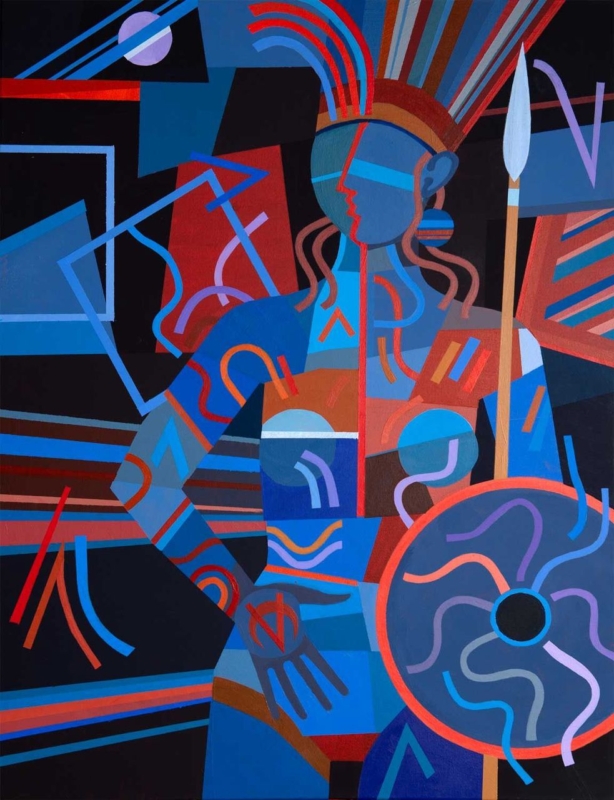
Contemporary framed art prints can make the turn in a staircase feel like a moment of arrival rather than leftover wall space. Warrior Princess by Fred Carson has an upright format and a bold stylised figure. Its clear presence suits the short, changing view experienced while moving between floors.
Use contemporary framed art prints to reward a changing viewpoint
Approaching from below
Test whether the full figure remains visible above the handrail. A portrait-format work should guide the eye upward without being hung so high that it feels detached.
Returning from above
Check the frame from the top landing. Keep it beyond door swings and away from the narrowest shoulder line, especially where furniture sometimes moves between floors.
Let the figure provide the drama. Plain surrounding walls and a controlled light source will help the geometric forms read quickly. Repeating one colour elsewhere on the landing is enough; a second figurative piece nearby could weaken the focal point.
Frame bold form with clean visual control
Fred Carson’s background across painting, ceramics, and architectural work informs the strong form of this image. Accurate Giclée reproduction protects its colour relationships and edges. A bespoke frame gives the portrait authority while guarding it in a high-traffic part of the home.
Among contemporary framed art prints, Warrior Princess has the upright scale and visual confidence needed to make a staircase turn memorable without crowding the route.
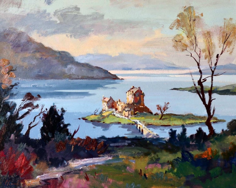
Scottish castle wall art can work beautifully in a room with limestone flooring when it offers more than another hard stone surface. View to Eilean Donan Castle by Joseph Maxwell Stuart sets historic architecture within water, landscape, and open distance. Those softer layers can balance a cool, durable floor.
Balance Scottish castle wall art with the room’s hard surfaces
Room element
Useful response
Pale limestone
Choose a restrained frame that separates the image from the wall.
Cool grey stone
Introduce wool, timber, or linen near the artwork for warmth.
Broad glazing
Hang away from direct reflections so water and distance stay readable.
Traditional furniture
Keep castle references to the artwork rather than adding heritage props.
The horizontal print options suit a console, bench, or modest sideboard. Avoid placing the lower edge too close to a stone surface, where the frame can feel compressed. Breathing space lets the castle sit within its wider setting and prevents architecture from dominating the room.
Let the landscape soften the stone; do not ask the room to imitate the castle.
Preserve detail across architecture, water, and distance
A castle landscape needs crisp structure, but its atmosphere depends on quieter changes in land, sky, and water. Colour-managed Giclée production retains both. Bespoke framing made in the Falkirk workshop gives the view a precise boundary against a tactile limestone interior.
As Scottish castle wall art, View to Eilean Donan Castle introduces heritage and a strong sense of place while helping a limestone-floored room feel more open and liveable.