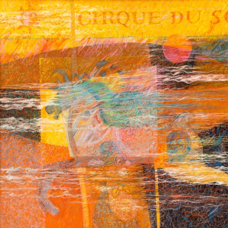
abstract art for a room with burnt orange furniture needs to do more than repeat the upholstery. A successful piece should carry the warmth into the wall, introduce contrast, and give the room a clear visual destination. Breton Circus by Fred Carson offers that balance through glowing yellow and orange, dark linear passages, sea-like blues, and overlapping translucent forms.
Why abstract art for a room with burnt orange furniture benefits from contrast
Burnt orange already has presence. It can make a velvet chair, painted cabinet, or generous sofa feel warm and grounded. If every nearby object repeats the same note, however, the room may become dense. Artwork can keep the warmth while adding the cooler and lighter areas needed to restore depth.
Breton Circus does not treat orange as a flat block. Rust, coral, ochre, and clear yellow move across the surface at different strengths. Turquoise and blue-green interrupt that heat, while charcoal and off-white marks create definition. The result connects with warm furniture without disappearing into it.
Decide whether the furniture or the picture should lead
Start by standing at the room entrance. If a large orange sofa already dominates the first view, the artwork should provide variation rather than trying to become even louder. Place it on a wall with enough breathing room and keep surrounding accessories restrained. If the orange appears only on one small chair, the print can become the main source of colour and help that chair feel intentional.
Existing feature
Useful response in the room
Large burnt orange sofa
Use the blues in the print as the secondary accent
Single orange armchair
Let the picture extend the warm palette across the wall
Dark timber furniture
Keep some pale wall visible around the finished frame
Brass or copper details
Avoid adding more metallic decoration beside the artwork
This hierarchy prevents colour matching from becoming a collecting exercise. Two or three clear relationships are enough. A blue ceramic, a cream rug, or a charcoal lamp can connect with the quieter parts of the print while allowing the orange furniture to retain its character.
Use the layered surface without adding more clutter
The image has the energy of pasted fragments, drawing, and rubbed-back colour. That layered quality suits an interior with tactile upholstery and collected objects, but it does not require a busy gallery wall. In many rooms, one compact framed piece will feel stronger than several small pictures competing around it.
The artwork’s overlapping forms relate to the language of collage, where separate materials or visual elements build a new whole. Tate’s introduction to collage gives useful context for that approach. Here, the effect creates movement and memory without asking the viewer to identify a single literal scene.
Make the compact square format feel deliberate
The available print size is 265 by 265 millimetres before mounting and framing. It can suit a short wall beside a bookcase, the space above a side table, or a quiet corner near the orange chair. It should not be expected to fill a wide wall over a long sofa by itself.
Mark out the finished frame size with low-tack tape. Then check it from the doorway and the main seat. A mount can increase the overall dimensions and create a calm transition around the active image. Clear wall on every side will make the square composition look chosen for the position rather than squeezed into a leftover gap.
Frame for separation, not an exact furniture match
A slim dark moulding can pick up the deepest marks and sharpen the edge against a pale wall. A light neutral mount can stop the orange areas from running directly into warm paint. Timber may also work, but an almost-match to nearby furniture can look accidental. Compare physical samples beside the upholstery in both daylight and evening light.
First 4 Frames produces colour-managed Giclée prints and completes bespoke framing in-house in Falkirk. That careful process helps the subtle transparent layers, bright passages, and dark lines remain distinct. It also allows the presentation to respond to the real room rather than a colour viewed only on a screen.
A layered composition by Fred Carson
Fred Carson is an Edinburgh-based artist whose practice has included painting, ceramics, murals, wood, glass, and silver. That broad interest in material and form is visible in this densely worked image. Browse the Fred Carson collection at First 4 Frames to compare his abstract and figurative compositions.
Well-chosen abstract art for a room with burnt orange furniture can amplify warmth while still giving the eye somewhere cooler to rest. View the framed Breton Circus print for a compact, energetic focal point with hand-finished presentation.
wall art for a room with stone walls should earn its place by answering a real question about the room or recipient. Foxy Bothy is a useful starting point because Esther Cohen’s snug shelter, swaying foxgloves and watchful fox introduce softness and story, creating a counterpoint to the wall’s hard, irregular texture.
Mount wall art for a room with stone walls on a calm section
Begin by finding the flattest, driest section of masonry. Avoid drilling until the finished frame position and fixing method have been assessed. Deep joints, projecting stones and old walls may require specialist advice, especially for a larger piece.
Let stone remain visible
Leave a generous border of masonry around the frame so the original material still reads clearly.
Add one softer layer
Use wool or muted upholstery to acknowledge the foxgloves and atmospheric sky.
Foxy Bothy already provides rural character. Resist adding lantern ornaments, tartan signs and miniature cottages beside it. A plain timber table or upholstered chair will support the scene while allowing its fox and graphic details to emerge gradually.
Should the frame match the stone?
Exact matching can make the edge disappear. Test a finish that separates the image gently from the masonry, then judge it under evening light as well as daylight.
Use precise framing against an irregular background
Stone provides a visually active edge, so the print benefits from accurate mounting and controlled frame proportions. Colour-managed Giclée production preserves atmospheric gradients and floral colour, while in-house hand finishing gives the narrative scene definition.
Wall art for a room with stone walls should complement the material without disguising it. Foxy Bothy adds warmth, softness and a quiet story, while space around the frame lets the masonry keep its character.
horizontal wall art above a dining bench should earn its place by answering a real question about the room or recipient. Wayfaring is a useful starting point because the wide painted sky and low landscape echo the bench’s long line, while fine foreground marks add movement without introducing a busy pattern behind diners.
Size horizontal wall art above a dining bench from the finished frame
Measure the bench, not the whole wall. The artwork should relate to the seating zone while leaving a visible margin at both ends. Include the mount and frame in every calculation, because print dimensions understate how much wall the finished piece occupies.
Measure
What to check
Bench width
Keep the framed work inside the seating zone.
Backrest height
Leave room for cushions and movement.
Seated headroom
Ask the tallest diner to sit before fixing.
Table lighting
Keep pendants out of the main sightline.
The low land in Wayfaring provides a visual baseline. Aligning it loosely with the room’s long elements creates calm, but avoid making every shelf, frame and tabletop perfectly level. A small difference keeps the arrangement natural.
Measure artwork with people seated; a dining wall is an occupied space, not an empty elevation.
Use textiles to acknowledge one earth or sky tone. A complete blue-and-beige scheme is unnecessary. The painting contains enough weather and texture to connect the zone.
Choose a frame that completes the bench composition
A long, calm landscape exposes uneven mounting and imprecise spacing. Colour-managed Giclée production keeps the pale sky and warm land balanced, while bespoke framing completed in-house establishes a dependable outer line above fixed seating.
Horizontal wall art above a dining bench can make built-in seating feel integrated. Wayfaring extends the zone through horizon and sky, while practical measurement keeps the picture comfortable for everyone at the table.
wall art for a room with low natural light should earn its place by answering a real question about the room or recipient. Under Our Skies is a useful starting point because its broad blue-and-white sky and low distant land create depth, while earthy grasses keep the composition grounded in a room that depends on lamps for much of the day.
Light wall art for a room with low natural light from the side
Artwork cannot solve a dark room alone. Support it with a floor or wall light that washes the surrounding surface gently, not a spotlight that produces a bright patch on the glazing. Side light can reveal the foreground texture while preserving distance in the sky.
Use warm-white ambient light for comfort.
Add a separate task light where reading happens.
Keep the glass outside direct lamp reflections.
Test the picture when the room is used most.
Do not make every surface pale in an attempt to chase brightness. A mid-tone wall can give the clouds cleaner definition, while timber, wool and warmer landscape marks prevent the blues from feeling cold. The result should have depth, not imitate daylight.
Under Our Skies has horizontal calm, yet the moving weather keeps it alive. That balance suits a snug or internal dining area where the aim is to create a visual destination rather than deny the room’s sheltered character.
Retain subtle sky changes through colour-managed production
A pale sky can lose structure if tonal transitions are poorly reproduced. Colour-managed Giclée production protects those changes, while a measured mount and bespoke frame made in-house separate the open image from a deeper wall colour.
Wall art for a room with low natural light is useful when it creates depth and works with the lighting plan. Under Our Skies brings an open horizon, active weather and enough warm land to keep a sheltered room welcoming.
large Scottish landscape art for a vaulted room should earn its place by answering a real question about the room or recipient. Buachaille Etive Mor from river, Glencoe, west Highlands is a useful starting point because the River Etive leads the eye from a close foreground towards the mountain’s distinctive summit, allowing a large image to feel expansive while staying connected to the room.
Measure large Scottish landscape art for a vaulted room at eye level
Ceiling height is not a reason to lift artwork beyond comfortable viewing. Begin with the sofa, console or table below the proposed wall. Mark a wide rectangle that relates to that furniture, then keep the mountain visible from normal seated and standing positions.
Ground the lower edge
Let the river sit close enough to furniture that the photograph belongs to the occupied room.
Protect the summit
Leave clear wall above the mountain instead of pushing the frame towards beams or roof lights.
The photograph can be produced at substantial scale, but bigger is only better when viewing distance supports it. Tape the exact outer frame dimensions to the wall. Cross the room, use the adjacent doorway and sit beneath the highest ceiling point before committing.
Measure the wall below beams and roof lights.
Compare the outline with the furniture width.
Check reflections at the brightest time of day.
Photograph the template from every entrance.
Give a large photograph enough tonal control
At generous scale, soft water, rugged ground and snow-bright mountain detail must remain distinct. Colour-managed production and accurate mounting provide that control, while a hand-finished frame gives the broad landscape a precise edge within complex architecture.
Large Scottish landscape art for a vaulted room works when height supports the image rather than pulling it away. Buachaille Etive Mor supplies scale and direction, while a grounded position keeps the room connected.
Scottish castle art for a hotel reception should earn its place by answering a real question about the room or recipient. Eilean Donan Castle in the western Highlands of Scotland is a useful starting point because the tidal-island landmark, mountain setting and converging lochs communicate Highland place immediately, even to a guest seeing the image from across the entrance.
Scale Scottish castle art for a hotel reception from the arrival point
Walk through the entrance as a first-time guest would. The photograph should register before signs, brochure stands and luggage interrupt the view. A wall beside low seating often works better than the space directly behind a busy reception desk.
Reception check
Practical response
Long arrival sightline
Test a larger outline so the castle remains legible.
Queue position
Keep the main subject above shoulders and signs.
Changing daylight
Check glazing reflections morning and evening.
Local information
Place brochures nearby, not across the picture.
Let the photograph provide the heritage. Timber, stone and one restrained textile can support it, but tartan samples and miniature castles will weaken the welcome. Guests need one memorable image and a reception that remains easy to navigate.
Commercial artwork succeeds when it strengthens the first impression and still allows the room to do its job.
Specify a professional finish for a hard-working public space
Reception artwork is viewed at different distances throughout a long day. Colour-managed printing supports the stone, water and mountain detail, while bespoke in-house framing can be chosen for scale, clarity and a finish that belongs with the property’s materials.
Scottish castle art for a hotel reception should feel specific, welcoming and operationally sensible. Eilean Donan offers instant recognition, while disciplined framing keeps the arrival area polished rather than themed.
sunset wall art for a north-facing living room should earn its place by answering a real question about the room or recipient. Edinburgh Castle with dramatic evening sky colours is a useful starting point because the photograph sets the castle’s dark silhouette against deep red, purple and orange light, bringing warmth without depending on strong sunshine entering the room.
Place sunset wall art for a north-facing living room in the longest view
A north-facing room often holds steady, cooler light. That makes the wall seen from the doorway a useful place for concentrated evening colour. Mark the finished framed outline there, then view it from the main seat before deciding how large the photograph should be.
Build warmth without matching every sunset tone
Repeat one muted rust or plum note in a cushion or throw.
Keep larger upholstery pieces neutral so the sky remains distinct.
Use warm-white lamps after dark rather than very cool bulbs.
Leave clear wall around the complete frame.
The castle gives the colour visual weight and anchors it to Edinburgh. Avoid adding several skyline prints nearby. One strong landmark creates a connection to place without turning the room into a tourist display.
What size should you test?
Start from the furniture width and viewing distance. The photograph can be produced at generous sizes, but a paper template should leave visible wall at each side and stay clear of lamps, switches and door arcs.
Preserve the dark silhouette as well as the bright sky
A dramatic sunset depends on separation between saturated colour and shadow detail. Colour-managed production helps retain both, while precise mounting and a bespoke frame completed in-house give the castle a calm boundary rather than adding more visual heat.
Sunset wall art for a north-facing living room can make cool light feel intentional rather than limiting. This photograph supplies warmth, local identity and a strong horizon when the surrounding colour remains measured.
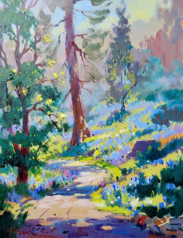
woodland wall art for a care home lounge should make a shared room feel more welcoming without asking residents to work hard to understand it. Bluebell Trail by Joseph Maxwell Stuart provides a recognisable path, trees, and bluebells in a clear upright composition. Its bright colour can lift a lounge, while the pathway creates a gentle sense of depth from a seated viewing position.
What woodland wall art for a care home lounge needs to do
A care home lounge serves many people and several activities. Residents may chat, read, watch television, welcome visitors, or simply sit quietly. Artwork has to contribute warmth without dominating those uses. A familiar nature subject can offer a pleasant point of conversation, but its scale and position matter as much as the subject itself.
Bluebell Trail has an immediate visual route. The pale track begins near the bottom edge and leads through bluebells into the trees. Strong trunks hold the upright composition, while yellow-green highlights keep the scene lively. The image is expressive, yet its main elements remain easy to identify from across the room.
Assess the lounge from a resident’s seat
Sit in the main chairs. Confirm that the path and trees remain legible at the usual viewing distance.
Check the hanging height. Position the centre for seated enjoyment rather than defaulting to a standing gallery height.
Watch daytime reflections. Windows and bright fittings should not turn the glazing into a mirror.
Review evening light. Lamps need to reveal colour without creating a sharp hotspot.
Keep routes clear. Place the frame away from doors, mobility-equipment storage, and areas where it could be knocked.
These checks are best made with staff and residents who use the room. A paper template can show the finished size before fixings are made. It also gives everyone a chance to judge the picture from different chairs and decide whether another wall offers a calmer view.
Use colour to support the room, not overwhelm it
The painting includes violet-blue flowers, fresh green, turquoise, warm cream, and touches of pink and yellow. A lounge does not need to repeat all of them. One blue cushion or a muted green chair can make a connection. Plain fabrics nearby will help residents see the artwork clearly and prevent several busy patterns from competing.
Contrast is useful around the frame. If the wall and moulding are almost identical, the picture can lose definition. A distinct but not harsh edge helps the artwork read as one complete object. A mount can provide a quieter transition between the energetic brushwork and the surrounding paint.
Select a size for the actual viewing distance
The print is available in 265 by 345 and 400 by 500 millimetre sizes before mounting and framing. The smaller option may suit a quiet seating area or a short wall between doors. The larger version will usually read more clearly across a substantial communal lounge. Finished frame dimensions should be marked out and checked before ordering.
One well-scaled image can be calmer than a grid of small pictures. If the lounge needs several artworks, give each one enough separation and use a consistent approach to frames. This creates visual order while still allowing different residents to enjoy different subjects.
Choose a subject with room for conversation
Bluebell woods can prompt thoughts about spring, local walks, gardens, and changing seasons without requiring a single correct interpretation. The Woodland Trust guide to native bluebells explains the native flower and its woodland habitat. That context can support an informal activity or conversation if residents are interested, while the picture still works simply as a colourful landscape.
Joseph Maxwell Stuart studied drawing at the Ruskin School and fine art at Edinburgh College of Art. His loose brushwork brings energy to the path and woodland floor without losing the scene’s structure. Explore the wider Joseph Maxwell Stuart collection at First 4 Frames to compare other Scottish landscapes and garden subjects.
Finish the piece for a busy shared setting
First 4 Frames produces colour-managed Giclée prints and completes bespoke framing in-house in Falkirk. A framing consultation can consider the moulding, mount, glazing, finished weight, and secure placement together. That practical care is valuable in a shared room where the artwork should remain easy to enjoy and straightforward to live with.
Thoughtful woodland wall art for a care home lounge can give residents a recognisable view, useful colour, and a gentle visual destination. View the framed Bluebell Trail print and compare both sizes for a care home lounge, quieter seating area, or visitor space.
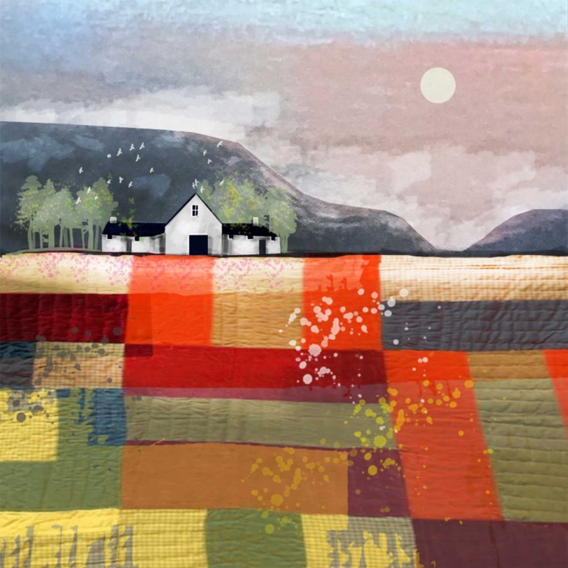
art for a room with patchwork textiles needs to respect the colour and hand-made character already in the room. It should not simply add another unrelated pattern. High Moon by Rikki O’Neill offers a thoughtful connection. Its lower half resembles joined pieces of richly coloured cloth, while the white cottage, distant hills, and pale moon create a quieter destination for the eye.
Why art for a room with patchwork textiles needs a resting point
Patchwork brings many small decisions together: cloth, stitch, tone, repeat, and contrast. That richness is part of its appeal, but it can leave a wall feeling unsettled if the artwork introduces several more competing motifs. A single framed piece creates a boundary. It can acknowledge the textiles while helping the wider room feel composed.
High Moon manages this through contrast. Blocks of rust, red, ochre, olive, charcoal, and cream give the foreground a fabric-like rhythm. Above them, the simple croft and open sky slow the composition down. The picture therefore feels connected to patchwork without looking like a literal sewing illustration.
Start with the dominant textile, not every fabric
Choose the quilt, throw, cushion, or upholstered chair that has the strongest visual presence. Identify two colours that appear across a useful area rather than focusing on the smallest accent square. In this print, warm red and muted green can connect with an earthy textile. Cream and soft grey can bridge the picture to a quieter wall.
Textile situation
How the artwork can respond
Traditional scrap quilt
Use the varied foreground as a link, then keep the frame restrained
Modern geometric throw
Let the square picture and block-like colour provide structure
Soft neutral patchwork
Pick up cream and grey while allowing the warmer tones to lead
Several patterned cushions
Leave clear wall around one framed piece instead of adding a gallery cluster
Avoid trying to match every colour. Exact repetition can make a room look over-planned and may date the scheme when one textile changes. A couple of clear relationships are enough. The remaining picture colours should be allowed to add depth rather than becoming instructions for more accessories.
Give a small square print enough space
The available print size is 265 by 265 millimetres before mounting and framing. That compact square can work above a side table, beside a reading chair, or on a short wall near a textile display. It should not be forced to fill a broad wall by itself. A deliberate pocket of clear space will make the picture feel more important.
If the room contains a quilt hung on the wall, place the print on a separate wall rather than immediately beside it. This lets each hand-made or artist-led element hold its own. Check the view from the doorway and the main seat. The cottage and moon should remain easy to read even when a colourful throw is in the foreground.
Choose framing that separates pattern from pattern
A measured mount can create valuable breathing room between the image and its moulding. A slim dark frame may connect with the cottage roof and charcoal sections. A warm timber can sit comfortably with natural fibres and older furniture. Highly decorated moulding is less helpful because it adds one more repeating surface around an already layered image.
First 4 Frames produces colour-managed Giclée prints and completes bespoke framing in-house at its Falkirk workshop. That approach protects the subtle texture and keeps the pale sky distinct from the saturated foreground. It also allows the mount, frame, and finished dimensions to be chosen for the actual textiles and wall colour.
Well-chosen art for a room with patchwork textiles can celebrate pattern while bringing the room back into focus. View the framed High Moon print for a compact landscape that connects layered colour, quiet Scottish scenery, and hand-finished presentation.
The biggest advertised discount may not deliver the best value if the frames don’t suit your photographs or the finished collection feels inconsistent. A bulk framing discount for photographers uk may catch your eye, but the whole order matters: materials, craftsmanship, sizing and delivery all shape the result. It’s reasonable to look for savings on a larger order without settling for standard frames that don’t do your work justice.
This guide explains how to compare overall value, plan a cohesive presentation across different print sizes and choose finishes that complement your images. At First4Frames Gallery, every frame is made to order, with precision cutting and expert mounting, and float glass fitted as standard. You can also upload digital photographs for a print-and-frame service, bringing the image and frame together in one finished piece. Here’s what to consider when assessing a multi-frame order, how bespoke framing can help maintain a professional look, and how finished framed prints are delivered ready to hang within two weeks.
Key Takeaways
Assess a bulk framing discount for photographers uk by comparing the whole order, including suitability, finish and delivery, rather than focusing on the discount claim alone.
See how bespoke framing can help your photographs feel cohesive without relying on standard stock frames that may not suit each image.
Use a simple four-step plan to organise image files, record print dimensions, choose a consistent finish and prepare for delivery.
Explore how uploading digital photographs for printing and framing can create a considered route from image file to finished artwork.
Bulk framing discount for photographers in the UK: what should value include?
A headline discount tells you little about how a finished collection will look or how well it will suit your photographs. When comparing a bulk framing discount for photographers uk, start with the complete order: its terms, materials, finish, suitability for each image and the practicalities of getting the work safely to its destination.
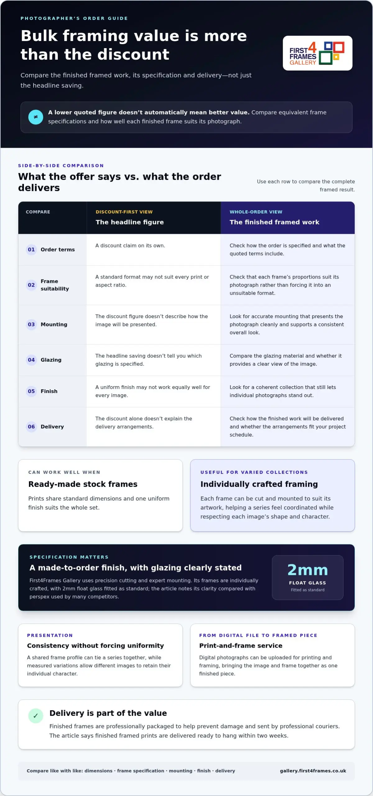
Bulk framing value is the balance of order terms, framing quality, presentation and delivery, measured against how well each finished frame suits the photograph. A picture frame does more than surround an image. Its proportions and components affect how the work is presented, so compare the finished specification rather than the discount figure alone.
Matting and framing can change how a fine art print is seen. This video offers a closer look at the process:
Bulk stock frames or bespoke framing for photographic work?
Ready-made stock frames can work well when prints share standard dimensions and a uniform finish suits the whole set. A varied collection, however, may include different aspect ratios, image borders or presentation needs. Individually crafted framing allows each frame to be cut and mounted to suit its artwork, rather than forcing a photograph into a standard format. This can help a series feel coordinated while respecting the shape and character of each image.
What should a photographer count as value?
Compare what arrives, not just the percentage saved. Consider how the finish supports the images, whether the components suit the intended display, how straightforward the ordering process is and how the finished work will be delivered. First4Frames Gallery uses 2mm float glass as standard, offering clarity compared with perspex used by many competitors. Each frame is individually crafted, professionally packaged to help prevent damage and sent by professional couriers. For a cohesive collection, explore choosing picture frames with the photographs’ formats and presentation in mind.
How to compare bulk framing offers without overlooking quality
A useful comparison looks beyond the headline saving to the framed work you’ll actually receive. Assess the complete framed result alongside any discount: compare equivalent materials, presentation, order terms and delivery. That makes it easier to judge whether an offer suits your photographs and how you plan to display them.
What to compare
What to look for
Order terms
How the order is specified and what is included in the quoted terms.
Frame suitability
Whether the proportions suit each print, rather than forcing images into unsuitable stock formats.
Mounting
Accurate mounting that presents the photograph cleanly and supports a consistent overall look.
Glazing
The glazing material specified and whether it gives a clear view of the image.
Finish
Whether the frames create a coherent collection while allowing individual images to stand out.
Delivery
The delivery arrangements and how they fit your project schedule.
Check materials, mounting and consistency across the set
Look at how each component contributes to the finished presentation. First4Frames Gallery’s in-house framing includes precision cutting and expert mounting, helping each frame fit its artwork accurately. When reviewing an order, consider whether the mount and frame choices work together across the collection. A shared visual direction can bring photographs together, while measured variations let different images retain their individual character. For instance, a consistent frame profile can tie a series together even when the images vary in subject or orientation.
Compare like with like when reviewing order terms
Compare the same print dimensions, frame specifications, mounting requirements and finish before weighing up offers. Otherwise, a lower figure may reflect a different specification rather than better value. Photographers can also draw on industry resources from the British Institute of Professional Photography when developing their professional practice. To explore presentation options for artwork, browse the framed art gallery.
Plan a multi-photo framing order in four practical steps
A little preparation helps turn a folder of photographs into a cohesive display. Use this four-step plan to organise your images, make clear choices and keep the order straightforward from file to finished frame.
Organise image files. Group photographs by intended display, then note each image’s orientation and the file that belongs with it. Clear filenames make it easier to keep artwork and framing details together as you prepare the order. If you’re working from digital images, photo printing and framing online brings those stages together.
Record print dimensions. Write down the intended print size for every photograph, including whether it’s portrait or landscape. Check measurements before ordering, especially if the set combines different formats. A guide to standard UK photo and picture sizes can help you compare common dimensions as you plan.
Select a coherent finish. Choose a frame and mount approach that gives the collection a shared visual thread while still allowing each image room to breathe. Product-page dropdowns offer an extensive selection of frames and mounts. Choose your frame online, then Design your framed artwork with the photographs’ tones, proportions and intended display in mind.
Plan delivery. Consider where the finished frames need to go and when you need them for installation or display. Finished framed prints are delivered ready to hang within two weeks, giving you a clear timeframe for planning the next steps.
Consistency doesn’t mean every photograph must be treated identically. A coordinated frame and mount style can make a varied collection feel considered, while tailored choices let a standout image retain its own character. Before placing the order, check that every file, print dimension and finish is correctly matched. This simple review can prevent a portrait image being paired with the wrong measurements or a frame choice being repeated where you intended a variation.
Explore the framed art gallery for ideas as you shape a professional presentation for your photographs.
Bespoke framed wall art for photographers: from digital image to finished piece
A photograph’s journey from digital file to wall can be part of the creative process. With Online picture framing, you can bring your image and framing choices together to create a piece that suits its intended setting. Consider the mood of the room and the story your collection tells, whether you’re preparing personal Photography prints or a coordinated display. If you’re planning a gallery wall, sketch the arrangement or use a Wall art visualiser to compare scale and spacing before choosing the final layout.
What photographers receive from an in-house framing service
First4Frames Gallery offers a print-and-frame service for customer-uploaded photographs, with bespoke framing shaped around the artwork. Think about how each image will sit alongside the rest: a Coastal wall art photograph might call for a different visual treatment from Scottish landscape art, while a sequence of Landscape wall art images can share a consistent framing direction. Fine art and Contemporary art prints can also inspire a collection with a distinct character. Professional in-house framing brings precision cutting, expert mounting and float glass glazing together in a polished finish.
Choose a route from online selection to ready-to-hang art
Explore framed wall art featuring work by Best-selling artists and Famous artists, or develop a presentation around your own photographs. The gallery’s selection can help you consider how colour, scale and subject will work together. To Visualise art on your wall and See artwork before you buy, note the available space, compare image proportions and imagine how the pieces will relate. An Art print framing service can bring your own image into a finished design, from Custom framed art prints to Bespoke framed wall art.
Give your photographs a considered place in your home, studio or exhibition. Explore framed artwork and find inspiration for your own collection.
Give your photographic collection its next frame
The right bulk framing discount for photographers uk should support the way you want your work to be experienced, not simply reduce the cost of ordering several frames. Think about the story your photographs create together, then choose a finish that helps each image belong to the collection while still making its own impression.
First4Frames Gallery brings professional in-house framing, precision cutting and expert mounting to the presentation of photography. You can also upload digital photographs for printing and framing, with your image and bespoke frame brought together as a ready-to-hang piece. Start by exploring the available framed artwork and considering which finishes suit the photographs you’re preparing to display.
Does First4Frames offer a bulk framing discount for photographers in the UK?
A discount is only one part of the value of a multi-frame project. Compare the complete specification, including print dimensions, frame and mount choices, glazing, workmanship and delivery. A clear record of the photographs and the presentation you want helps you assess the overall order and whether the finished work will suit your collection.
What should photographers compare when ordering multiple framed photographs?
Use one comparison sheet for the whole project. Give each photograph a reference name and note its intended use, such as a studio display, exhibition or home collection. Then compare orders against the same requirements for every image. This simple record can prevent mismatched specifications and make it easier to review the overall presentation before placing the order.
Can I upload my own photographs for printing and framing?
Yes, you can upload your own photographs as artwork for a framed print. This lets you create a personal collection from images you’ve already made, rather than choosing only from existing artwork. Think about how the photographs will work together in the finished display, and select the images that best express the atmosphere you want to create.
How long does it take to receive a ready-to-hang framed print?
Your professionally framed, premium quality print will be delivered ready to hang within two weeks. If the framed print is for a room opening, exhibition or another planned display, use that timeframe to plan installation. You can also decide where each piece will hang beforehand, so the collection is ready to arrange once it arrives.
Can framed prints be delivered across the UK?
Yes, framed prints can be delivered across the UK. For a multi-piece order, decide where the collection will be received and how you’ll arrange the display once it arrives. If the frames are intended for different rooms or locations, make a simple allocation plan in advance so each piece can be placed where you intended.