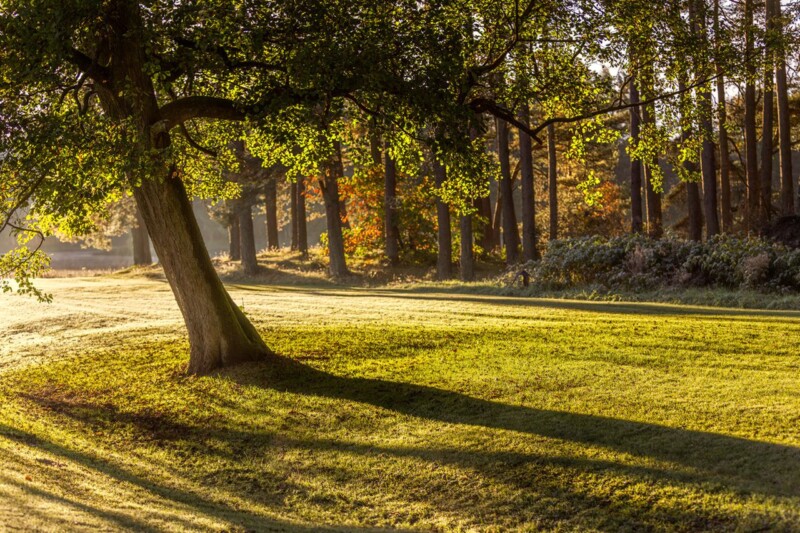
The best nature wall art should do more than reference the outdoors. It should change how the room feels. First Morning Rays does that especially well, using low sunrise light, long shadows, and woodland texture to create an uplifting focal point that still feels restful enough to live with every day.
Why First Morning Rays gives nature wall art a brighter mood
Some nature-led pieces are chosen mainly for calm. First Morning Rays adds something extra. The shafts of light create optimism and direction, which can be very useful in a hallway, breakfast room, home office, or living area that needs more energy without becoming visually loud. The woodland setting keeps the effect grounded, while the early light gives the image a more hopeful lift.
It helps a room feel lighter without relying on stronger colour alone.
It suits spaces that need warmth and momentum as well as calm.
It offers a more atmospheric answer than generic botanical decor.
First 4 Frames produces and frames every piece in-house with bespoke care, which is important for images built around light. Colour-managed Giclee printing and hand-finished framing help preserve the subtle glow and shadow detail that give the picture its sense of depth and morning clarity.
To learn more about the photographer, visit Noel Fenech. You can also browse more work by Noel Fenech Photography and see the exact framed product here.
If you want nature wall art that feel uplifting, spacious, and easy to place at home, First Morning Rays is an excellent option.
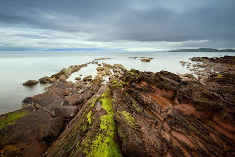
Finding the right art for plum walls is usually about contrast, not matching. Mossy Red shows why, combining rock texture, mossy greens, calm water, and warmer tones in a way that gives a richer wall colour more life rather than making it feel darker still.
Why Mossy Red works as art for plum walls
Plum walls can look elegant and cocooning, but they also need artwork that prevents the scheme from becoming too enclosed. Mossy Red helps because it introduces surface texture and natural variation. The red-brown rock notes sit comfortably with a deeper palette, while the green moss and open water stop the room from feeling visually flat. That balance works well in dining rooms, lounges, and more atmospheric bedrooms.
It gives darker paintwork contrast without clashing.
It brings natural texture that keeps a richer room feeling alive.
It suits spaces where warmth matters but heaviness does not.
Because First 4 Frames handles the production and framing in-house, the final piece benefits from bespoke workmanship and careful colour control. That is especially useful when artwork is being chosen for a stronger wall colour, because subtle tonal balance is what keeps the result sophisticated rather than overworked.
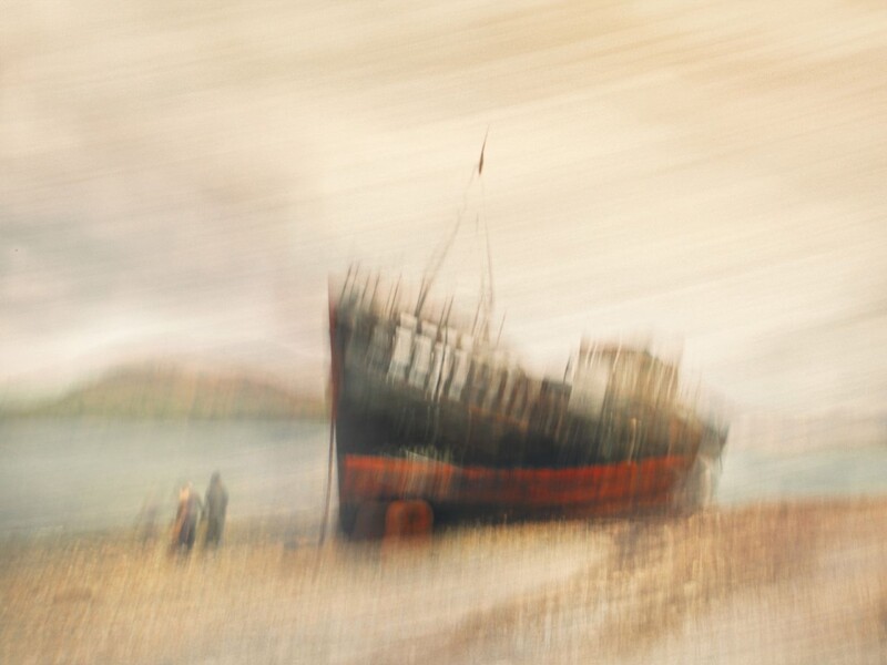
People searching for framed photography prints often want something more imaginative than a straightforward literal image. Ship Ashore answers that well, turning an abandoned vessel into a more dreamlike composition with movement, softness, and a painterly sense of atmosphere.
Why Ship Ashore gives framed photography prints more character
One reason photography works so well in interiors is its range. Ship Ashore shows that clearly. Rather than feeling purely documentary, the image carries mood and memory, which makes it especially useful in living rooms, studies, hallways, or reading corners where the artwork should invite a second look. It brings structure through the boat itself, but the handling keeps the overall effect softer and more emotional.
It suits rooms that need atmosphere more than sharper detail.
It bridges photography and painterly wall art in a very natural way.
It gives a room a more individual focal point than generic coastal imagery.
At First 4 Frames, the finished piece is produced and framed in-house with bespoke care. That matters with expressive photography like this, because the framing has to support the image without making it lose its softness. Hand-finished craftsmanship and colour-managed printing help the final artwork feel deliberate, polished, and ready to live with.
For more about the artist behind the image, visit Noel Fenech. You can also browse more work by Noel Fenech Photography and see the exact framed product here.
If you want framed photography prints that feel more evocative and less purely descriptive, Ship Ashore is a particularly strong example.
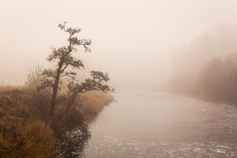
The best bathroom wall art should help the room exhale. Silent Morning does exactly that, using mist, water, and softened morning light to create a quieter focal point that feels far more restorative than novelty prints or overly themed bathroom decor.
Why Silent Morning suits bathroom wall art so well
Bathrooms often look best when the artwork supports the overall mood instead of grabbing attention too abruptly. Silent Morning keeps that balance. The low mist, filtered light, and still water create a sense of privacy and calm that works beautifully in bathrooms, en suites, and dressing spaces where people want the room to feel settled rather than merely finished.
It helps a harder, more functional room feel softer.
It works especially well with pale tiles, brushed metals, and simple cabinetry.
It adds atmosphere without making the room feel busy.
First 4 Frames completes the print and framing in-house, which is especially valuable for subtler landscape photography. Colour-managed production and hand-finished framing help those quieter tonal changes stay visible, so the final piece still has presence even in a clean, light-filled bathroom.
To learn more about the photographer, visit Noel Fenech. You can also browse more work by Noel Fenech Photography and view the exact framed product here.
If you are comparing bathroom wall art, Silent Morning is a refined choice for creating a calmer room with more atmosphere and less visual fuss.
Choosing art for maple furniture is often about keeping a lighter room from feeling too bare. Out of Reach does that beautifully, bringing golden canopy colour, branching texture, and a clear blue backdrop that gives pale timber more warmth without taking away its freshness.
Why Out of Reach works as art for maple furniture
Maple furniture has a clean, useful lightness, but that can leave a room feeling visually thin if everything else follows the same note. Out of Reach adds the missing contrast in a gentle way. The upward woodland view introduces shape and energy, while the autumn tones help bedside tables, dining pieces, or lighter storage furniture feel more grounded and complete.
It adds natural warmth without forcing darker colour into the room.
It suits bedrooms, hallways, and living areas with pale timber pieces.
It gives lighter furniture a more layered and collected setting.
Because First 4 Frames produces and frames every piece in-house in Falkirk, the final artwork benefits from bespoke craftsmanship, hand-finished presentation, and colour-managed printing that keeps the blue and gold tones clear once framed. That superior finish matters when a print is helping to balance a lighter scheme rather than overpower it.
If you are weighing up art for maple furniture, Out of Reach is a very good choice for making pale timber feel warmer, richer, and more deliberately styled.
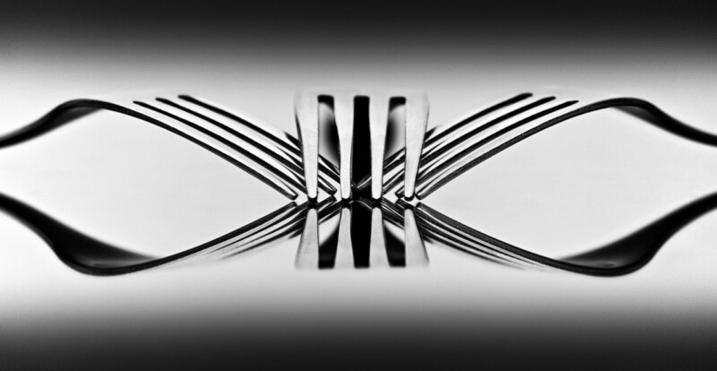
The best kitchen diner wall art should add presence without relying on obvious food-themed decor. Papillon is a particularly strong answer because it brings wit, balance, and a crisp monochrome finish that feels more considered than the usual kitchen artwork choices.
Why kitchen diner wall art should feel intentional rather than obvious
Kitchens and kitchen diners are busy, practical spaces, so artwork often gets treated as an afterthought. Yet these are also rooms where people gather, pause, and notice details at close range. A framed piece can make the space feel more finished, but it needs enough style to hold its place among cabinetry, worktops, lighting, and everyday movement.
Papillon works especially well here because it turns familiar objects into something elegant and unexpected. The monochrome palette keeps the result clean, while the reflected form adds rhythm that can sharpen a plainer wall. It suits kitchens, dining corners, breakfast areas, and open-plan kitchen diners that need a focal point with a little more intelligence.
Why Papillon suits kitchen diner wall art so well
It nods to the dining setting without becoming literal or gimmicky.
It gives a practical room stronger visual structure through monochrome contrast.
It feels polished enough for a design-led interior while still being easy to live with every day.
First 4 Frames produces each piece in-house in Falkirk with bespoke framing, colour-managed Giclee printing, and hand-finished craftsmanship. That higher standard of presentation matters in a kitchen diner because the artwork is often seen often, from close range, and in changing daylight throughout the day.
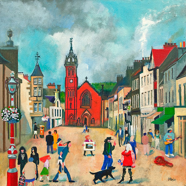
Thoughtful Peebles wall art should feel connected to the place itself rather than reading like a generic town scene. High Street, Peebles does that especially well, bringing colour, recognisable local character, and a hand-finished framed presentation that suits everyday interiors.
Why Peebles wall art works best when it feels lively as well as rooted
Town artwork can lose impact if it feels too postcard-like or too busy to live with comfortably. The stronger pieces hold onto a real sense of place while still feeling balanced enough for a hallway, home office, guest room, or sitting room. That is often what makes local art feel lasting rather than momentary.
High Street, Peebles carries that balance very naturally. The street scene has movement and warmth, yet the composition still feels composed enough for a well-finished interior. It gives a room personality and local connection without turning the wall into a theme.
What makes High Street, Peebles a strong Peebles wall art choice
It captures the character of the town without slipping into souvenir-style presentation.
It brings colour and movement that can lift a quieter wall.
It suits customers who want Scottish town art that still feels refined and easy to live with.
First 4 Frames completes each piece in-house in Falkirk using bespoke framing, colour-managed Giclee printing, and hand-finished craftsmanship. That superior finish matters because place-led artwork works best when the presentation feels considered and lasting, not hurried or mass produced.
You can discover more about the artist at Rob Hain, browse more work by Rob Hain, and view the exact framed print here.
If you are comparing Peebles wall art and want something rooted, lively, and professionally finished, High Street, Peebles is well worth considering.
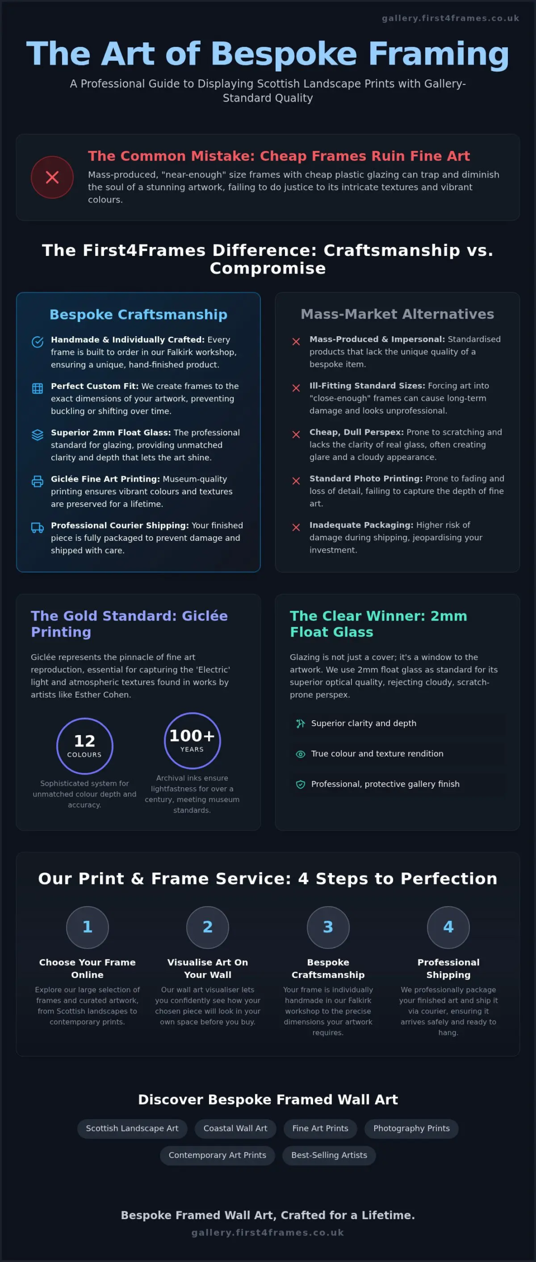
Have you ever noticed how a stunning piece of art can lose its soul when trapped behind a cheap, plastic frame that doesn’t quite fit? It’s a frustrating experience for anyone who appreciates the misty, ethereal beauty of Esther Cohen’s work. You want your home to reflect the raw, atmospheric power of the Highlands, but finding the right way to display it shouldn’t be a gamble. We understand that a mass-produced frame simply cannot do justice to the intricate textures found in high-quality landscape wall art.
In this guide, you’ll discover exactly how to frame Scottish landscape prints to achieve a professional, gallery-standard finish. We’ll show you how our bespoke, handmade service in Falkirk elevates your collection. By choosing 2mm float glass for superior clarity instead of the dull perspex used by competitors, and using our wall art visualiser to see the results before you buy, you can feel confident in your choice. From custom sizes to professional courier shipping, we’ll ensure your investment is protected and ready to hang.
Key Takeaways
Understand why Giclée printing is the gold standard for Esther Cohen’s work, ensuring the vibrant ‘Electric’ light effects and atmospheric textures are preserved for a lifetime.
Learn exactly how to frame Scottish landscape prints by selecting bespoke, handmade frames that are individually crafted to suit the unique dimensions of your chosen artwork.
Discover the technical advantages of using 2mm float glass for your glazing, providing the superior clarity and depth required for fine art that cheap perspex alternatives cannot match.
Design your framed artwork with confidence using our online wall art visualiser, allowing you to see your finished piece before it is professionally packaged and shipped to your door.
Esther Cohen: Capturing the Atmospheric Beauty of Scotland
Esther Cohen is a visual artist based in Edinburgh who has redefined the way we view the rugged terrains of East Central Scotland. She doesn’t just paint. Instead, she builds her work through intricate layers of photomontage and digital collage, creating a depth that traditional painting often misses. Her ‘Electric Landscapes’ capture the neon-tinged light found in the North, offering a contemporary perspective on the wilderness. Understanding her unique creative process is the first step in learning how to frame Scottish landscape prints that carry such significant emotional weight for collectors. For those who want to extend this sense of wilderness and refuge to their own property, you can learn more about Polis Remodeling.
The ‘Bothy’ Series: A Modern Scottish Icon
The ‘Coorie Bothy’ collection has become a staple for those seeking a modern take on Scottish landscape art. In these pieces, the traditional Highland shelter is transformed into a symbol of modern sanctuary and shelter. Cohen expertly blends photography with digital drawing to achieve a crisp, contemporary aesthetic. These prints are the perfect choice for ‘Coorie’ (cosy) home decor, providing a sense of warmth and heritage. To maintain that atmosphere, you need a bespoke frame that complements the organic textures without overwhelming the delicate digital details of the collage.
From Edinburgh to Your Walls
Cohen’s journey is marked by significant recognition, including features at the Royal Scottish Academy. When you bring her work into your home, you’re preserving a piece of contemporary Scottish heritage. This is why choosing an online art gallery with local expertise is vital for your project. A mass-produced frame from a big-box retailer won’t fit the unique proportions of her digital montages or protect the archival quality of the print. At First4Frames Gallery, we craft each piece by hand in our Falkirk workshop. We use 2mm float glass to ensure the ‘Electric’ light in her work remains sharp and vibrant, providing a level of clarity that standard perspex simply cannot provide. Learning how to frame Scottish landscape prints with the right glazing is essential for showcasing these specific textures.
The Art of the Giclée Print: Why Quality Matters for Landscape Art
Giclée printing represents the pinnacle of fine art reproduction. Unlike standard inkjet, it uses a sophisticated 12-colour system with pigment-based archival inks to achieve a depth of colour that standard photo prints simply cannot reach. When you’re researching how to frame Scottish landscape prints, the quality of the image itself is the foundation of the final piece. First4Frames Gallery ensures that every Esther Cohen piece is printed with high-fidelity accuracy, capturing her signature ‘Electric’ light effects. This professional approach prevents the fading and loss of detail that often ruins mass-produced alternatives.
Preserving Fine Art for the Long Term
Professional archival inks score a 6 or higher on the Blue Wool Scale, ensuring lightfastness for over 100 years. This level of durability aligns with museum framing standards, where the primary goal is to protect the art for future generations. Bespoke framed wall art is an investment in your home’s character; it’s a long-term addition rather than a temporary decoration. First4Frames Gallery uses these premium materials to ensure your chosen landscape remains as vibrant as the day it was printed.
The Print and Frame Service for Digital Art
Our print and frame service is specifically designed to transform digital files into physical masterpieces. We match the highest print resolution with frames that are individually crafted to fit the artwork perfectly. This synergy is a vital part of how to frame Scottish landscape prints correctly. A custom fit prevents the print from buckling or shifting inside the frame over time. By choosing a local specialist, you benefit from a hand-finished product that mass-market providers simply cannot match. You can view our full range of contemporary art prints to find the perfect starting point for your home.
How to Frame Scottish Landscape Prints: A Design Guide
Designing the perfect display for your home is an intentional creative process. When you learn how to frame Scottish landscape prints through our platform, you move beyond simple decoration into the world of bespoke curation. Unlike high-street stores that force your art into “near-enough” sizes, our focus remains on the unique proportions of your chosen piece. This ensures your artwork is the hero of the room, not an afterthought.
Step 2: Choose your frame online to match the specific tones of the Scottish Highlands or coastlines.
Step 3: Select a mount to provide ‘breathing room’ and prevent the print from touching the glass.
Step 4: Design your framed artwork to fit your unique interior space, choosing between minimalist or ornate profiles.
Visualise Art on Your Wall Before You Buy
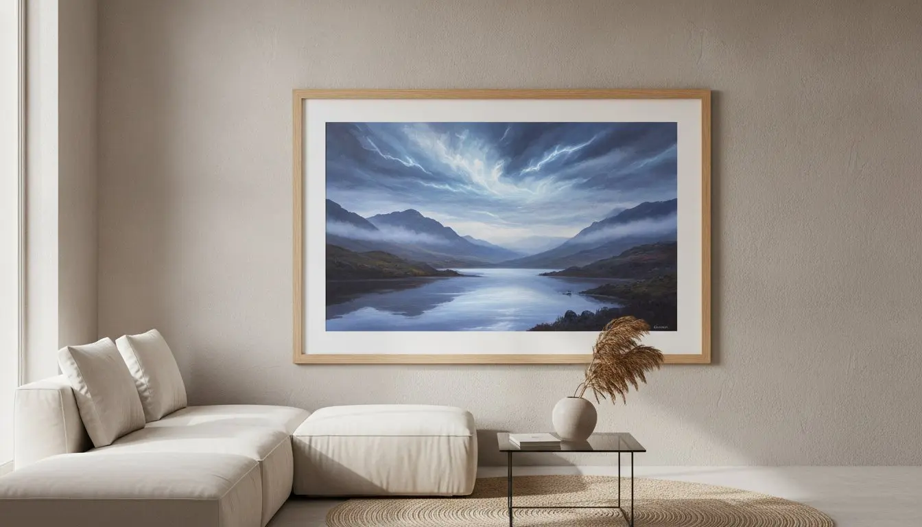
Our online tools take the guesswork out of ordering bespoke framed wall art. You can preview how a dark oak frame contrasts with the misty greys of a landscape or how a sleek black profile anchors a coastal scene. This visualisation ensures the final product complements your furniture and lighting. For contemporary art prints, a slim, modern profile often works best to let the atmospheric textures remain the focal point of the room.
Online Picture Framing: A Seamless Experience
Choosing online picture framing with First4Frames Gallery offers a level of precision that off-the-shelf options cannot provide. Standard frames often use acidic backings or tight dimensions that can ‘pinch’ the paper, causing permanent ripples. Every frame we produce is individually crafted in our workshop to prevent these issues. This bespoke approach to how to frame Scottish landscape prints ensures your art is held securely and presented with professional elegance. You can design your framed artwork online today to start your home’s transformation.
The First4Frames Difference: Craftsmanship and 2mm Float Glass
Choosing the right materials is the most critical part of deciding how to frame Scottish landscape prints. While others might settle for standard, mass-produced components, we believe in the power of precision. Our frames are individually crafted in our Falkirk workshop using premium wood and conservation-grade materials. This ensures your artwork isn’t just displayed; it’s preserved. Real wood frames provide a structural integrity that cheap alternatives lack, preventing warping over time. By focusing on these details, we ensure that every piece of Scottish landscape art retains its depth and atmospheric texture for years to come.
Why We Avoid Perspex and Acrylic
We use 2mm float glass because it is the professional standard for superior clarity and scratch resistance. Perspex and acrylic often carry a dull, static-heavy finish that attracts dust and obscures fine details. Real glass enhances the vibrant colours and subtle shifts in light found in contemporary art prints. It provides a level of fidelity that allows the viewer to feel the mist and heather of the Highlands without the interference of a plastic sheen.
Hand-Crafted in our Falkirk Workshop
There is immense value in supporting local art frame shops near me for guaranteed quality and personal service. At First4Frames Gallery, we don’t just put art in a box. We create a bespoke environment for it. Our promise is simple: individually crafted frames that fit your art perfectly, every time. Once the crafting is complete, we provide logistical peace of mind. Every finished frame is fully packaged in protective layers to prevent damage during transit. We ship exclusively via professional couriers, ensuring your gallery-standard wall art arrives ready to hang and in pristine condition. Understanding how to frame Scottish landscape prints means choosing a partner who values the art as much as you do.
Bring the Spirit of the Highlands Into Your Home
Esther Cohen’s evocative work captures the raw, shifting beauty of Scotland, but it takes professional craftsmanship to let those atmospheric textures truly shine. Throughout this guide, we’ve explored how to frame Scottish landscape prints by focusing on archival Giclée quality and the technical precision of our Falkirk workshop. By choosing 2mm float glass instead of plastic alternatives, you ensure every neon-tinged light effect is seen with absolute clarity. Our bespoke frames are individually crafted to fit your art perfectly, removing the risk of damage from standard, ill-fitting options.
You can feel confident in your investment knowing each piece is fully packaged and sent via professional couriers. It’s time to turn your digital inspiration into a physical masterpiece that defines your interior space. Browse the Esther Cohen Collection and Design Your Framed Artwork Today. We’re ready to help you create something timeless that celebrates the landscapes you love.
Frequently Asked Questions
Who is Esther Cohen and what is her artistic style?
Esther Cohen is a prominent visual artist based in Edinburgh, known for her evocative and atmospheric landscapes. Her unique style blends photography with digital drawing and collage to create multi-layered photomontages. She is particularly celebrated for her ‘Electric Landscapes’ and ‘Coorie Bothy’ series, which capture the raw beauty of the Highlands and islands. Her work is a popular choice for modern interiors seeking a contemporary take on traditional Scottish scenery.
What is the best way to frame Scottish landscape art?
The best way to frame these pieces is through bespoke services that respect the artwork’s unique dimensions. When considering how to frame Scottish landscape prints, you should avoid mass-produced, standard frames that often use cheap plastic glazing. Instead, choose a handmade frame from our Falkirk workshop. We recommend using acid-free mounts to protect the Giclée print and high-quality wood profiles that complement the natural, rugged tones of the Scottish coast.
Why is 2mm float glass better than perspex for picture frames?
We use 2mm float glass because it provides superior clarity and scratch resistance compared to the perspex used by many competitors. Perspex often carries a dull, plastic-like sheen that can obscure the fine details and vibrant colours of high-quality prints. Real glass also lacks the static charge found in acrylic, which means it doesn’t attract dust. This ensures the atmospheric depth of your landscape art remains the focal point for years.
How can I see how a framed print will look on my wall before I buy it?
You can use our interactive wall art visualiser to take the guesswork out of your purchase. This tool allows you to see artwork before you buy by placing your chosen print into various frame styles against different wall colours. It’s a key part of our online picture framing service, helping you design your framed artwork with confidence. This ensures the final piece perfectly matches your unique interior decor before we begin the hand-crafting process.
Is it safe to have framed glass art shipped to my home?
Yes, it’s completely safe when you choose a provider that understands professional logistical requirements. Every bespoke frame we create is individually wrapped in multiple layers of protective packaging to prevent damage during transit. We ship our finished pieces via professional couriers who are experienced in handling fragile items. This ensures your ready-to-hang art arrives in pristine condition, ready to be displayed in your home without the fear of glass breakage.
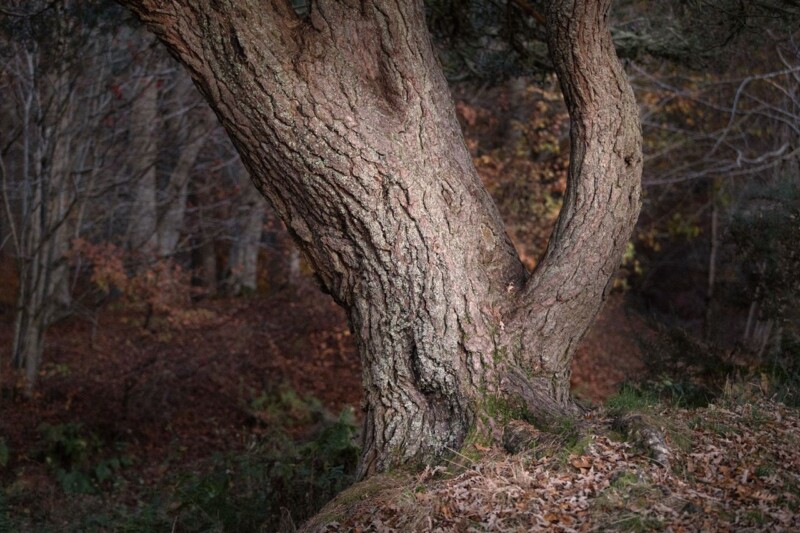
Paler timber can make a room feel fresh and airy, but it sometimes needs more texture around it to avoid looking visually dry. That is where art for ash wood furniture becomes important. Where Ghosts Wander brings exactly that missing depth, using bark detail, autumn colour, and woodland atmosphere to build warmth around lighter furniture.
Why Where Ghosts Wander works as art for ash wood furniture
Ash wood often looks best with artwork that introduces natural contrast but stays gentle enough to preserve the room’s calm. Where Ghosts Wander does that very well. The tree study gives the wall texture and weight, while the softer woodland background keeps the whole piece atmospheric rather than heavy. It suits bedrooms, hallways, studies, and living rooms where pale timber needs more depth beside it.
It adds texture that works naturally with timber grain.
It brings warmth to lighter furniture without forcing stronger colour into the room.
It helps a pale scheme feel layered and collected rather than sparse.
At First 4 Frames, every piece is framed and produced in-house with bespoke care. That hand-finished approach matters with more textural photography like this, because the final presentation needs to preserve subtle bark detail and tonal depth if the image is going to enrich the room properly.
For more on the artist behind the photograph, visit Noel Fenech. You can also browse more work by Noel Fenech Photography and see the exact framed product here.
If you are choosing art for ash wood furniture, Where Ghosts Wander is a very good way to give a lighter timber scheme more warmth, texture, and quiet character.
Questions about the best frame colours for black and white photography are rarely just technical. They change how the artwork behaves in the room. Trippy makes that easy to see because the image is already full of movement, contrast, and distortion, so the framing choice has a direct effect on whether it feels sharper, calmer, or more dramatic.
What Trippy shows about the best frame colours for black and white photography
With simpler black and white pictures, a frame can quietly support the image. With Trippy, the frame has a more active job. A darker frame can intensify the drama and keep the piece feeling crisp, while a lighter or softer finish can introduce more breathing space around the pattern. The right answer depends on whether the room needs energy, restraint, or a more gallery-like presentation.
Darker frames can make graphic black and white work feel bolder and more architectural.
Softer finishes can stop a high-contrast piece from overwhelming a smaller room.
The mount and frame need to work together so the image feels intentional rather than busy.
This is exactly where First 4 Frames stands out. Because the framing is completed in-house, customers can approach the final presentation as a design decision rather than an afterthought. Bespoke guidance, hand-finished workmanship, and colour-managed production make it easier to land on a result that feels right for the room as well as the image.
If you are weighing up the best frame colours for black and white photography, Trippy is a particularly helpful product-led example because presentation makes such a visible difference to the final mood.