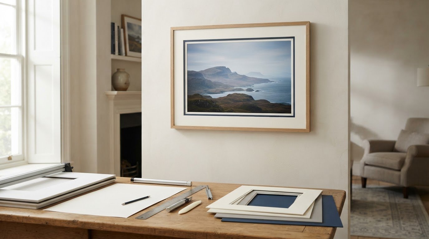
Scottish landscape art for a garden-facing room should respond to the room as well as the subject. Old Man of Storr offers a practical example because sunrise illuminates the rock formation above rolling green slopes, while calm water gives the broad landscape a quieter second layer.
Position Scottish landscape art for a garden-facing room
A room with garden views already contains movement, weather and seasonal colour. The artwork should not compete by imitating every leaf. Old Man of Storr introduces another scale: the recognisable formation creates a destination, while open land and water preserve a sense of space.
Face the glazing
Use a solid wall opposite or beside the windows. Check reflected daylight before choosing the hanging point.
Relate, do not match
Let one green or sunrise note connect with the room. Avoid repeating the full palette in cushions and planters.
Test the complete framed outline from the main chair and the route into the room. Keep tall plants outside the image edge. In winter, the photograph provides colour and distance. In summer, visible wall around the frame stops it disappearing into the garden.
The garden supplies the changing foreground. Let the artwork supply a lasting destination.
Frame the sunrise without closing down the landscape
The photograph depends on separation between bright sky, dark rock, green land and reflected light. Colour-managed Giclée production helps retain those relationships, while bespoke in-house framing gives the expansive scene a precise edge.
Scottish landscape art for a garden-facing room works when it complements nature rather than copies it. Old Man of Storr adds place, scale and a steady horizon while the living view remains free to change.
A Scottish train journey gift can preserve more than the sight of a locomotive. It can recall the anticipation of departure, the changing view from the carriage, and the moment the line curves across a remarkable landscape. The Glenfinnan Express by Matylda Konecka builds on those memories through a train crossing Glenfinnan Viaduct, misty hills, drifting steam, and large white owls in flight. The recognisable setting gives the picture a real anchor, while its imaginative details keep it from feeling like a standard transport print.
When does a Scottish train journey gift feel personal?
The best reason to choose journey-related art is a real connection. The recipient may have travelled the West Highland Line, visited Glenfinnan, watched trains from a nearby viewpoint, or planned the trip for years. That personal link changes the print from an attractive scene into a record of anticipation or shared experience.
Before buying, identify the memory you want the gift to hold. Was it a family holiday, an anniversary journey, a long-awaited rail trip, or a child’s first encounter with the viaduct? Add that context in a separate handwritten card. The artwork can remain untouched and versatile, while the message explains why this particular route matters.
A quick fit check before choosing railway art
Question
Why it matters
Do they know Glenfinnan or the West Highland route?
A genuine place connection makes the present more specific
Do they enjoy imaginative illustration?
The owls, feathers, mist, and movement go beyond railway realism
Will they look closely at layered detail?
The winding composition rewards repeat viewing
Is there a suitable wall in their next space?
Finished dimensions matter if the recipient moves or travels often
A yes to several of these questions suggests a strong fit. Someone who wants a precise technical locomotive study may prefer a more documentary image. Someone who remembers both the landscape and the feeling of the journey may respond to this picture’s freer visual story.
Why The Glenfinnan Express is more than railway memorabilia
The train provides direction, but it is not the only subject. The viaduct bends through the picture and draws the eye into misty green hills. Steam, feathers, and birds create several kinds of movement. This wider composition makes the landscape and atmosphere as important as the vehicle itself.
That balance broadens the places where the artwork can live. It can add narrative to a hall, a study, a guest room, or a family space. It need not sit beside model trains, old tickets, or route maps. A clear wall and a few well-chosen objects will let the imaginative detail do the work.
Present the gift around the journey, not a theme
Name the shared memory. Write down the date, route, travelling companions, or moment at Glenfinnan that prompted the gift.
Consider the recipient’s wall. Check whether a square composition suits the available space and furniture.
Keep extras separate. Place tickets, photographs, and messages in a small book or envelope rather than attaching them to the mount.
Plan safe transport. If the recipient is moving, confirm how a glazed frame will reach the new home.
This approach keeps the finished picture polished. It also lets personal material be read and stored without becoming part of the permanent framing. The recipient can then hang the artwork in different rooms over time.
Place a detailed print where it can be explored
The smaller details deserve a position that allows close viewing. Above a console, beside a desk, or near a reading chair may work better than high on a large wall. At the same time, the sweeping curve of the viaduct should remain visible from across the room.
A restrained frame can give the busy scene a calm edge. Darker moulding may sharpen the viaduct and locomotive. Natural timber can relate to the landscape and soften the magical elements. A generous mount creates separation from patterned wallpaper, bookshelves, or collections that might otherwise compete with the picture.
Make the quality match the memory
A journey gift is intended to carry a story forward. First 4 Frames uses colour-managed Giclée production and completes bespoke framing in-house at its Falkirk workshop. This careful process supports the greens, mist, white birds, smoke, and fine illustrated marks. It also gives the present a hand-finished, ready-to-hang quality.
Matylda Konecka is a Polish-born illustrator and landscape architecture graduate who established her studio in Scotland. Her detailed images often combine real architecture and landscape with playful, dreamlike narratives. See more of her work on Matylda Konecka’s official website, or browse the Matylda Konecka collection at First 4 Frames.
A thoughtful Scottish train journey gift should recall the route and the feeling of travelling through it. View the framed The Glenfinnan Express print for a recognisable Highland setting transformed through motion, atmosphere, and imagination.
calming fox wall art for an adult bedroom can introduce the quiet presence of nature without turning a grown-up room into a woodland theme. Healing Thoughts by Charlotte Strawbridge shows a fox resting with closed eyes among tall grass. Soft blue and white tones give the image space, while the animal’s still posture creates a gentle focal point. It is expressive enough to hold attention, yet calm enough for a room designed around rest.
Why calming fox wall art for an adult bedroom needs restraint
Wildlife art can suit an adult bedroom beautifully, but the treatment matters. Highly literal woodland signs, repeated animal motifs, and themed accessories can make the room feel younger than intended. One carefully chosen picture gives the subject more dignity. It allows the fox to carry the natural character while the rest of the room remains simple.
Healing Thoughts works because the mood comes from posture and paint rather than a staged story. The closed eyes suggest stillness. Loose grass marks add movement without noise. The pale background keeps the composition light, so the piece can settle into a bedroom without feeling like a heavy decorative statement.
Use the picture to guide the mood, not every purchase
Begin with the qualities you want the bedroom to have. If the aim is quiet, natural, and soft, the artwork already supplies those cues. You do not need fox cushions, woodland bedding, or several pictures of animals. Instead, repeat one or two understated elements from the image.
Colour: echo the blue in a throw, lampshade, or narrow line within a rug.
Texture: relate the tall grass to linen, wool, woven baskets, or lightly grained timber.
Shape: use rounded ceramics or a softly curved lamp to support the resting pose.
Space: leave clear wall around the frame so the pale areas remain part of the composition.
These connections should be noticed gradually rather than read as a matching set. A bedroom feels calmer when its relationships are quiet. The artwork can then bring personality without asking every object to repeat its subject.
Choose the wall according to how the room is used
The wall above a bed is not the only option. A smaller picture often feels more personal near a reading chair, chest of drawers, or dressing area. It can also sit opposite the bed, where its restful image becomes one of the first things seen in the morning.
Possible position
What to check before hanging
Opposite the bed
Keep the centre comfortable to view from a seated or reclining position
Above a low chest
Leave enough separation for lamps, books, and everyday objects
Beside a reading chair
Use nearby light that reveals texture without creating glass glare
On a narrow return wall
Measure the finished frame, including mount and moulding
A paper template helps test the finished scale. Move it around the room for a day before making holes. Check the view in both morning and evening light. Bedrooms change noticeably after dark, and a position that works in daylight may disappear behind glare from a bedside lamp.
Balance the soft palette with enough definition
Pale blue and white can disappear against a very light wall if the presentation has no boundary. A well-proportioned mount gives the image breathing room, while the moulding provides definition. A light timber can preserve the natural mood. A slim darker finish can sharpen the fox and grass without making the piece feel severe.
On deeper paint colours, the pale ground can create useful contrast. Dusty blue, muted green, warm grey, and soft clay tones could all work. The aim is not an exact colour match. A little separation lets the artwork stay visible and prevents the bedroom from becoming overly coordinated.
Give a quiet image a carefully made finish
Subtle artwork depends on tonal control. First 4 Frames uses colour-managed Giclée production and completes bespoke framing in-house at its Falkirk workshop. That process supports the delicate shifts between the fox, grasses, blue marks, and pale background. It also allows the mount and frame to be selected for the actual bedroom rather than treated as an afterthought.
Well-chosen calming fox wall art for an adult bedroom should make a bedroom feel more personal without disturbing its quiet. View the framed Healing Thoughts print for a peaceful wildlife subject with soft colour, natural movement, and a grown-up sense of restraint.
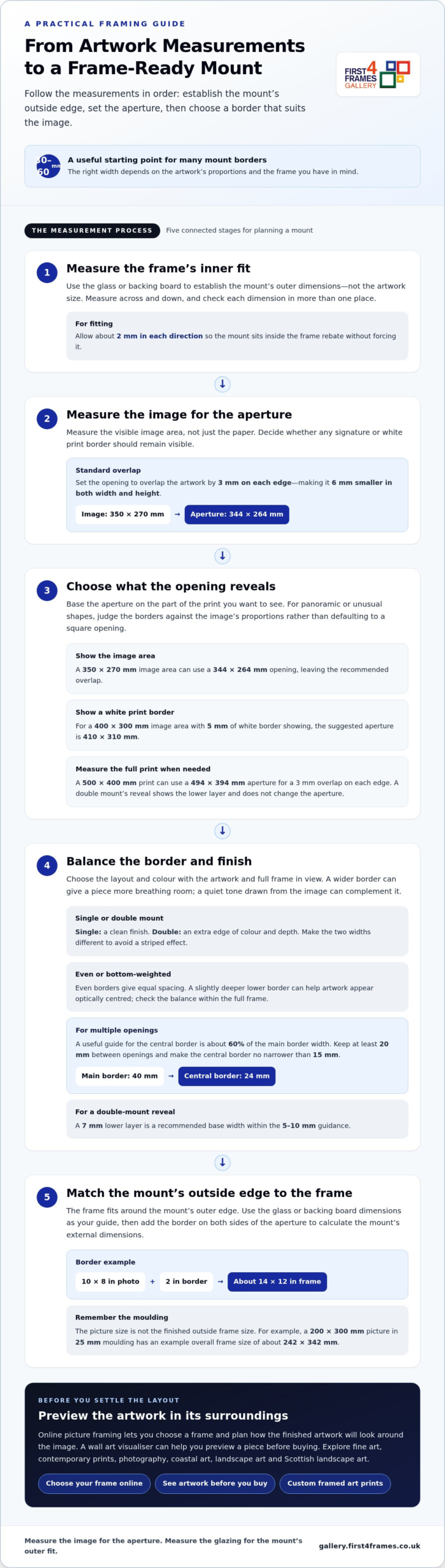
A mount border of 30-60 mm is a useful starting point for many pictures. Choose a single mount for a clean finish or a double mount for extra depth and colour. The right width depends on the artwork’s proportions and the frame you have in mind.
With online picture framing, you can choose a frame and plan how the finished artwork will look around the image. Custom framing gives art prints and other pictures a considered finish. Explore fine art, contemporary prints and photography, including coastal, landscape and Scottish landscape art. A wall art visualiser can help you preview a piece before buying and imagine how it might look at home. Browsing artists and their work can also help you find a style that suits your space.
Next, learn which dimensions to measure, how to position the aperture around the artwork, and how to size the mount’s outer edge to fit the frame. These steps make it easier to plan a framed print or choose framed wall art with confidence.
Key Takeaways
Use the glass or backing board dimensions to establish the mount’s outer size, and measure the artwork itself carefully before setting the aperture.
Choose a single mount for a simple finish or a double mount when an extra edge of colour and depth will suit the artwork.
Balance the border against the image and frame; a wider border can give a piece more presence, while a weighted bottom can help it look centred.
Plan the finished mount’s external dimensions to fit the frame, rather than assuming the artwork size determines the frame size.
For a secure fit, measure the glass or hardboard inside the frame, not just its internal dimensions. A practical guide to how to decide on a mount width starts with this outer measurement and the artwork’s visible image size. Set the aperture to overlap the artwork by 3 mm on each edge, making it 6 mm smaller in both width and height.
For panoramic or unusually shaped artwork, judge the borders against the image’s proportions rather than defaulting to a square opening. Keep the mount balanced around the image, then check that its outer dimensions suit the frame.
Watch this framing guide for a visual explanation of how to choose a mount:
Measure the glazing and frame rebate. Remove the glass and backing board, then measure across and down. Check each dimension in more than one place because paper may not be perfectly square. The rebate usually overlaps the picture by about 5 mm on each side and is typically 3 mm larger than the glass size.
Set the aperture using the image, not the paper. To understand how to decide on a mount width for a particular print, measure the image area and account for any signature below it. For a 350 mm × 270 mm image, a suitable opening is 344 mm × 264 mm. A 10 × 8 inch photo typically has a 9.75 × 7.75 inch window.
Choose what the opening should reveal. For larger prints, subtract 10 mm from each image dimension to create 5 mm overlap on each side. To show a print’s white border, measure the full print: a 500 mm × 400 mm print needs a 494 mm × 394 mm aperture. A double mount’s reveal shows the lower layer and doesn’t change the aperture.
Select a complementary finish. A wider mount gives artwork more breathing room, while a quiet colour drawn from the image can complement it. For valuable or sentimental prints, acid-free mount board and backing help reduce the risk of yellowing or acid damage over time.
How Do I Choose the Border Width?
Set the border after considering the image shape, frame and number of openings. Then choose an even or weighted layout and check that the aperture reveals the intended part of the artwork.
Balance Even and Bottom-Weighted Borders
Choose an even border for equal spacing around the image. For a bottom-weighted mount, make the lower border slightly deeper than the top and sides; this can help the artwork appear optically centred. Compare both layouts within the full frame, not just around the aperture, and avoid extra weight if it makes the picture feel too low.
Select Mount Width and Colour
Choose a border that gives the artwork breathing room without overwhelming it. Wider borders can create a gallery-style finish and add presence, particularly around a larger frame. A mount colour drawn from a quiet tone in the image, such as soft off-white or cream, can work with many styles of artwork. Compare it beside the print, because surrounding colours can affect how the mount appears.
Set the central border for multiple openings. In a multiframe mount, keep the central border narrower than the main borders to avoid a striped effect. A useful guide is about 60% of the main mount width, with at least 20 mm between openings. For example, a 40 mm main border pairs proportionately with a 24 mm central border. Keep it no narrower than 15 mm.
Check the aperture and reveal. Base the opening on the image area you want visible, then consider whether any white print border should remain in view. For a 400 mm × 300 mm image area with 5 mm of white border showing, the suggested aperture is 410 mm × 310 mm. For a double mount, make the two widths different to avoid striping; a 7 mm lower layer is a recommended base width, within the 5-10 mm guidance. Browse framed artwork in the gallery to compare how border proportions frame different images.
How Do I Measure the External Mount Size?
Measure the glass or backing board to establish the mount’s outer dimensions. The frame fits around that outer edge, not just the picture.
Measure the Picture and Frame
Start by measuring the picture’s visible image, then measure the glass or backing board across and down. These measurements serve different purposes: the image guides the aperture, while the glass or board helps establish the mount’s outer dimensions. Use millimetres for precision and note the width before the height. Measure the paper in more than one place, as it may not be perfectly square.
Account for Frame Moulding and Overall Dimensions
Measure the frame’s visible opening separately from its outside edges. Moulding adds to the overall frame dimensions, so don’t treat the picture size as the finished frame size. For example, a 200 × 300 mm picture in 25 mm moulding has an example overall frame size of about 242 × 342 mm. A 25 mm moulding overlapping the picture by 5 mm extends 20 mm beyond it on each side.
Match the External Mount to the Frame
Use the glass or backing board dimensions as the guide for the mount’s outside edge, then allow about 2 mm in each direction for fitting. Check that the mount sits inside the frame rebate without forcing it. An A4 frame, for instance, can hold a mount with an aperture sized for a 7 × 5-inch photo, showing why frame size and picture size aren’t interchangeable.
Check How the Mount Affects Frame and Picture Size
Add the border on both sides of the aperture to calculate the mount’s external dimensions. A 10 × 8-inch photo with a 2-inch border needs a frame of about 14 × 12 inches. A double mount or acid-free backing adds thickness, so ensure the frame rebate can accommodate the complete stack. Ready-made frames suit standard sizes; made-to-measure frames can follow a chosen mount’s outer dimensions.
Standard picture mount border widths
Use standard widths only as a starting point. Judge the mount against the image and frame: the border should give the artwork space without making the opening feel cramped.
Start with the common range. Mount border widths vary, so choose one that suits the image and frame. For many pieces, 2-3 inches is a useful starting range. These are guides, not fixed rules: compare the border with the visible image and the frame’s proportions before settling on a width.
Scale the border to the picture. A small photo can sit comfortably within a 5-8 cm border, while a larger print may need more space to feel balanced. Consider the image’s visual weight too. A busy composition often benefits from a quieter margin, while a simple image can carry a broader border without losing focus.
Check the full framing proportions. Picture the mount and frame together rather than judging the opening alone. A narrow border inside a broad frame can feel crowded; a wider mount can create a gallery-style finish and give the artwork more presence. Compare the proposed border on all four sides, then consider how the finished piece will look on the wall.
Adapt standard widths to the image shape. A square photograph and a panoramic print may need different border proportions. Centre the opening on the visible image, then adjust the border to create a balanced overall shape. For a panoramic picture, an even border can keep the presentation clean, while a wider mount may help the long image hold its own within the frame.
Choose by looking at real examples. Compare mount widths around different prints before deciding. Notice whether the border supports the image or draws attention away from it. Explore framed artwork in the gallery to see how artwork and framing proportions work together, then use the standard ranges as a practical starting point for your own picture.
First4Frames Gallery: Ready-to-Hang Framed Art
First4Frames Gallery offers Ready-to-Hang Framed Art with frames handmade to order from high-quality materials. Each frame is made for its individual order, with 2 mm float glass and expert mounting for a considered finish. If you have a particular picture, Custom Picture Framing lets you choose a frame to suit it; Giclée Fine Art Prints can be paired with a frame from the available range.
Explore the framing and artwork options to find a combination that feels right for your image and space. Browse the First4Frames Gallery to see framed art and choose a direction for your own piece.
When you’re ready, contact First4Frames Gallery to discuss your framing needs.
Give Your Artwork Room to Belong
A mount shapes the space around the image and influences how the artwork sits in a room. Knowing how to decide on a mount width gives you a practical starting point, but the final choice should feel in harmony with both the picture and its intended setting.
Before choosing a finish, picture the framed piece in its intended setting. Consider nearby colours, available wall space and whether you want the artwork to blend in or become a focal point. A paper outline at the intended outer dimensions can help you judge its presence before you decide.
When you’re ready to explore artwork and framing options, browse the First4Frames Gallery. Let your chosen image guide the details, and create a presentation that feels right at home on your wall.
Frequently Asked Questions
Single or double mount?
Choose a single mount when you want the image to remain the main focus, especially with detailed artwork. A double mount can add a second tone that picks up a small accent in the image. For a coordinated display of several pictures, use the same mount treatment throughout so the frames feel connected, even when the artwork differs.
How wide should a mount be?
Let the image’s composition guide the visible margin. A portrait with a small signature beneath the image may need enough space to keep that detail visible, while a full-bleed print has no paper border to preserve. Sketch the proposed opening over a copy or outline of the artwork, then check that important details remain clear.
How wide should the border be?
Consider where the framed picture will hang before choosing its border. A piece displayed alongside other frames may look more cohesive with a similar treatment, while a standalone work can have a more individual presence. For a pair of prints, test the same border design around both images and adjust only if their compositions need different breathing room.
How do you choose the right mount width for a picture frame?
Start with the frame’s available space and the picture’s visible image, then make a paper template of the proposed mount. Place it over the artwork and view it from the distance where the picture will usually be seen. This helps show whether the opening cuts into an important feature or leaves an awkward sliver of the image.
What is the standard mount border width in the UK?
No single border width suits every picture. Common framing guidance provides a starting point, but the image’s shape, composition and display setting all affect the choice. For a group of photographs, consistent borders may matter more than finding a separate ideal width for each picture.
How wide should a picture mount be for different print sizes?
Choose the border based on the visible image and intended presentation, not the paper size alone. For a print with a white margin, decide whether to leave it visible or cover it with the mount. With a collection of different print sizes, matching the visual treatment can create unity while preserving each picture’s proportions.
milestone birthday art gift for a teddy collector works best when the artwork solves a particular visual problem instead of merely filling an empty wall. Arthur Bear is a useful example because Michael Simpson models an individual miniature character in solid foundry bronze, giving a familiar collecting subject lasting material weight.
Choose a milestone birthday art gift for a teddy collector personally
Start by learning what the recipient collects. Some favour early mohair bears, some remember a childhood companion and others simply enjoy miniature sculpture. Arthur Bear works when its expression, size and bronze craft add something distinct to that story. It is less convincing as a last-minute gift chosen only because the recipient once mentioned teddy bears.
Question
Why it matters
Do they display miniatures?
The 3–4 cm height suits a cabinet, shelf or desk with close viewing.
Is the collection material-specific?
Solid foundry bronze offers a different presence from plush or resin.
Will it sit securely?
A tiny sculpture still needs a stable surface away from an edge.
What memory links to the gift?
A handwritten card can explain the personal connection without altering the sculpture.
Arthur Bear arrives in branded presentation packaging. Before gifting, identify a possible display location and measure it. Avoid adding an engraved number to the sculpture itself. The birthday can be recorded on the card, allowing the bronze to remain relevant long after the date.
A collector’s gift should contribute to the collection, not merely mention the hobby.
Let miniature foundry bronze carry the occasion
Michael Simpson is known for detailed animal modelling and bears with individual character. Casting Arthur Bear in solid foundry bronze gives the 3–4 cm sculpture surprising substance, while careful presentation makes the craft visible at close range.
A milestone birthday art gift for a teddy collector becomes meaningful through knowledge of the person. Arthur Bear combines familiar warmth with foundry craft, creating a small object designed to remain part of the recipient’s story.
nature wall art for a quiet reading nook works best when the artwork solves a particular visual problem instead of merely filling an empty wall. Healing Thoughts is a useful example because Charlotte Strawbridge places a peaceful fox with closed eyes among textured tall grass, creating intimacy and movement without a busy narrative.
Build nature wall art for a quiet reading nook around the chair
Set the chair, lamp and side table first. The artwork should belong to that seated zone rather than the whole room. A side wall can be more comfortable than the surface directly above the chair, especially if the frame would otherwise compete with a tall lamp or leave the reader sitting beneath it.
Place the chair where daylight and evening light both work.
Mark the finished framed outline from seated eye level.
Keep the lamp shade away from the fox’s face.
Choose one grass or earth tone for a cushion or throw.
Leave woodland ornaments and animal-patterned fabrics out.
The calm comes from the fox’s closed eyes and the soft movement around it, not from making every item beige. A dark bookcase or stronger chair colour can still work. Visible wall and a clean frame will give the textured image enough separation.
Can wildlife art feel grown-up in a small corner?
Yes. Choose a work shaped by atmosphere and observation, then avoid supporting it with literal woodland décor. One expressive subject is enough.
Frame soft animal detail with a dependable boundary
Charlotte Strawbridge’s nature-led work depends on texture and gentle tonal movement. Colour-managed Giclée printing helps preserve those marks, while bespoke in-house framing gives the intimate subject enough definition beside books, textiles and warm reading light.
Nature wall art for a quiet reading nook should reward close looking while allowing the corner to settle. Healing Thoughts brings a peaceful presence, leaving books and the reader to supply the changing story.
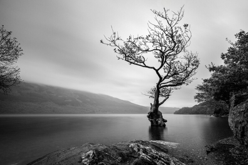
black and white wall art for a calm study works best when the artwork solves a particular visual problem instead of merely filling an empty wall. Exiled Grace is a useful example because a lone tree stands in long-exposure loch water while distant Scottish hills dissolve into mist, creating stillness with a clear central anchor.
Position black and white wall art for a calm study sightline
Choose a wall that can be seen when looking away from the screen. A study needs visual rest, but a completely blank surface may offer little reason to refocus at distance. Exiled Grace creates a slow route from rocky foreground to the tree and then into mist, giving the eyes somewhere purposeful to travel.
Run a desk-level test
Sit in the working chair before marking the frame.
Keep the lone tree clear of monitor edges.
Switch on task lighting and check reflections.
Move filing trays and pinboards outside the image outline.
The photograph comes in four landscape print sizes, from 400 x 266 mm to 700 x 466 mm before framing. Select scale from the desk, cabinet or wall section beneath it. The largest option is not automatically the calmest; sufficient surrounding wall is part of the composition.
Monochrome does not require an all-grey office. Oak, walnut, olive upholstery or one muted blue can provide warmth. Keep patterned accessories limited so the photograph’s tonal range remains the main quiet detail.
Protect the mist, water and shadow detail
Black and white printing is demanding because subtle greys must remain separate without unwanted colour casts. A colour-managed workflow, suitable fine-art paper and precise in-house framing help preserve the long-exposure softness as well as the tree’s crisp silhouette.
Black and white wall art for a calm study can be focused without feeling severe. Exiled Grace offers stillness, depth and resilience in a composition that supports concentration rather than issuing instructions.
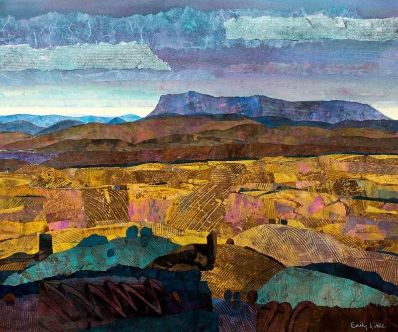
abstract wall art for maple furniture works best when the artwork solves a particular visual problem instead of merely filling an empty wall. Quo Vadis is a useful example because Emily Little’s semi-abstract approach introduces colour, memory and emotion, while the 360 x 300 mm landscape format remains measured enough for pale contemporary timber.
Place abstract wall art for maple furniture without overmatching
Maple already contributes fine grain and a warm, pale tone. The picture does not need a blond frame simply because the furniture is blond. First test a frame that separates the artwork from both wall and cabinet. That boundary can make the timber feel lighter and the colour inside Quo Vadis feel more deliberate.
Above a low cabinet
Measure from the furniture width and leave breathing space above any lamps or ceramics. Keep the artwork visually connected to the cabinet rather than floating near the ceiling.
Beside open shelving
Reduce shelf clutter before installation. The picture should be the area of colour, while books and objects provide quieter rhythm.
Quo Vadis is available as a 360 x 300 mm print before framing. Tape out the finished size and view it in morning and evening light. Pale timber can change noticeably under warm bulbs, so a relationship that works at noon may become too yellow after dark.
Let maple provide material calm and the artwork provide the emotional depth.
Choose a frame that separates colour from pale grain
Semi-abstract work relies on nuanced transitions rather than a single literal subject. Colour-managed Giclée printing protects those changes, and one-to-one framing advice can establish enough contrast without overpowering the maple furniture nearby.
Abstract wall art for maple furniture is strongest when each material keeps its identity. Quo Vadis can deepen the room, while clear spacing and a considered frame protect the furniture’s natural lightness.
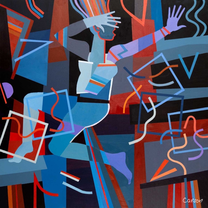
statement wall art for an entrance works best when the artwork solves a particular visual problem instead of merely filling an empty wall. Fallen Angel II is a useful example because Fred Carson combines a stylised figure with bold colour and geometric control in a compact 265 mm square print.
Plan statement wall art for an entrance around the first sightline
Stand outside the room and open the door fully. The best wall is the one that appears naturally during arrival but stays clear of the door swing. Mark the complete framed outline there. A strong image does not need to sit at the architectural centre if that position is hidden by coats or moving people.
Remove temporary clutter before judging the available wall.
Open cupboards and doors to expose their full movement.
Mark the finished frame, not only the 265 mm print.
Check the view from outside and from the adjoining room.
Keep keys, post and charging cables below a separate practical zone.
The compact square can carry more visual weight than its measurements suggest because the figure and geometry are concentrated. Avoid surrounding it with several miniature prints. One mirror may still be useful, but place it on another plane so reflections do not fracture the composition.
Should a small entrance use quiet artwork?
Not necessarily. A controlled square composition can be bold without becoming untidy. Clear wall around it matters more than choosing a timid image.
Use framing to turn visual energy into a welcome
Fred Carson’s work draws on painting, ceramics and sculptural form. Accurate colour-managed reproduction protects those deliberate relationships, while a hand-finished frame creates the firm outer line needed in a busy circulation space.
Statement wall art for an entrance should make the first view intentional. Fallen Angel II supplies personality in a modest footprint, leaving the rest of the arrival area free to work properly.
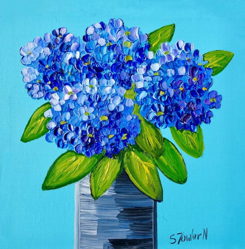
colourful wall art for a navy sofa works best when the artwork solves a particular visual problem instead of merely filling an empty wall. Summer Blues is a useful example because its square format holds a blue-led, atmospheric palette within a clear boundary, allowing the sofa and picture to relate without merging into one dark block.
Balance colourful wall art for a navy sofa with contrast
Begin by separating the two blue areas. Leave visible wall between the top of the sofa and the bottom of the finished frame. That gap prevents the picture from looking like an extension of the upholstery and gives its lighter, warmer and more expressive notes room to register.
Room element
Useful response
Navy upholstery
Let it provide the deepest blue rather than buying several matching cushions.
Pale wall
Keep a generous border of wall around the square framed outline.
Warm timber
Use it to soften the transition between cool colours and the rest of the room.
Small accessories
Repeat one quieter artwork colour once, then stop.
Summer Blues is offered in 265 mm and 500 mm square print sizes before framing. Make paper templates for both finished outlines. Check them from the doorway and the main seat, since a sofa wall often looks much smaller once people, lamps and side tables return.
Blue can create continuity, but contrast gives the artwork its own voice.
Give the square composition a precise framed edge
A blue-led picture depends on tonal separation, especially beside dark upholstery. Colour-managed Giclée production helps subtle changes remain visible, while bespoke framing completed in-house gives the square composition a disciplined edge and ready-to-hang presence.
Colourful wall art for a navy sofa should connect with the furniture without disappearing into it. Summer Blues can lead the scheme, while measured spacing and selective colour echoes keep the whole room confident and clear.