Posted on

Wall Art for a Room With Garden Views: Poppies at Lower Largo

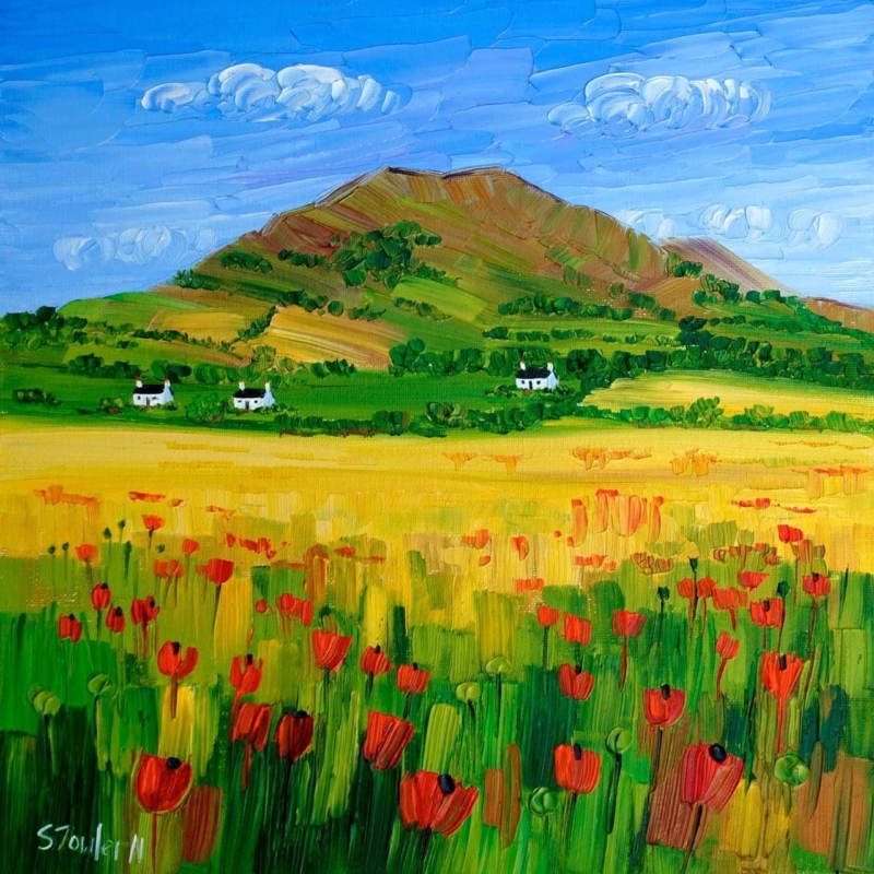
Image of Poppies at Lower Largo by Sheila Fowler

wall art for a room with garden views works best when it responds to the room instead of simply filling an empty surface. Poppies at Lower Largo is a useful example because its poppies create a seasonal colour link to the outdoors while the square composition remains clearly separate from the changing view beyond the glass.

wall art for a room with garden views - Poppies at Lower Largo

Choose wall art for a room with garden views by season

Do not try to reproduce every plant visible outside. Instead, choose one relationship: a shared red, the rhythm of stems or the contrast between cultivated flowers and a wider landscape. The artwork then feels connected even when the garden changes through autumn and winter.


The two square print sizes, 265 × 265 mm and 500 × 500 mm, create different effects. The smaller size can finish a breakfast corner or wall return. The larger option can hold a clearer sightline across a dining or garden room.

Check placement on a bright day. Position the piece where direct glare will not erase the colour, and avoid centring it between two windows if that leaves too little visual space around the finished frame.

Use framing to separate garden colour from the wall

Floral colour needs clarity without becoming harsh. Colour-managed Giclée printing helps retain the shifts within the poppies and landscape, while a bespoke frame made in Falkirk gives the square image a deliberate interior boundary.

For inspiration on seasonal planting and designed views, explore the National Trust for Scotland’s garden at Kellie Castle. You can also browse the Sheila Fowler collection or view the exact framed product.

Wall art for a room with garden views should still offer something the window cannot. Poppies at Lower Largo adds a lasting square composition, coastal identity and colour that remains after the flowers outside have faded.

Posted on

Cloakroom Wall Art With Scottish Wit: Ah Dinnae Ken

Image of Ah Dinnae Ken by Stewart Bremner

cloakroom wall art works best when it responds to the room instead of simply filling an empty surface. Ah Dinnae Ken is a useful example because its portrait format and familiar Scots expression give a small room character without demanding several competing objects.

cloakroom wall art - Ah Dinnae Ken

Keep cloakroom wall art clear and singular

A cloakroom is often seen in a mirror as well as directly. Hold a paper template on the intended wall, close the door and check both views. The 420 × 594 mm print option can suit a vertical space, while the larger 594 × 840 mm option needs more distance than many compact rooms provide.

Three compact-room checks

  • Keep the frame clear of splash zones and towel movement.
  • Allow the wording to be read comfortably from the doorway.
  • Use one characterful piece instead of building a collection of novelty signs.

Let the wall colour do the supporting work. A clean contrast around the frame will make the phrase legible, while restrained accessories stop the joke from becoming a theme.

Give informal wording a properly made finish

Humour does not need a throwaway presentation. In-house Giclée production and bespoke framing give this Scottish phrase crisp definition and a durable, hand-finished presence suited to a carefully decorated home.

For the meaning and history of Scots words and phrases, search Dictionaries of the Scots Language. You can also browse the Stewart Bremner collection or view the exact framed product.

Cloakroom wall art has limited space in which to make an impression. Ah Dinnae Ken does it with one clear phrase, useful portrait proportions and no need for decorative clutter.

Posted on

Contemporary Framed Art Prints: Give A Path Unseen Space to Move

Image of A Path Unseen by Diana Hand

contemporary framed art prints works best when it responds to the room instead of simply filling an empty surface. A Path Unseen is a useful example because Diana Hand’s confident equestrian lines need a clear boundary, yet the horse must still feel able to move beyond the marks.

contemporary framed art prints - A Path Unseen

Use contemporary framed art prints to contain energy

Expressive drawing asks for restraint around the edge. A wide, ornate moulding can turn every charcoal stroke into decoration, while an overly narrow dark frame may close the composition too tightly. Begin with the palest open area in the image and allow the mount to extend that breathing space.

  1. Identify the strongest direction of movement.
  2. Keep nearby furniture clear of that visual route.
  3. Test a quiet timber, black or pale frame against the actual wall.
  4. Judge the complete 420 × 297 mm print presentation from normal viewing distance.

In a study, landing or living room, position the work where people naturally pause. The anatomy and gesture deserve a closer look, but the picture should also read as one assured shape from across the room.

Protect the marks without boxing in the horse

Accurate tonal control keeps charcoal-like marks distinct from the paper ground. Colour-managed Giclée printing supports that separation, while bespoke in-house framing gives the work structure and a hand-finished edge.

To see the artist’s wider approach to equestrian drawing, visit Diana Hand’s own website. You can also browse the Diana Hand collection or view the exact framed product.

The strongest contemporary framed art prints feel resolved but not restricted. A Path Unseen keeps its expressive movement because the surrounding presentation knows when to stay quiet.

Posted on

How Large Should Artwork Be Above a Sofa? Measure A Moment by the Sea

Image of A Moment by the Sea by Colin Robertson

how large should artwork be above a sofa works best when it responds to the room instead of simply filling an empty surface. A Moment by the Sea is a useful example because its horizontal format can relate naturally to seating, while the available 400 × 190 mm and 560 × 270 mm print sizes make proportion easier to discuss.

how large should artwork be above a sofa - A Moment by the Sea

How large should artwork be above a sofa in practice?

MeasurePractical check
Sofa widthUse it as the visual anchor, not the full wall.
Finished frameConfirm the outer size after mount and moulding are added.
Gap above sofaKeep the picture connected to the seating without risking head contact.
Side spaceLeave an even margin so the arrangement can breathe.

A useful starting point is for the finished artwork to occupy roughly half to two-thirds of the sofa width. Treat that as a visual test, not a rigid law. A deep sofa, high back or nearby floor lamp can change what feels balanced.

Mark the finished outline first

Use low-tack tape or paper to mark the proposed outer frame dimensions. Sit down, enter through the main doorway and check the arrangement in evening light before fixing a hook.

Let the frame complete the measurement

The print dimension is only part of the decision. Bespoke framing adds the mount, moulding and glazing that create the true wall footprint. First 4 Frames completes that work in-house and uses colour-managed Giclée production for the coastal detail.

For a broader reminder to record dimensions carefully, consult RICS consumer guidance on measuring up. You can also browse the Colin Robertson collection or view the exact framed product.

When asking how large should artwork be above a sofa, measure the furniture and the finished frame together. A Moment by the Sea offers calm horizontal movement without overwhelming the seating below.

Posted on

Animal Wall Art With a Story: A Bear Who Carried a Kingdom

In "A Bear Who Carried A Kingdom," a giant bear carries a basket of colorful houses, while a red-cloaked figure with a sword stands atop its head in a mystical, foggy landscape with barren trees.

animal wall art works best when it responds to the room instead of simply filling an empty surface. A Bear Who Carried A Kingdom is a useful example because its steady bear, scarlet rider and cluster of glowing windows invite a story that can keep unfolding over time.

animal wall art - A Bear Who Carried A Kingdom

Choose animal wall art that rewards another look

A narrative image can make a reading corner feel shared across generations without turning it into a themed children’s space.

Look first at emotional tone. The bear feels protective rather than threatening, while the carried kingdom introduces scale, shelter and adventure. That balance makes the picture suitable for an older child’s room, family library or landing where both adults and children will encounter it.

  • Leave enough space to notice the tiny windows and rider.
  • Echo one muted woodland tone rather than every colour.
  • Keep toys and animal ornaments away from the wall so the story remains open.

A chair and a warm lamp are enough to complete the setting. The artwork provides its own cast of characters, so additional narrative decoration would only narrow the viewer’s imagination.

Give imaginative detail a lasting presentation

The soft gold light, bare branches and fine architectural details need accurate reproduction. First 4 Frames combines colour-managed Giclée production with hand-finished bespoke framing in Falkirk, helping the quieter marks stay legible.

For another source of imaginative reading and storytelling, explore the Scottish Poetry Library. You can also browse the Matylda Konecka collection or view the exact framed product.

Animal wall art can be thoughtful, mysterious and easy to live with. A Bear Who Carried a Kingdom brings wildlife and fable together in one considered focal point.

Posted on

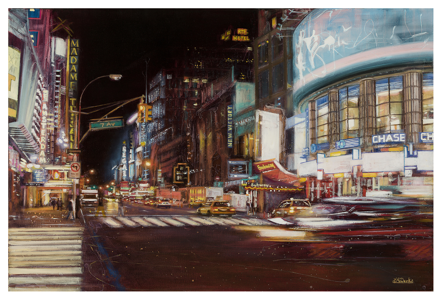
Wall Art for a Room With Statement Lighting: Let 7th Avenue Glow

7th Avenue, New York" depicts a lively city street at night with neon signs, bright lights, yellow taxis, blurred headlights, bustling pedestrians, and landmarks like Chase and Madame Tussauds.

wall art for a room with statement lighting works best when it responds to the room instead of simply filling an empty surface. 7th Avenue, New York is a useful example because its night-time city light has enough energy to answer a striking fitting without trying to imitate its shape.

wall art for a room with statement lighting - 7th Avenue, New York

Balance wall art for a room with statement lighting

Begin by deciding which feature is seen first from the doorway. If a pendant already commands the centre of the room, place the artwork on a quieter sightline. The city scene can then add a second layer of light and movement rather than becoming a rival focal point.

In daylight

Check that the darker passages retain detail and that direct window glare does not flatten the illuminated signs.

After dark

Dim the main fitting and view the print from the usual seat. A separate picture light is rarely needed if nearby ambient light reveals the scene clearly.

Repeat one warm city tone in a small object, but avoid surrounding the work with metallic accessories. The painting already supplies sparkle, traffic and urban rhythm.

Frame the city glow without adding glare

Night scenes rely on controlled blacks and small shifts in warm light. Colour-managed Giclée printing helps preserve that separation, while a bespoke frame made in-house gives the busy city image a calm, precise edge.

For context on how the real city is illuminated, see New York City’s guidance on street lighting. You can also browse the Lesley Anne Derks collection or view the exact framed product.

Good wall art for a room with statement lighting does not need to compete for brightness. 7th Avenue, New York contributes its own after-dark energy while the frame keeps the relationship orderly.

Posted on

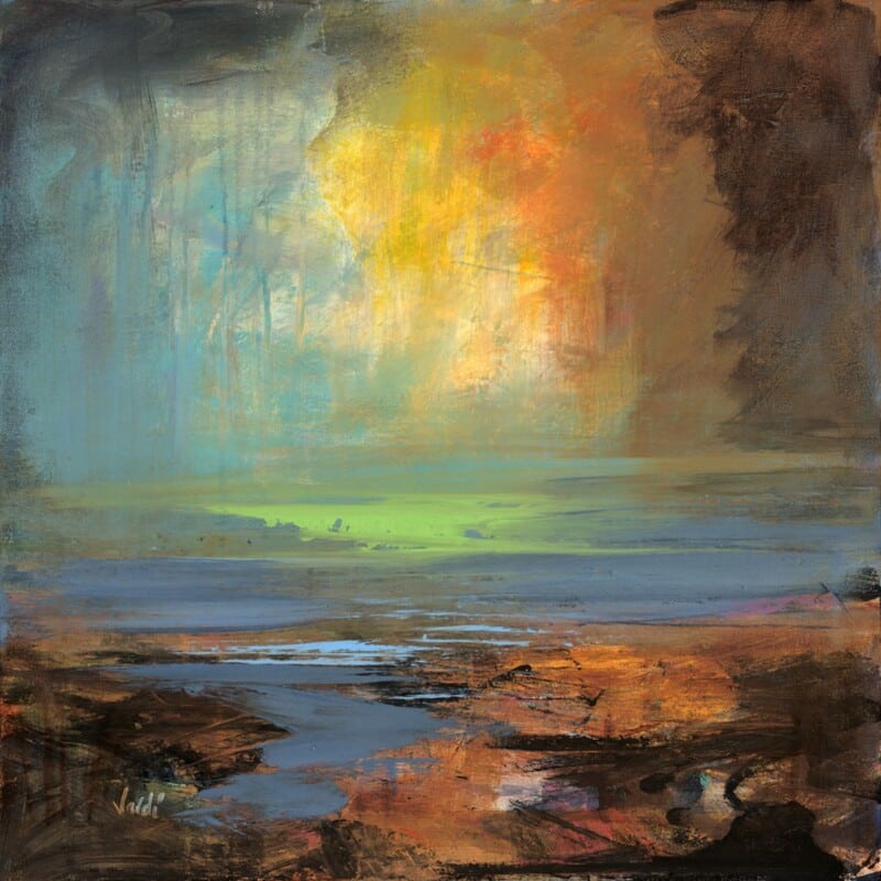
Reading Nook Wall Art: Let Kilbrachan Sound Create a Quiet Horizon

Image of Kilbrachan Sound by Arie Vardi

reading nook wall art is easiest to choose when the room, wall and mood are considered together. Kilbrachan Sound offers a practical example: its calm water and open distance can make a compact corner feel like a place to pause rather than simply a chair beside a wall

reading nook wall art - Kilbrachan Sound

Build a reading nook around one visual pause

Begin with the chair and the light. The artwork should be visible from the seat, but it should not sit directly behind a reading lamp or compete with the book in your hands. A modest landscape can provide visual travel between pages without demanding attention.


Keep the supporting arrangement simple: one shelf, a small table and perhaps a single textile echo from the image. Sit down before fixing the height; the centre should feel natural from the reading position.

Frame a quiet image with quiet confidence

Fine landscape detail benefits from accurate colour and a clean presentation. Colour-managed Giclée production and bespoke in-house framing give Kilbrachan Sound the clarity and hand-finished quality a small focal point deserves.

Learn more about Scotland’s lochs through Scotland.org’s loch guide. For more work by Arie Vardi, browse the artist collection or view the exact product.

Reading nook wall art works best when it helps the corner feel separate from the rest of the room. Kilbrachan Sound supplies that sense of distance while keeping the atmosphere calm and liveable.

Posted on

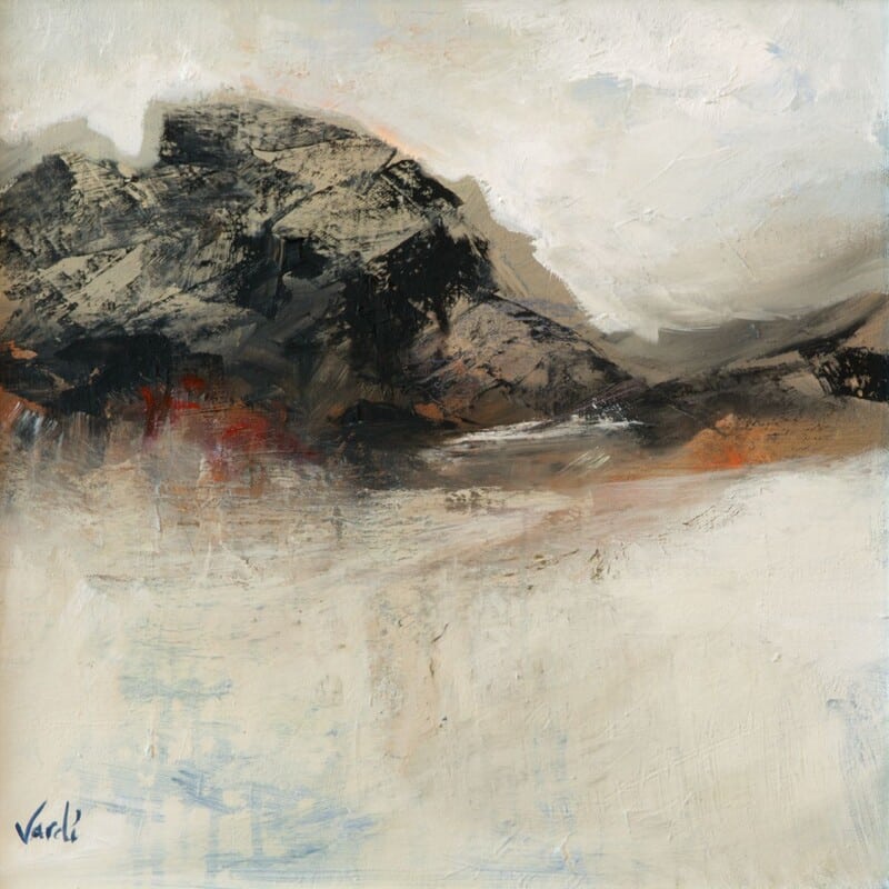
Framed Art Prints UK Buyers Can Live With: Harr Over the Glen

Image of Harr Over the Glen by Arie Vardi

framed art prints UK is easiest to choose when the room, wall and mood are considered together. Harr Over the Glen offers a practical example: its atmospheric Scottish setting gives the framed print identity, while its balanced composition makes it easy to live with

framed art prints UK - Harr Over the Glen

What to look for in framed art prints UK homes

  1. Choose a subject with a personal or regional connection.
  2. Check the full framed dimensions against the intended wall.
  3. Consider how the print will look in daylight and lamplight.
  4. Use the frame to separate the artwork from the wall colour.

A good framed print should feel finished before accessories are added. That makes it useful in a new home, a sitting room refresh or a thoughtful Scottish housewarming gift.

Quality is visible at the edge

The frame, mount and print need to work as one presentation. First 4 Frames produces and finishes work in-house in Falkirk, combining colour-managed Giclée printing with bespoke craftsmanship and personal service.

For regional travel inspiration, see VisitScotland’s Highlands guide. For more work by Arie Vardi, browse the artist collection or view the exact product.

For buyers comparing framed art prints UK options, Harr Over the Glen offers the useful combination of place, atmosphere and a superior quality finish designed for everyday living.

Posted on

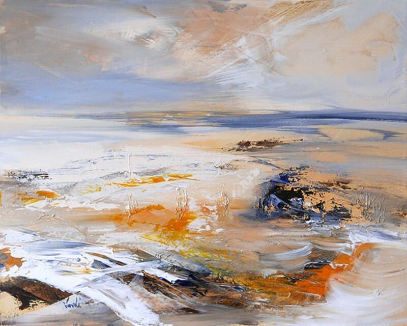
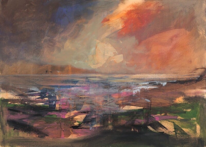
Bedroom Wall Art That Keeps the Morning Calm: The Sound of Mull

Image of The Sound of Mull by Arie Vardi

bedroom wall art is easiest to choose when the room, wall and mood are considered together. The Sound of Mull offers a practical example: its quiet water and spacious composition can support rest while still giving the room a meaningful focal point

bedroom wall art - The Sound of Mull

Choose bedroom wall art by its after-dark character

Artwork that looks attractive in bright daylight may feel too forceful beside bedside lighting. Look for a composition with open area to remain restful at night, then test the wall colour and frame beside the actual lamp.

CheckWhat to look for
PlacementAvoid glare across the pillow sightline.
ScaleRelate the finished width to the bed.
ColourChoose one quiet echo rather than matching every tone.

Make the finish part of the restful mood

Subtle water and sky require careful tonal control. Colour-managed Giclée production preserves that restraint, and in-house bespoke framing provides a polished edge without unnecessary visual weight.

Discover more about Mull through Visit Mull and Iona. For more work by Arie Vardi, browse the artist collection or view the exact product.

The best bedroom wall art gives the room a gentle final view at night and a positive first view in the morning. The Sound of Mull achieves that through space, light and quiet character.

Posted on

Art for a Hallway: Use Head of the Loch, Arran to Lead the Eye

Image of Head of the Loch, Arran by Arie Vardi

art for a hallway is easiest to choose when the room, wall and mood are considered together. Head of the Loch, Arran offers a practical example: its receding landscape gives a passage somewhere for the eye to travel, making an everyday route feel more deliberate

art for a hallway - Head of the Loch, Arran

Make art for a hallway work with movement

Follow the route

Hang the picture where it can be seen from the approach, not only beside it. A landscape with recession can make the hallway feel less like leftover circulation space.

Protect the width

Measure door swings, radiators and sightlines. One well-sized framed piece is stronger than several small works that make a narrow wall feel busy.

Use framing to give the passage a pause

Hallway light can change quickly from window to lamp. A colour-managed Giclée print and a hand-finished bespoke frame help the landscape keep definition as viewing conditions shift.

For ideas about Arran’s scenery, visit VisitArran. For more work by Arie Vardi, browse the artist collection or view the exact product.

Good art for a hallway adds a destination without obstructing the route. Head of the Loch, Arran gives a narrow space depth, welcome and a clear visual pause.