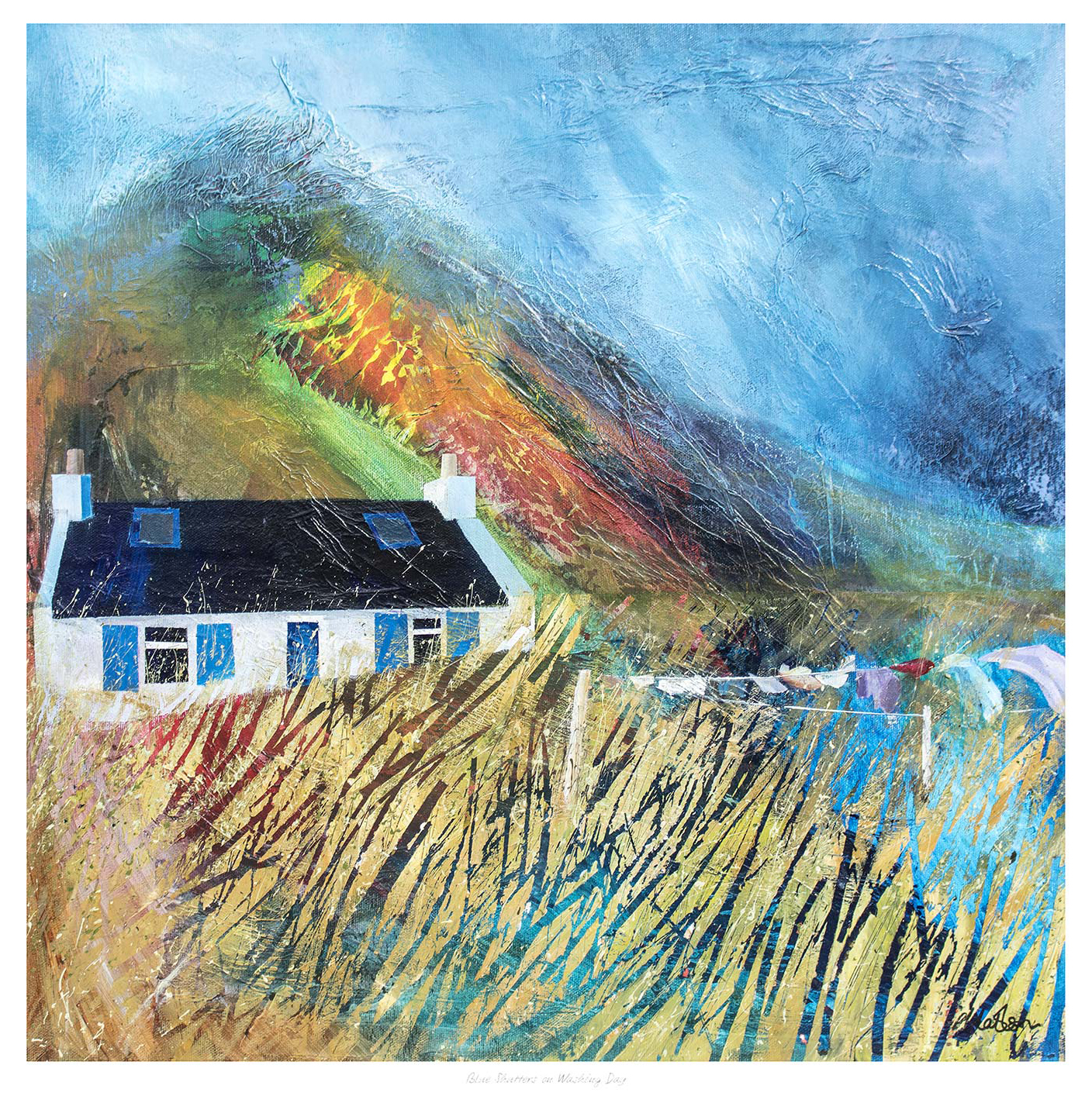
Good art for a hallway should make the entrance feel more welcoming before the rest of the home has even come into view. Hallways are often tighter, more transitional spaces, so the artwork needs to bring life without creating clutter. Blue Shutters on Washing Day does that especially well, offering colour and charm while still feeling comfortably balanced on the wall.
Why hallways benefit from artwork with warmth and movement
Entrance spaces can feel purely functional if every decision is practical. One framed piece with enough rhythm and personality can change that completely. Blue Shutters on Washing Day helps a hallway feel less like a passage and more like a proper part of the home.
It gives a narrower wall more energy without making it feel busy.
It helps the first impression of the home feel friendlier and more personal.
It works well where painted woodwork, tiled floors, or simple storage already shape the space.
This is often exactly what a hallway needs, especially when the rest of the decor is still quite restrained and the entrance needs a more memorable visual note.
Why a hand-finished frame helps the entrance feel complete
First 4 Frames completes every piece in-house in Falkirk with bespoke framing, colour-managed Giclee printing, and hand-finished craftsmanship. That superior finish is useful in a hallway because smaller transitional spaces tend to show the quality of each detail more clearly.
You can explore more from Fiona Matheson and view the exact framed artwork here.
If you want art for a hallway that feels welcoming, bright, and properly finished, Blue Shutters on Washing Day is a very appealing choice.
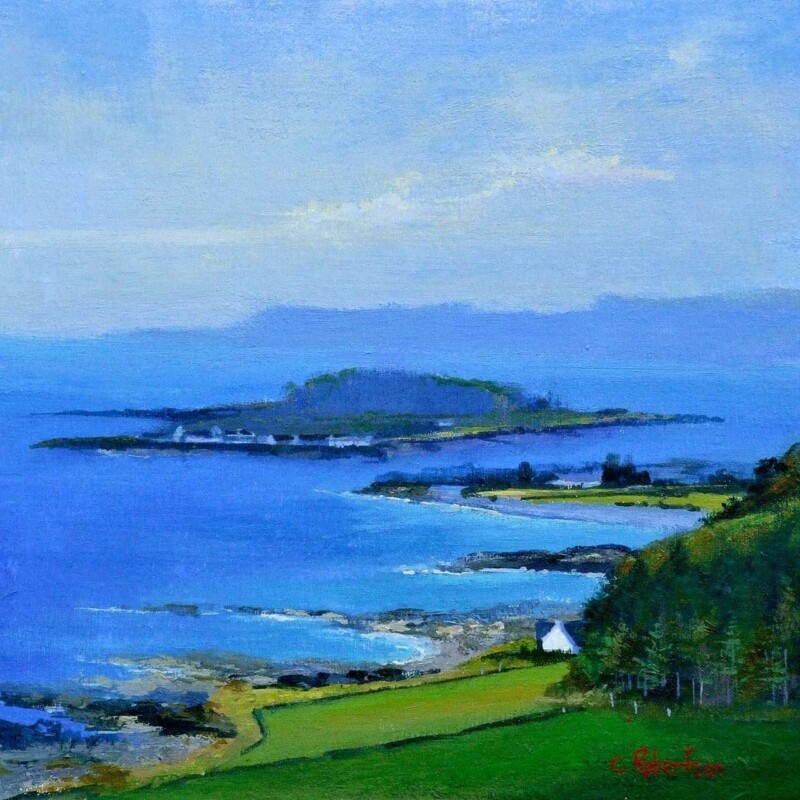
Choosing wall art for brushed brass interiors is often about balance. Brass details add warmth and quiet luxury, but they can also make a room feel a little too crisp if the surrounding artwork is overly sharp or formal. Sea Meets Skye, Easdale works beautifully here because it softens the scheme with atmosphere, colour variation, and a more natural sense of movement.
Why brass finishes benefit from softer artwork
Brushed brass appears in lighting, handles, shelving details, and occasional furniture. It brings warmth, but it also introduces a gentle sheen that can dominate if everything around it feels equally hard-edged. Artwork with layered tone and a calm horizon line helps the room feel more settled and less purely styled around the fittings.
It tempers metallic details without fighting them.
It adds depth to cream, sand, stone, or muted blue palettes often paired with brass.
It helps a room feel collected and composed rather than designed around one finish.
Why Sea Meets Skye, Easdale is such a good match
The print has enough mood to hold its own, yet it still feels restful. That makes it a strong choice above a console, in a bedroom, or in a calmer sitting room where brass accents need a visual counterweight. The landscape quality keeps the overall effect grounded, while the hand-finished presentation from First 4 Frames gives the piece the kind of refinement that suits a well-considered interior.
First 4 Frames completes each framed print in-house in Falkirk using bespoke framing, colour-managed Giclee printing, and superior craftsmanship. That quality-led finish matters when you are pairing artwork with stronger material choices and want every detail to feel intentional.
You can discover more by Colin Robertson and see the exact framed product here.
If you are looking for wall art for brushed brass interiors that feels calm, nuanced, and easy to live with, Sea Meets Skye, Easdale is a very strong option.
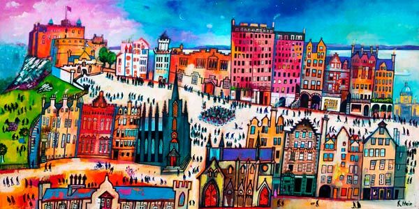
Good townhouse stairway wall art should do more than fill a blank section of wall. A stairway is a moving viewpoint. People see it in passing, from below, and again as they turn on the landing. Marching the Mile works particularly well in that setting because it has rhythm, colour, and enough life in the scene to keep the eye engaged as you move through the house.
Why stairways need a different kind of artwork
Unlike a sitting room wall, a stairway often has height, movement, and narrower viewing angles. The artwork needs presence, but it should not feel heavy or static. In a townhouse especially, this part of the home helps connect one floor to the next, so it benefits from a framed piece that adds energy and identity rather than simply occupying the space.
It helps a tall wall feel intentional rather than slightly empty.
It gives the journey between floors more character and continuity.
It can introduce local interest without making the entrance feel formal.
Why Marching the Mile suits the setting
The sense of movement in the piece makes it especially effective on a stairway wall, where people rarely stand still for long. The Edinburgh scene gives it strong personality, while the framing from First 4 Frames keeps the finished piece polished and well judged. That balance matters in a hallway or stairway where the artwork helps shape the first impression of the home.
Every framed print is completed in-house in Falkirk using bespoke framing, colour-managed Giclee printing, and hand-finished craftsmanship. That superior quality helps a transitional space feel considered rather than improvised, especially in homes where architectural details already carry a lot of visual weight.
You can explore more work by Rob Hain and view the exact framed product here.
If you want townhouse stairway wall art that feels lively, rooted, and properly finished, Marching the Mile is well worth considering.
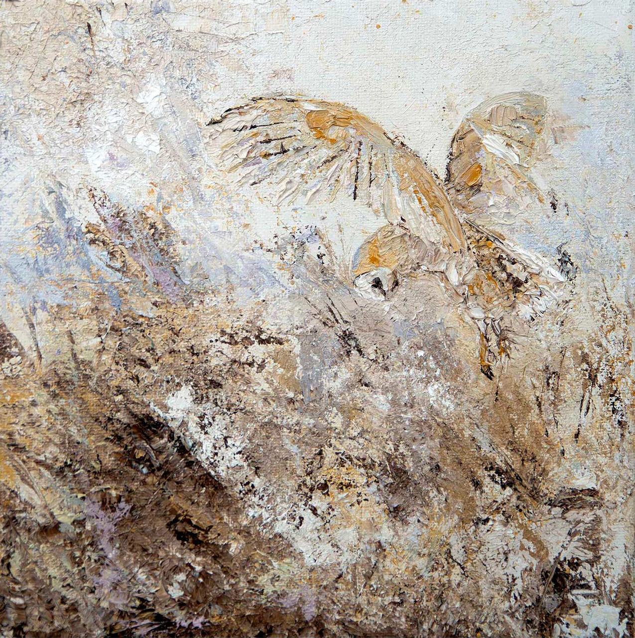
The best animal wall art does more than show a favourite subject. It should help a room feel warmer, more personal, and more resolved. Barn Owl is a particularly good example because it brings natural character without making the wall feel themed or overly decorative.
Why animal artwork works best when it feels observed rather than obvious
There is a clear difference between a piece that simply announces its subject and one that genuinely contributes to the room. Barn Owl falls into the second category. It has enough quiet detail and presence to feel elegant, which makes it easier to place in grown-up interiors than more novelty-led animal imagery.
Animal wall art is strongest when it brings character to the room without asking the whole scheme to revolve around it.
This makes it especially suitable for bedrooms, halls, studies, or guest rooms where a softer natural focus often works better than something louder.
Why framing helps the subject feel more considered
First 4 Frames produces each piece in-house in Falkirk with bespoke framing, colour-managed Giclee printing, and hand-finished craftsmanship. That level of finish is what helps animal imagery feel polished and display worthy rather than casual or temporary.
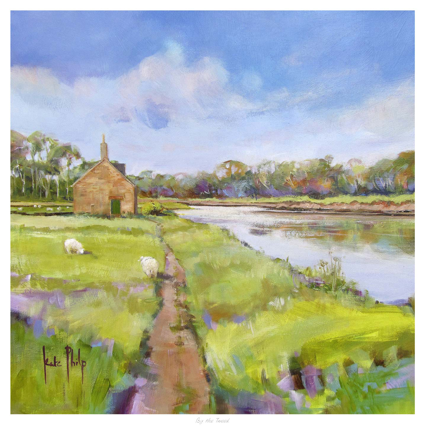
Well chosen landscape wall art can steady a room in a way few other subjects manage. It brings space, atmosphere, and a gentler focal point without feeling empty. By the Tweed is especially effective because it offers calm depth and a clear sense of place while still feeling easy to live with day after day.
Why landscape artwork remains such a useful decorating choice
Landscape pieces often succeed because they expand the mood of a room rather than narrowing it. They can make a wall feel more open, but the stronger examples also add enough structure to stop the space feeling vague. By the Tweed strikes that balance very well, which makes it suitable for quieter living rooms, bedrooms, and studies.
It gives the eye somewhere calm to settle without becoming bland.
It works across both traditional and more contemporary interiors.
It adds a stronger sense of place without dominating the wider scheme.
This is often exactly what people want when the room already functions well but still lacks one unifying visual element.
Why a superior framed finish keeps the effect refined
First 4 Frames completes each piece in-house in Falkirk with bespoke framing, colour-managed Giclee printing, and hand-finished craftsmanship. That quality matters because quieter artwork depends on finish and balance just as much as louder statement pieces do.
You can explore more from Kate Philp and view the exact framed print here.
If you want landscape wall art that feels calm, lasting, and room-ready, By the Tweed is well worth considering.
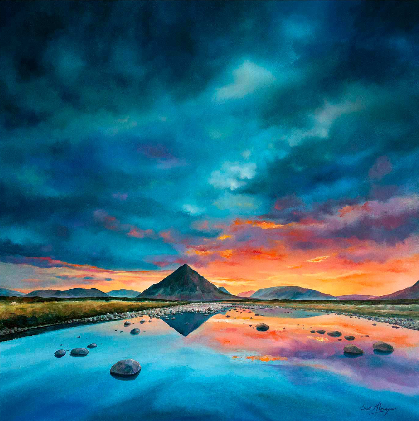
People looking for bespoke framed wall art are usually trying to avoid something that feels standard or lightly finished. They want artwork that looks properly considered once it is on the wall. Buachaille Etive Mor Glencoe is a strong example because both the image and the final presentation carry enough presence to feel lasting from the start.
Why bespoke presentation changes how artwork sits in a room
The difference is not only visual. A bespoke framed piece tends to feel more connected to the room itself. It looks chosen rather than merely added. Buachaille Etive Mor Glencoe works especially well in that respect because the subject has enough scale and atmosphere to reward a more careful finish.
Bespoke framed wall art feels stronger because the final result is about presentation as well as the image.
That matters in living rooms, offices, and entrance spaces where the artwork needs to steady the room rather than simply occupy blank space.
Why First 4 Frames is well placed for this kind of piece
First 4 Frames produces each work in-house in Falkirk with bespoke framing, colour-managed Giclee printing, and hand-finished craftsmanship. That level of care is exactly what buyers are usually looking for when they move beyond off-the-shelf wall decor and want something with more confidence and longevity.
You can browse more from Scott McGregor and see the exact framed print here.
If you are weighing up bespoke framed wall art, Buachaille Etive Mor Glencoe is a very good illustration of how better presentation can elevate the whole room.
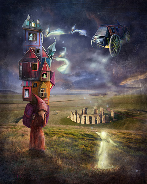
Good modern framed wall art should bring energy to a room without disturbing the calm that makes modern interiors work. That balance can be hard to find. Secret Beliefs does it especially well, adding personality and visual movement while still feeling composed enough for everyday living.
Why cleaner interiors often need one piece with more imagination
Rooms with simpler furniture lines and fewer decorative layers can look excellent, but they often rely on one or two stronger decisions to stop the space feeling too pared back. Secret Beliefs gives that kind of interior a more expressive focal point without making the wall feel crowded.
It adds movement and story to a room that already feels quite disciplined.
It works well where the furniture is modern but the space still needs warmth.
It helps the room feel collected rather than merely minimal.
This is particularly useful in living spaces, studies, or hallways where the rest of the palette is restrained and the artwork needs to do more of the visual lifting.
Why the framed finish matters just as much as the image
First 4 Frames completes each piece in-house in Falkirk with bespoke framing, colour-managed Giclee printing, and hand-finished craftsmanship. That superior presentation keeps a more imaginative image feeling polished and intentional rather than loose or novelty led.
You can explore more from Matylda Konecka and view the exact framed print here.
If you want modern framed wall art that feels lively, refined, and easy to live with, Secret Beliefs is a compelling option.
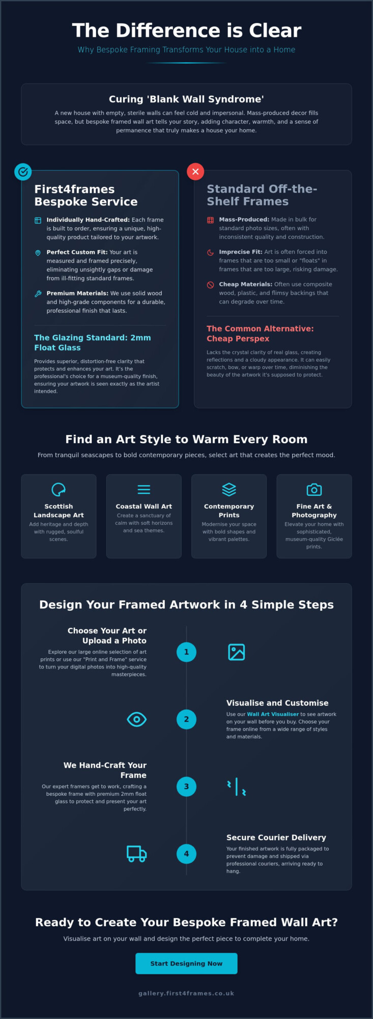
Why does a brand new house, with its pristine paint and perfect finishes, often feel like a cold showroom rather than a sanctuary? It’s a common frustration for new homeowners who find themselves staring at “blank wall syndrome,” unsure how to inject warmth without ruining the aesthetic. Choosing the right art to make a new house feel like a home is about more than just filling space; it’s about selecting pieces that resonate with your story. Whether you’re drawn to the beauty of Scottish landscape art, fine art, or photography prints, your walls should be a reflection of your personality.
We know that the fear of picking the “wrong” piece often leads to empty rooms. This guide simplifies the journey, showing you how to use a wall art visualiser to visualise art on your wall and see artwork before you buy. You’ll discover how bespoke framed wall art, crafted with premium 2mm float glass rather than cheap perspex, provides the clarity your home deserves. From contemporary art prints to landscape wall art, we’ll show you how to choose your frame online and design your framed artwork using professional online picture framing and an expert art print framing service to ensure every piece arrives safely via specialist courier.
Key Takeaways
Understand how to choose art to make a new house feel like a home by replacing empty, sterile walls with bespoke pieces that add immediate character.
Explore various aesthetic styles like coastal wall art and Scottish landscape art to find the perfect match for your room’s specific mood.
Learn why premium 2mm float glass is essential for clarity and how it outperforms the cheap perspex used by standard retailers.
Use a wall art visualiser to see artwork before you buy, ensuring the scale and frame style are perfect for your space before you order.
Discover how our professional “print and frame” service turns your digital photos into high-quality, bespoke framed wall art with secure courier delivery.
Curing ‘Blank Wall Syndrome’: Why Bespoke Framed Wall Art Matters
Walking into a newly built property feels exciting, yet the silence of those pristine, white surfaces can be unsettling. This is often called “blank wall syndrome,” where the lack of texture and history makes a space feel temporary or sterile. To solve this, you need more than just decor; you need art to make a new house feel like a home. While mass-produced posters might fill a gap, they don’t offer the permanence or depth required to truly anchor a room. A room without art lacks a narrative, but a carefully placed frame tells a story about who lives there.
Bespoke framed wall art acts as the “soul” of your living space. It transforms a house into a sanctuary by reflecting your personal taste and experiences. By applying the fundamental principles of interior design, you can use art to create focal points that suggest a lived-in history. Unlike a showroom, a home should feel curated over time. Selecting custom framed art prints provides that essential sense of belonging, moving your space from a construction project to a personal retreat.
To better understand this concept, watch this helpful video:
Quality Over Quantity: The Bespoke Difference
Standard shop-bought frames often use thin perspex, which lacks clarity and can warp over time. We believe in a different approach. Bespoke framing is a hand-made process where every frame is individually crafted to ensure every piece is unique and fits your artwork perfectly. Using premium 2mm float glass ensures superior clarity, providing a professional finish that mass-market plastic simply cannot match.
Seeing real materials like wood and glass in your home provides a psychological sense of stability and quality. Our art print framing service protects your investment while helping you choose your frame online with ease. We package your bespoke framed wall art securely for shipping via professional couriers, ensuring it arrives in perfect condition to transform your environment.
A Roundup of Art Styles to Warm Every Room
Selecting the right art to make a new house feel like a home is about more than just matching colours. It’s about creating a visual language that resonates with your emotional needs. Citing the psychological benefits of art, experts note that curated surroundings can significantly reduce stress and increase your sense of belonging. Each room in a new build offers a fresh canvas to define these moods through different genres.
Scottish landscape art: Bring the rugged, soulful beauty of the Highlands into your living room. These textures add a sense of heritage and depth to modern, clean-lined interiors.
Coastal wall art: Maritime themes and soft horizons create a sanctuary of calm. These pieces are particularly effective in bedrooms and bathrooms where tranquility is essential.
Contemporary art prints: Use bold abstract shapes and vibrant palettes to modernise traditional spaces or provide a striking focal point in a minimalist hallway.
Fine art and photography prints: Elevate a home office or study with museum-quality Giclée prints. Whether you choose works by famous artists or best-selling artists, high-fidelity bespoke framed wall art provides a sophisticated, professional finish.
Curating for Connection
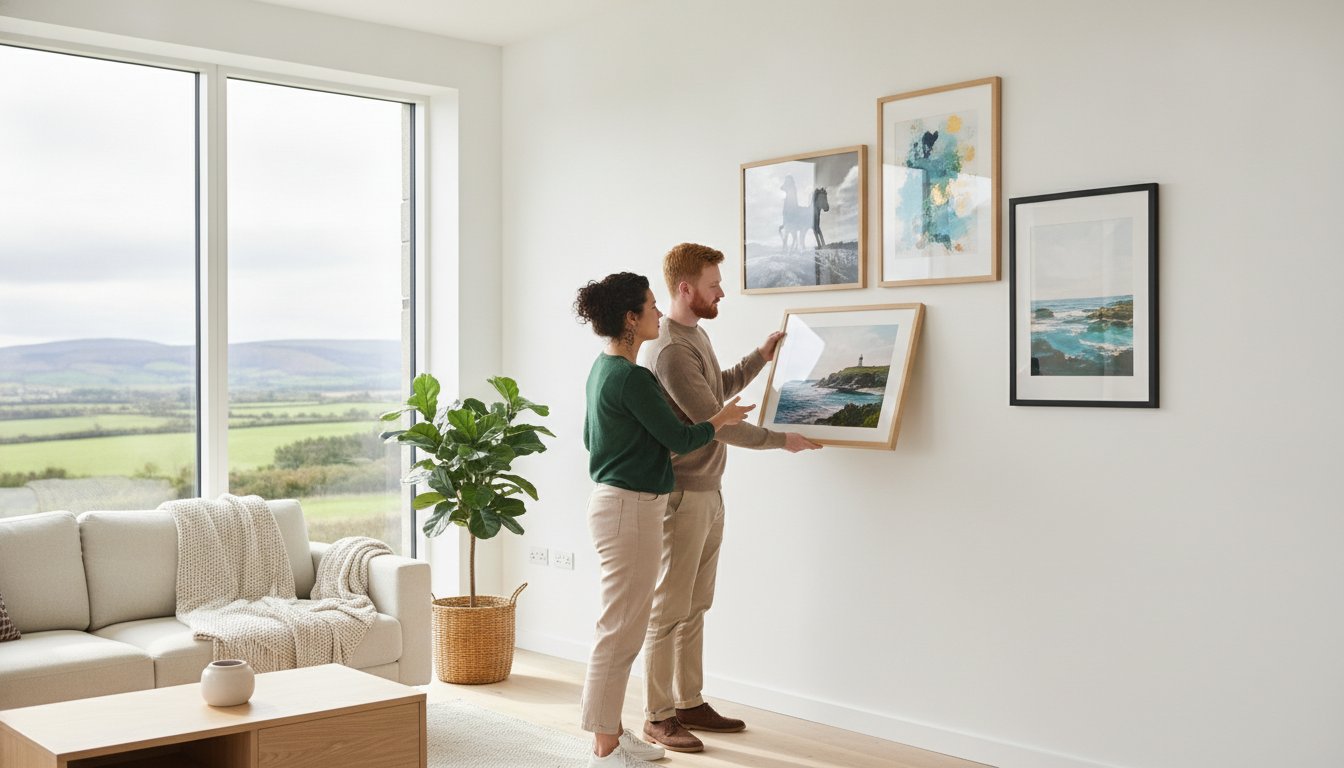
Personalising your space requires a balance between the artwork and the architecture. You can use our wall art visualiser to visualise art on your wall and see artwork before you buy. This tool allows you to design your framed artwork by testing different combinations. When you choose your frame online, consider how the wood tones or metallic finishes complement your existing furniture. Supporting local talent and landscape wall art specialists ensures your home feels authentic rather than generic. You can explore our full range of curated collections in our online art gallery.
The ‘Print and Frame’ Service for Personal Memories
Sometimes the best custom framed art prints aren’t found in a gallery but in your own camera roll. Our photo printing and framing online service allows you to transform digital photography into professional-grade wall decor. We use an art print framing service that matches the high standards of our bespoke frames. Every order is individually hand-made using premium materials, including 2mm float glass for superior clarity. Your finished memories are fully packaged to prevent damage and shipped via professional couriers, ensuring your personal history is preserved with the same care as a masterpiece.
The Craftsman’s Secret: Why Your Glazing and Framing Matter
Quality is the silent partner of style. When choosing art to make a new house feel like a home, the physical construction of the piece is just as vital as the image itself. Many mass-market retailers use standard-sized, pre-made frames and cheap perspex glazing. This often leads to a dull, plastic-like finish that reflects light poorly and can warp over time. We reject this approach in favour of traditional craftsmanship that treats every piece with the respect it deserves.
Our gold standard is 2mm float glass. This premium material offers superior clarity, allowing the true colours and textures of your bespoke framed wall art to shine through without the milky distortion often found in plastic alternatives. Every frame we produce is individually crafted for your specific order. This hand-made process ensures a perfect fit for your artwork, providing a level of structural integrity and aesthetic perfection that standard frames simply cannot reach. When you design your framed artwork with us, you’re choosing a product built to professional gallery standards.
We also understand that your investment needs to arrive safely to truly transform your space. Finished frames are fully packaged using specialized materials to prevent any damage during transit. By using professional couriers instead of standard postal services, we ensure your custom framed art prints arrive in pristine condition, ready to hang the moment they reach your door.
Preservation and Longevity
A home is a long-term sanctuary, so your art should be built to last. We use high-quality Giclée prints to ensure exceptional colour fidelity and resistance to fading. When combined with our professional online picture framing, these materials prevent the paper from warping or the colours from losing their vibrancy. Whether you’re displaying Scottish landscape art or contemporary art prints, our art print framing service guarantees that your walls will look as beautiful in a decade as they do today. You can browse our collection of custom framed art prints to find a piece that stands the test of time.
How to Design Your Framed Artwork Online
Transforming your space shouldn’t be a guessing game. While some suggest just “eyeballing” the size, professional results require better tools. Using a wall art visualiser allows you to see artwork before you buy, ensuring the scale is perfect for your specific room. This technology bridges the gap between digital browsing and physical reality, helping you find the right art to make a new house feel like a home.
The process is a simple, three-step journey. First, browse our gallery to find a piece that speaks to you, whether it’s Scottish landscape art or contemporary art prints. Second, choose your frame online from our extensive selection of hand-crafted mouldings. Finally, use the wall art visualiser to visualise art on your wall. These online picture framing tools let you experiment with different mount widths and frame styles until the combination is exactly right.
Step-by-Step Customisation
Finalising Your Home’s Look
Once your art arrives, fully packaged and delivered by professional couriers, it’s time for the final touch. For a cohesive feel, hang pieces so the centre is at eye level. If you’re creating a gallery wall, lay the frames out on the floor first to test the arrangement. Understanding dimensions is key to a perfect fit. You can learn more about standard photo and picture sizes to plan your layout effectively. Every home deserves the warmth of quality art.
Our art print framing service ensures your custom framed art prints are presented with the clarity and protection they deserve. Start curating your home today at First4Frames Gallery and experience the difference that professional craftsmanship makes.
Transform Your Space with Bespoke Artistry
Your journey from a sterile new build to a characterful sanctuary starts with the right choices. You’ve seen how professional glazing and individually hand-crafted frames provide a level of clarity and permanence that mass-market alternatives simply can’t match. By using our digital tools, you can confidently select art to make a new house feel like a home without the fear of making a mistake. Every frame we produce is hand-crafted in the UK using superior 2mm float glass as standard; this ensures your investment is protected and beautifully presented.
We are proud to collaborate with best-selling Scottish artists to bring you a collection that is as unique as your new space. Whether you’re hanging a sprawling landscape or a personal photograph, the craftsmanship behind the frame is what creates that essential lived-in feel. It’s time to stop looking at blank walls and start telling your story. Visualise art on your wall and start your collection today. We’re here to help you turn every room into a place you’re truly proud to call home.
Frequently Asked Questions
How do I choose the right size art for a large blank wall?
You should aim for artwork that occupies between 60% and 75% of the available wall space to achieve a balanced, professional look. Using our wall art visualiser is the most effective way to ensure the scale is correct before you commit to a purchase. This tool allows you to see artwork before you buy by projecting the piece onto a digital representation of your room. It prevents the common mistake of choosing a piece that is too small for a large new-build wall.
What is the difference between float glass and perspex in picture frames?
We use 2mm float glass as our standard because it provides superior clarity and doesn’t warp or scratch as easily as plastic. Many mass-market competitors use cheap perspex, which often has a milky appearance and can distort the colours of your bespoke framed wall art. Real glass offers a professional, gallery-quality finish that significantly enhances the visual impact of your prints. It’s an essential component for achieving a high-end look that lasts for years in your new home.
Can I turn my own photos into professional framed wall art?
Yes, our specialized “print and frame” service transforms your digital memories into museum-quality custom framed art prints. This is a wonderful way to find the perfect art to make a new house feel like a home by using your own personal photography. We print your images to the highest professional standards, ensuring they match the quality of our individually crafted frames. Every order is hand-made to your specific requirements to ensure a perfect fit and a truly unique finish.
How do I make sure my framed art won’t be damaged during delivery?
We protect your investment by ensuring every frame is fully packaged in specialized, impact-resistant materials before it leaves our workshop. Unlike standard postal services, we use professional couriers who are experienced in handling fragile, bespoke items. This logistical care ensures that your custom framed art prints arrive in pristine condition. We take full responsibility for the journey, so you can focus on finding the perfect spot for your new art without worrying about transit risks.
What art styles are best for a modern new-build house?
Modern new-builds benefit from styles that add texture and organic depth, such as Scottish landscape art or coastal wall art. These genres introduce natural elements that soften the sharp lines of contemporary architecture. You might also consider contemporary art prints with bold abstract shapes to create a striking focal point in a minimalist room. Our gallery features landscape wall art by best-selling artists, allowing you to design your framed artwork to match your home’s unique personality perfectly.
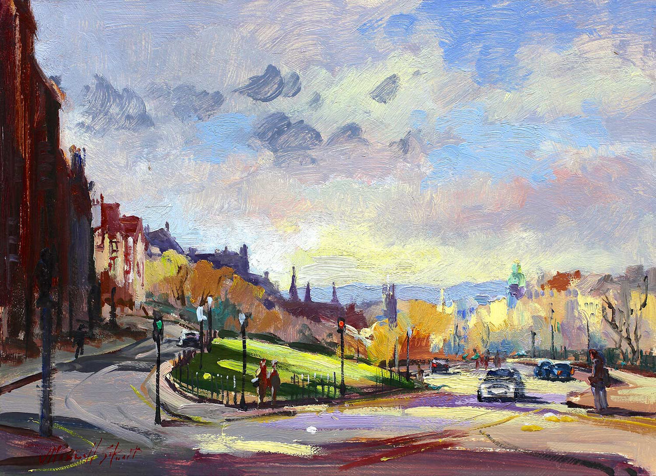
Strong Scottish wall art should feel connected to place without becoming predictable. That matters when you want art that reflects Scotland in a more personal and lived-in way, rather than simply ticking a box. The Mound, Edinburgh is particularly effective because it combines recognisable location with enough energy and painterly interest to hold a room on its own merits.
Why local character often gives a room more staying power
Artwork with a real sense of place can make a room feel more rooted and individual. It often creates a stronger response than something more generic because it gives people both atmosphere and recognition. The Mound, Edinburgh does this well, making it a good fit for halls, studies, and living spaces that want more identity.
It adds local character without feeling themed.
It works well where you want a talking point that still feels refined.
It helps a room feel more personal and less interchangeable.
This is especially appealing for homes where Scottish references matter, but the overall interior still needs to feel polished and easy to live with day after day.
Why the finish matters as much as the subject
First 4 Frames completes every piece in-house in Falkirk with bespoke framing, colour-managed Giclee printing, and hand-finished craftsmanship. That superior presentation ensures the artwork feels considered and lasting rather than casual or novelty led.
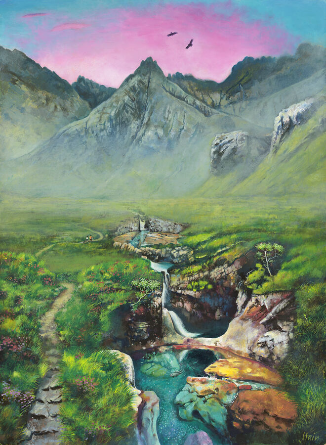
Many people search for Isle of Skye prints because they want to keep a connection with a place that matters to them. The challenge is finding something that still feels refined enough for everyday living. Glen Brittle, Home of the Fairy Pools answers that beautifully, giving the room a clear sense of place without slipping into a souvenir look.
Why place-led artwork needs more than recognition alone
A strong Skye image should do more than remind you of where you have been. It should bring atmosphere, colour, and enough visual depth to keep rewarding attention over time. Glen Brittle, Home of the Fairy Pools works well because it balances location with mood, making it suitable for the home long after the memory of the trip itself.
The best place-led prints keep their emotional connection without feeling tied to a single season or travel moment.
This makes the piece especially useful in living rooms, hallways, and studies where you want artwork with both personal meaning and real decorative value.
Why First 4 Frames presentation adds staying power
First 4 Frames finishes each piece in-house in Falkirk with bespoke framing, colour-managed Giclee printing, and hand-finished craftsmanship. That superior quality helps the artwork feel lasting and room-ready, which matters when the goal is something more substantial than a passing reminder.
You can explore more from Rob Hain and see the exact framed print here.
If you are comparing Isle of Skye prints and want something atmospheric, personal, and easy to live with, Glen Brittle, Home of the Fairy Pools is a strong choice.