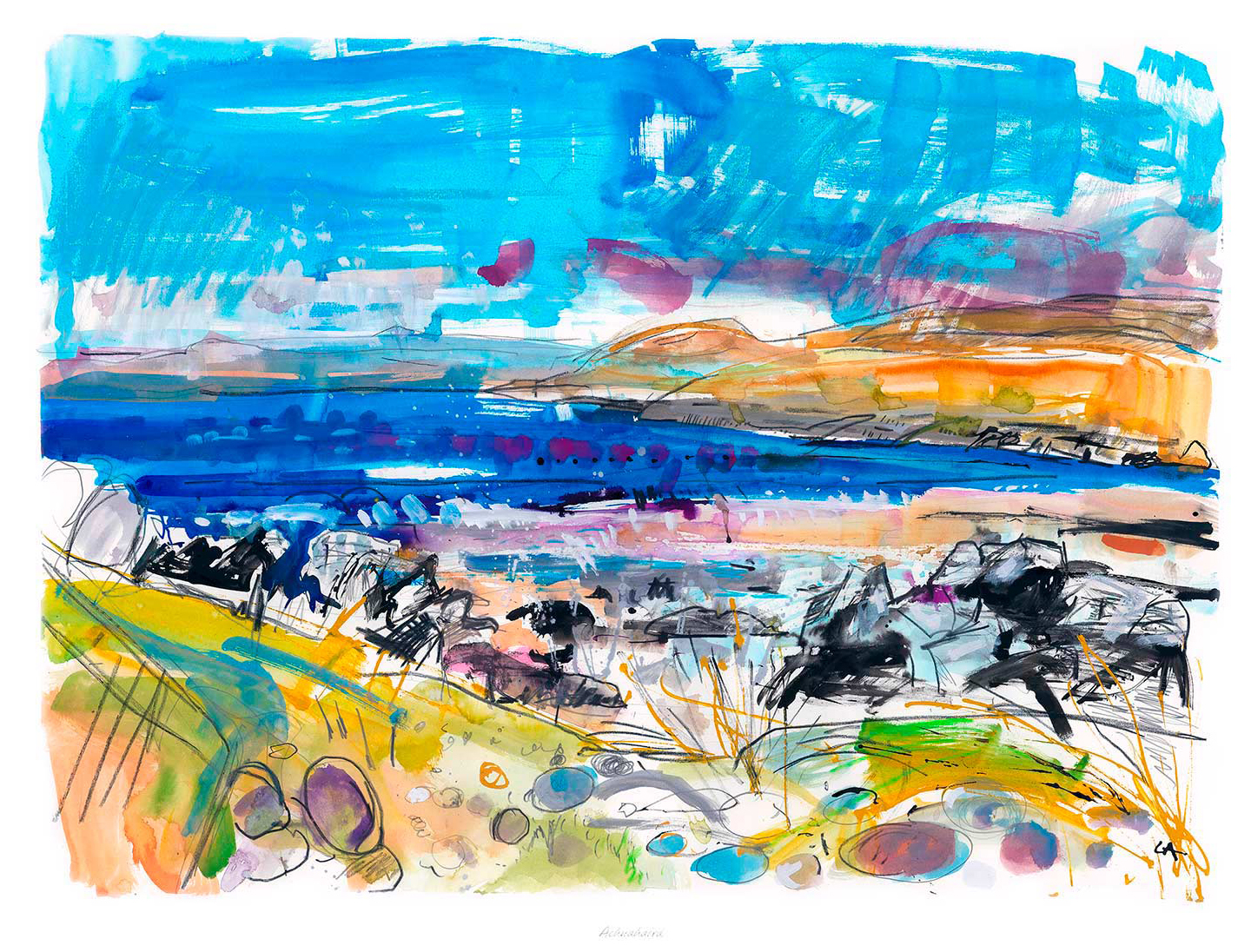
The best wall art for a room with slipcovered sofas should bring enough structure to the room without disrupting the softness that makes it feel easy to live in. Slipcovered sofas have a relaxed charm, but that same ease can leave a space looking slightly adrift if the artwork is too faint or too formal. Achnahaird works especially well because it adds calm coastal colour and a clear focal point while still keeping the room gentle and unforced.
Why wall art for a room with slipcovered sofas needs quiet structure
Rooms built around slipcovered seating often feel light, welcoming, and comfortable from the start. The challenge is making sure they do not tip into looking too loose or slightly under-finished. One well-judged framed print can provide the visual anchor that pulls upholstery, flooring, and softer accessories into one calmer whole.
Achnahaird does that beautifully. Its sense of open space and coastal atmosphere brings freshness to the scheme, while the composition still feels grounded enough to hold the wall with confidence. It suits sitting rooms, garden rooms, and relaxed bedrooms where comfort matters just as much as presentation.
Why Achnahaird suits a relaxed interior so naturally
It introduces a calm focal point without disturbing the room’s softer mood.
It helps slipcovered furniture feel styled rather than simply practical.
It brings colour and place in a way that still feels easy to live with every day.
First 4 Frames completes each piece in-house in Falkirk with bespoke framing, colour-managed Giclee printing, and hand-finished craftsmanship. That superior finish matters in a room built around texture and comfort, where the final presentation needs to feel deliberate rather than decorative for its own sake.
If you are comparing wall art for a room with slipcovered sofas and want something airy, balanced, and quietly distinctive, Achnahaird is a very strong option.
A frame is never just a border; it’s the vital bridge between an artist’s vision and the unique character of your home. You’ve likely spent hours finding the perfect piece of Scottish landscape art, only to feel paralyzed by the fear of choosing a frame that looks dated within a year. Learning how to match frame to art style shouldn’t be a source of stress, yet many collectors struggle with technical choices like mount widths or worry that cheap materials might damage their investment. We believe your art deserves better than mass-produced, standard-sized solutions that never quite fit the story you’re trying to tell.
In this guide, you will master pairing bespoke frames with any creative style using professional design principles. We’ll show you how to achieve a gallery-quality finish that protects your fine art prints while perfectly complementing your room’s decor. You’ll discover why premium components like 2mm float glass are essential for visual clarity and how our bespoke approach ensures your photography or coastal wall art remains a timeless centrepiece for years to come.
Key Takeaways
Learn exactly how to match frame to art style by balancing the unique aesthetic of your artwork with the existing decor of your home.
Discover why premium 2mm float glass and bespoke mounts are vital for protecting Giclée fine art prints from long-term damage and environmental wear.
Master the selection process for different genres, from pairing ornate woods with Scottish landscapes to choosing minimalist profiles for contemporary prints.
Find out how to use a wall art visualiser to design your bespoke framed wall art online and see the finished result before you buy.
The Art of the Frame: Why the Right Choice Transforms Your Space
Choosing a frame is a creative act. It is the final step in the artistic journey, serving as a delicate balance between honouring the artist’s original intent and respecting the unique architecture of your home. When you master how to match frame to art style, you transform a simple image into a commanding focal point. This process isn’t just about aesthetics; it’s about longevity. High-quality bespoke frames provide the necessary structural support for Giclée fine art prints, ensuring the delicate paper remains flat and protected from the subtle shifts in humidity that occur in British homes.
The psychological impact of a well-framed piece is significant. A frame that feels right instantly elevates the perceived value of the artwork, making even a modest print feel like a gallery acquisition. By choosing bespoke framed wall art, you’re making a long-term investment in your home’s atmosphere. Unlike mass-produced frames that often use flimsy materials, a handmade frame is built to last. It provides a sense of permanence and professional polish that standard shop-bought options simply cannot replicate.
The Bridge Between Art and Atmosphere
A frame acts as a vital transition point between the creative world of the artist and the physical reality of your living space. It functions as a visual translator, helping a moody Scottish landscape art piece or a vibrant contemporary print settle into its surroundings without clashing. You can explore how sourcing and framing work in harmony by visiting our online gallery, where we showcase a wide selection of curated works.
Consider these key benefits of a professional framing choice:
Visual Focus: Directs the eye toward the artwork rather than the wall.
Protection: Shields the medium from physical contact, dust, and environmental damage.
Cohesion: Ties different art styles together through consistent framing choices.
Ultimately, the right frame ensures your art doesn’t just hang on the wall; it belongs there.
Matching Frames to Specific Art Genres and Mediums
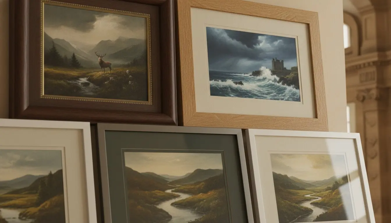
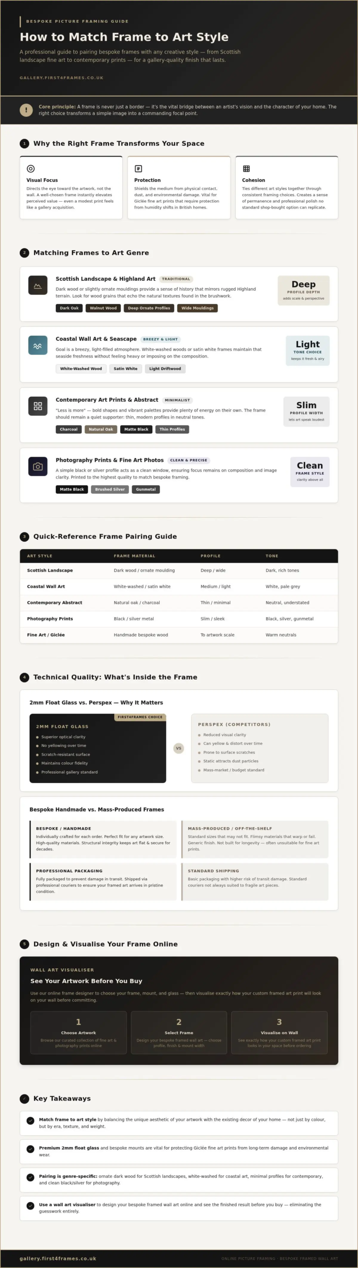
Different genres demand distinct visual languages. Understanding how to match frame to art style begins with identifying the era and medium of your piece. Traditional works, such as classic Scottish landscape art, often thrive within the weight of dark wood or slightly ornate mouldings. These choices provide a sense of history that mirrors the rugged Highland terrain. In contrast, professional photography prints usually require a sleek, minimalist frame. A simple black or silver profile acts as a clean window, ensuring the focus remains entirely on the composition and clarity of the image.
Framing Scottish Landscapes and Coastal Fine Art
When you’re framing Highland scenes, look for wood grains that echo the natural textures found in the brushwork. Using deeper frame profiles is a professional designer’s secret; it adds a sense of perspective and scale, drawing the viewer deeper into the landscape. For coastal wall art, the goal is a breezy, light-filled atmosphere. White-washed woods or satin white frames maintain that seaside freshness without feeling heavy. You can explore these combinations in our online gallery to see how different finishes transform the mood.
Contemporary and Abstract Pairings
For contemporary art prints and abstract works, a “less is more” philosophy prevents visual clutter. Bold shapes and vibrant palettes provide plenty of energy, so the frame should remain a quiet supporter. Thin, modern profiles in neutral tones like charcoal or natural oak are ideal. Unlike the flimsy, standard-sized frames sold by mass-market competitors, our handmade frames are individually crafted to ensure your artwork sits perfectly. This bespoke approach provides the structural integrity needed to keep your art flat and secure, avoiding the common pitfalls of “off-the-shelf” solutions that often warp or fail over time.
The Technical Details: Glazing, Mounts, and Material Quality
The technical foundation of your frame is just as important as its visual style. When considering how to match frame to art style, you must also evaluate the materials that will house and protect your investment. A bespoke, handmade frame from First4Frames Gallery isn’t just about a perfect aesthetic fit; it’s about using professional-grade components that ensure your artwork remains in pristine condition for decades. Unlike the flimsy, standard-sized frames found in high street shops, our frames are individually crafted to provide the structural integrity your art deserves.
Why 2mm Float Glass Beats Perspex for Clarity
2mm float glass is the professional standard for minimising distortion and maximising colour fidelity in fine art display. While mass-market competitors often use Perspex to reduce shipping costs, this plastic alternative has significant drawbacks. Perspex scratches easily during routine cleaning and acts as a magnet for dust due to static electricity. In contrast, our high-quality glass provides a crystal-clear window that lets the true depth of your art shine through. For a deeper look at the hardware used in professional displays, see our ultimate guide to picture frames.
The mount serves a critical functional role beyond its aesthetic appeal. It creates a necessary “breathing space” between the artwork and the glazing. Without this gap, subtle changes in temperature can cause moisture to trap against the surface of the print, potentially leading to mould or permanent damage. A professionally cut mount ensures the art never touches the glass, preserving the fidelity of your Giclée fine art prints.
How to Design and Visualise Your Custom Framed Art Online
Designing your own display shouldn’t feel like a guessing game. Our Wall art visualiser provides the clarity you need to see artwork before you buy, removing the uncertainty of how to match frame to art style. This digital tool allows you to experiment with different combinations until the balance feels exactly right for your home. It’s the most effective way to ensure your bespoke framed wall art looks exactly as you imagined it.
The process is straightforward and logical. First, start by uploading your own digital file or selecting a print from the First4Frames Gallery gallery. Next, use the Choose your frame online feature to cycle through various finishes, from natural oak to deep charcoals. You can then adjust mount sizes to find the perfect proportions for your specific wall space. This ensures your custom framed art prints don’t just fit the paper, but also the unique character of the room they inhabit.
Using the Wall Art Visualiser for a Perfect Match
The visualiser goes beyond simple framing. You can design your framed artwork by placing it against different room backgrounds, helping you visualise art on your wall before the physical work begins. This interactive process makes online picture framing accessible and precise. If you have complex requirements or need advice on specialized options, we encourage you to contact the Falkirk workshop directly. Our artisans are always ready to help you refine your vision.
Once your design is finalised, our team in Falkirk individually crafts your frame using the high-quality materials discussed earlier. We understand that local logistics are just as important as the build itself. Every finished piece is fully packaged with protective layers to prevent damage during transit. We ship exclusively via professional couriers, ensuring your investment arrives safely and ready to hang. This comprehensive art print framing service combines digital convenience with traditional Scottish craftsmanship, giving you a gallery-quality result every time.
Elevate Your Artwork with Bespoke Craftsmanship
Mastering how to match frame to art style is the final step in turning a simple print into a timeless heirloom. By choosing handmade frames from our Falkirk workshop, you ensure your art is protected by the superior clarity of 2mm float glass rather than cheap plastic alternatives. Whether you’re framing a rugged Scottish landscape or a sleek contemporary abstract, the right materials provide the structural integrity and visual depth your collection deserves. Every piece we create is individually crafted to order, reflecting a level of care that mass-produced frames simply cannot match.
You don’t have to guess how the final result will look in your home. Use our interactive tools to visualise art on your wall and design your bespoke frame today. With secure UK-wide shipping via professional couriers, your finished artwork will arrive fully packaged and ready to transform your living space. Trust your creative vision to artisans who share your passion for excellence and enjoy a gallery-quality finish that lasts a lifetime.
Frequently Asked Questions
How do I match a frame to a modern abstract print?
Use a thin, minimalist frame in a neutral tone like black, white, or natural oak to complement a modern abstract print. This “less is more” approach ensures the frame doesn’t compete with the bold shapes and vibrant colours of the artwork. By choosing a slender profile, you allow the abstract piece to remain the focal point while providing a professional finish that standard shop-bought frames can’t match.
Should the frame match the room decor or the artwork itself?
You should always prioritise matching the frame to the artwork itself rather than the room’s decor. A frame’s primary job is to enhance the piece it holds; if the art looks good, it’ll naturally find its place in your home. Learning how to match frame to art style involves finding a balance where the frame serves as a bridge, respecting the art’s era while nodding to your room’s aesthetic.
What is the best frame style for a traditional Scottish landscape painting?
Traditional Scottish landscape art is best served by dark wood or slightly ornate frames that reflect the rugged, historic nature of the scenery. These deeper profiles add a sense of perspective and scale to Highland vistas or coastal scenes. Unlike mass-produced alternatives, our bespoke frames are individually crafted in our Falkirk workshop to ensure your landscape print is perfectly supported and visually grounded.
Why is 2mm float glass better than Perspex for picture frames?
2mm float glass provides superior visual clarity and colour fidelity compared to the Perspex used by many mass-market competitors. Perspex is prone to scratching during cleaning and often attracts dust through static electricity, which can obscure the fine details of your art. High-quality float glass is the professional standard, offering a durable, crystal-clear window that protects your Giclée prints without the distortion common in plastic glazing.
Can I see how my framed art will look on the wall before I buy it?
Yes, our interactive Wall art visualiser allows you to see exactly how your finished piece will look before you commit. You can upload your own photography or select from our curated gallery, then cycle through different frames and mount sizes. This tool helps you master how to match frame to art style by letting you see the artwork against various room backgrounds, ensuring complete confidence in your final selection.
The best Scottish island art for a calm bedroom should help the room slow down. In the Sea Near Ulva Ferry Isle of Mull is especially good for that because it brings place, softness, and open water without turning the bedroom into a themed coastal scheme.
Why Scottish island art for a calm bedroom should feel spacious
Bedrooms benefit from artwork that gives the eye somewhere to rest. Island scenes are often well suited to that because they suggest distance and quiet rather than visual pressure. In the Sea Near Ulva Ferry Isle of Mull has that quality, which is why it works well above a bed, chest, or dressing table without pushing the room too hard.
The piece is also useful when you want a bedroom to feel more personal and rooted in Scotland, but still understated enough for everyday rest.
Why In the Sea Near Ulva Ferry Isle of Mull feels restful on the wall
First 4 Frames completes every framed print in-house with bespoke craftsmanship and colour-managed Giclee production. That careful finish helps the artwork keep its gentler tonal shifts, giving the room a superior quality focal point that still feels calm and unforced.
If you are looking for Scottish island art for a calm bedroom that feels spacious, gentle, and easy to live with, In the Sea Near Ulva Ferry Isle of Mull is a very appealing option.
The appeal of ready to hang harbour art is obvious: it should arrive ready to give the room identity without leaving more decisions behind. Yacht Club, Gourock does that especially well because it brings maritime structure and calm without feeling generic.
Why ready to hang harbour art appeals in everyday rooms
Harbour scenes can be lively without being loud, which makes them useful in sitting rooms, studies, and hallways that need a little more focus. The best examples feel composed enough for daily life, not simply nautical for the sake of it. That is where Yacht Club, Gourock stands out.
It gives the wall shape and direction without feeling rigid.
It suits both classic and more contemporary interiors.
It feels polished quickly, which is exactly what ready-to-hang buyers want.
Why Yacht Club, Gourock feels finished from the start
First 4 Frames completes the print and framing in-house with bespoke craftsmanship and colour-managed Giclee production, so the convenience never comes at the expense of quality. The final result feels hand-finished, balanced, and easy to place with confidence.
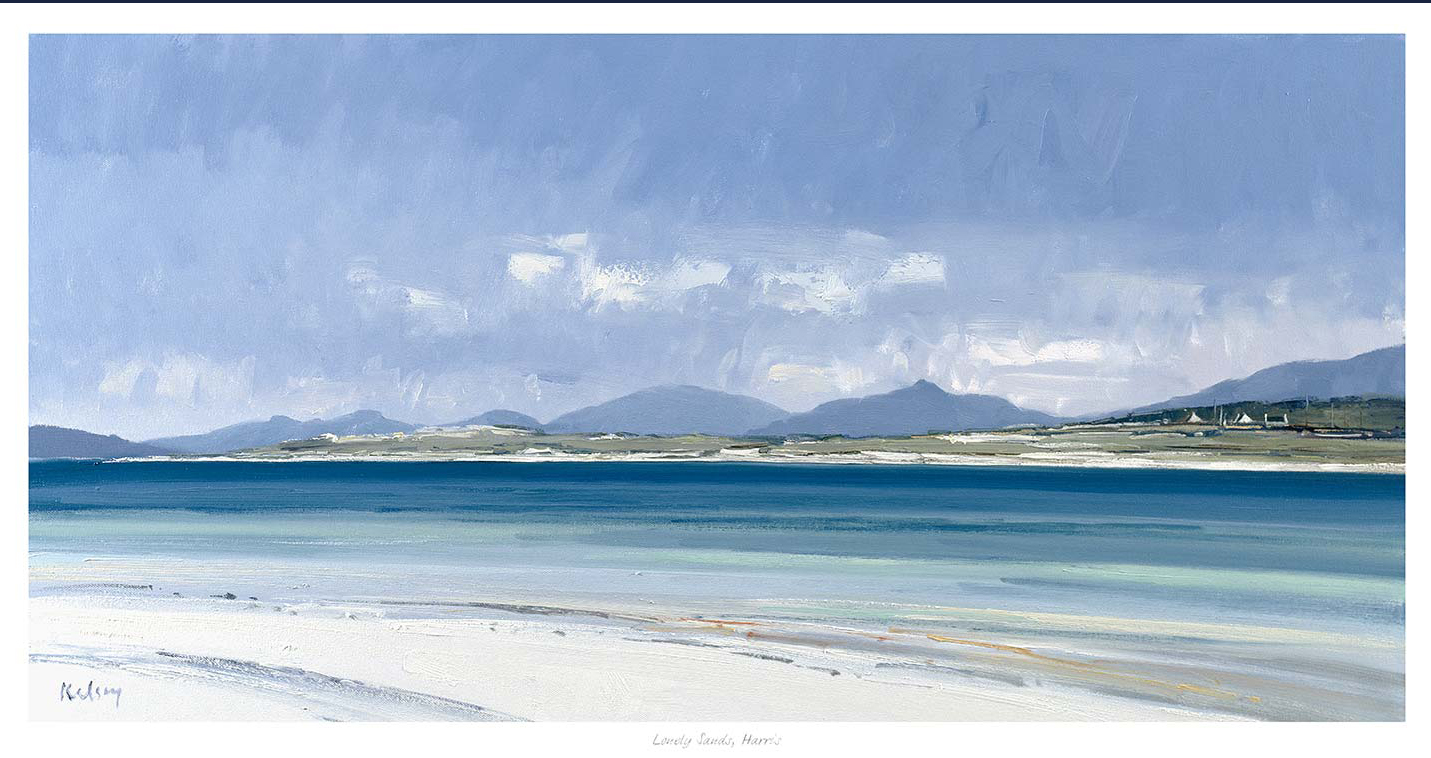
Good large framed prints for a living room should give a wider wall enough presence without making the room feel crowded. Lonely Sands, Harris is a strong example because the horizon, shoreline, and open light create scale through space rather than noise.
Why large framed prints for a living room need breathing space
When buyers look for a larger piece, they often want one artwork to do the work of several. The risk is choosing something with plenty of size but not enough calm. Lonely Sands, Harris avoids that problem by giving the wall air as well as structure, so the room feels broader and more composed rather than overfilled.
This is especially helpful above a sofa, sideboard, or chimney breast where the artwork needs confidence but also enough restraint to stay liveable in the long term.
Why Lonely Sands, Harris feels expansive rather than oversized
The image already carries width and clarity, but the craftsmanship still matters. First 4 Frames completes the work in-house in Falkirk with bespoke framing and colour-managed Giclee production, helping the final piece feel superior quality, balanced, and genuinely ready for everyday living.
If you are comparing large framed prints for a living room and want something spacious, calm, and quietly striking, Lonely Sands, Harris is a very strong option.
The strongest moody nature wall art does not simply make a room darker. It gives the space depth, texture, and a quieter kind of focus. Drift in Fall works well because the autumn tones feel atmospheric without becoming oppressive.
Why moody nature wall art suits calmer rooms
Reading rooms, snugs, and quieter corners often benefit from artwork that slows the eye a little. A nature-led image with darker tones can do that beautifully when it still keeps enough detail and breathing space. Drift in Fall manages that balance well, which is why it feels thoughtful rather than simply sombre.
It adds texture to neutral walls and timber furniture.
It suits rooms lit more for atmosphere than glare.
It creates calm depth without demanding constant attention.
Why Drift in Fall feels atmospheric rather than gloomy
The photograph already has strong pacing and tonal contrast, so the presentation matters. First 4 Frames completes the print and framing in-house with bespoke care and colour-managed Giclee production, helping the final piece feel clean, polished, and properly resolved on the wall.
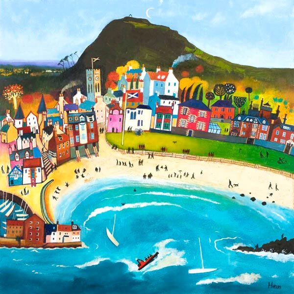
Choosing beach wall art for a dining nook is often about atmosphere rather than theme. In a smaller dining nook, the right piece should make the space feel brighter, more open, and easier to linger in. Day Out, North Berwick does exactly that.
Why beach wall art for a dining nook should feel relaxed, not themed
Dining nooks work best when they feel welcoming enough for coffee, conversation, and everyday meals. A coastal image can help, but only if it brings ease rather than obvious seaside styling. Day Out, North Berwick has enough lightness and movement to soften the area without making it feel overly decorative.
That makes it especially useful in kitchens, breakfast corners, and informal dining spots where you want the artwork to add warmth while still keeping the room practical and uncluttered.
Why Day Out, North Berwick gives a dining corner more lift
The scene already carries brightness and easy rhythm, while the framing gives it enough authority to hold the wall properly. First 4 Frames completes every piece in-house with bespoke framing and colour-managed Giclee production, helping the final artwork feel superior quality and ready to enjoy from the day it arrives.
If you are looking for beach wall art for a dining nook that feels bright, sociable, and properly finished, Day Out, North Berwick is an excellent fit.
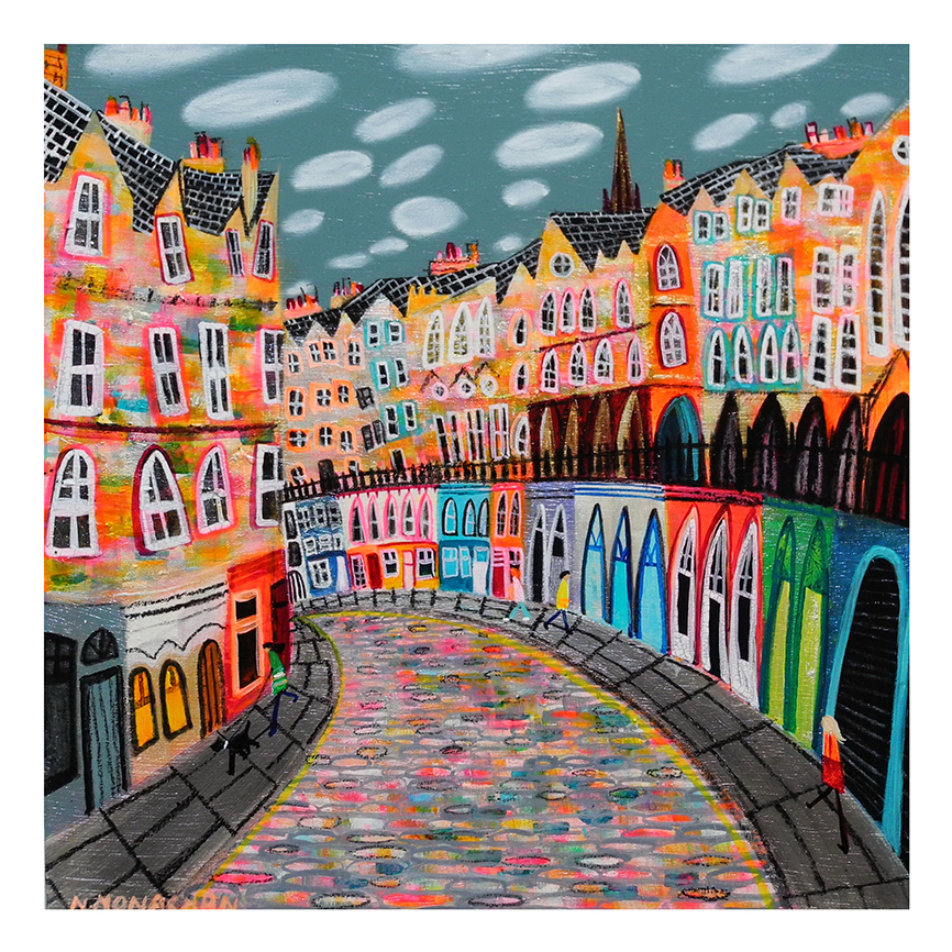
The best colourful Edinburgh wall art does more than add colour. It helps the home feel friendlier from the moment you step through the door. Edinburgh, Rainbow Cobbles works beautifully for that because it brings city character, movement, and warmth without making the space feel crowded.
Why colourful Edinburgh wall art works so well in an entrance
Hallways and entry spaces often need lift more than they need more objects. A print like Edinburgh, Rainbow Cobbles gives the wall energy and local identity, while still feeling tidy enough for everyday living. That balance matters when you want a practical space to feel intentional rather than overlooked.
It adds colour without overwhelming a narrower wall.
It gives an entrance a more personal, local feel.
It helps a neutral hall feel warmer and less purely functional.
Why Edinburgh, Rainbow Cobbles feels lively rather than hectic
The subject already carries movement, but the finish keeps the piece composed. First 4 Frames produces and frames the work in-house in Falkirk with bespoke craftsmanship and colour-managed Giclee printing, so the final result feels hand-finished, superior quality, and properly settled on the wall.
For more context on the city itself, Edinburgh World Heritage is worth exploring. You can also browse more work by Nikki Monaghan and view the exact framed product here.
If you want colourful Edinburgh wall art that feels bright, rooted, and easy to live with, Edinburgh, Rainbow Cobbles is a very strong option.
A really good gift for a bagpipe player should feel more personal than the usual themed extras. For someone who plays the pipes, the best present often reflects pride in the music and the tradition, while still being refined enough to live with every day. Pipers on Parade does exactly that, giving the subject real movement and Scottish character in a piece that feels polished rather than novelty led.
Why a gift for a bagpipe player should feel display-worthy
Pipe players often receive presents that lean too heavily on novelty, tartan cliches, or short-lived celebration. Framed artwork offers something more lasting. It can acknowledge the music and the atmosphere around it while also becoming part of the home, studio, or practice space in a more enduring way.
Pipers on Parade stands out because it captures energy, rhythm, and the shared spirit of performance. That makes it a strong choice for birthdays, thank-you gifts, competition milestones, retirements, or simply marking someone’s lasting connection to Scottish music.
Why Pipers on Parade feels more considered than a novelty gift
It reflects the subject directly without feeling gimmicky.
It is easy to display in a hall, study, music room, or sitting room.
It carries the sense of occasion that makes a gift feel properly chosen.
First 4 Frames completes each piece in-house in Falkirk with bespoke framing, colour-managed Giclee printing, and hand-finished craftsmanship. That superior quality helps the present feel substantial from the first glance, which is exactly what you want when the gift is meant to be remembered.
You can learn more about the artist at Rob Hain, browse more work by Rob Hain, and view the exact framed print here.
If you need gift for a bagpipe player that feels rooted, thoughtful, and genuinely lasting, Pipers on Parade is well worth considering.
The right wall art for a room with exposed brick should bring some softness into the room without fighting against the texture already on show. Brick walls have presence, pattern, and natural warmth, so the artwork needs to complement that character rather than add more visual hardness. Out of Reach works especially well because its woodland atmosphere brings a calmer, lighter counterpoint that still feels grounded.
Why wall art for a room with exposed brick needs softness as well as character
Exposed brick can make a room feel rich, tactile, and full of history, but it can also leave the space looking visually firm if every other element is equally bold. Artwork is one of the easiest ways to introduce balance. A more atmospheric image can soften the harder edges of the wall and help the room feel finished rather than slightly stark.
Out of Reach does that naturally. The autumn woodland scene brings colour variation, organic shape, and a sense of depth that sits beautifully against brick. It can work in a dining space, hallway, garden room, or relaxed sitting area where you want texture to remain part of the design without dominating it.
What makes Out of Reach such a balanced choice
It introduces softer natural forms against a stronger architectural surface.
Its colour and atmosphere help a textured wall feel warmer rather than harsher.
It gives the room a calm focal point without flattening the character of the brick.
At First 4 Frames, each piece is presented with bespoke framing and colour-managed Giclee printing completed in-house in Falkirk. That hand-finished quality matters in more tactile interiors, where the final presentation needs to feel every bit as considered as the room around it.
If you are comparing wall art for a room with exposed brick and want something atmospheric, grounded, and easy to live with, Out of Reach is a very strong option.