Posted on

Bespoke Picture Framers in Scotland: Frames Made for Your Art

Bespoke Picture Framers in Scotland: Frames Made for Your Art

The right frame can make artwork feel at home, rather than simply filling the space around it. Choosing a frame and mount can be difficult when a standard size does not fit properly or distracts from the piece. If you are searching for “bespoke picture framers Scotland”, First4Frames Gallery crafts each frame individually, bringing together the artwork, its setting and carefully selected materials.

This guide explains how bespoke framing can present your art, from choosing a frame and mount to selecting glazing and preparing the finished piece for display. Explore online picture framing, use the wall art visualiser to visualise art on your wall and see artwork before you buy, or choose your frame online. You can also learn about printing and framing digital photographs, 2mm float glass and professionally couriered, fully packaged frames. Whether you are considering Scottish landscape art, fine art or contemporary art prints, discover how to design bespoke framed wall art for your home.

Key Takeaways

  • Bespoke picture framers Scotland help you find a frame and mount that complement your artwork instead of forcing it into a standard size.
  • Profile, finish and mount all affect visual balance, while 2mm float glass provides clear presentation.
  • Choose artwork, select a frame and mount, then complete your order through a simple online process.
  • Individually crafted framing and careful packaging prepare your finished artwork for delivery and display.

Why Choose Bespoke Picture Framers in Scotland for Your Artwork?

A frame should complement an artwork, not compete with it. Bespoke framing means selecting and making a frame for an individual artwork or photograph, with its dimensions and character guiding the choices. As what is a picture frame explains, a frame is more than an edge around an image: it shapes how the work is presented. First4Frames Gallery crafts every frame individually for its order, avoiding the compromises of a cheap, standard frame that may leave artwork loose, cramped or visually unbalanced.

When does artwork benefit from a made-to-measure frame?

Unusual dimensions are a clear reason to choose a bespoke frame. Panoramic landscapes, narrow prints and other non-standard proportions can be difficult to fit neatly into off-the-shelf frames. A tailored mount, the border between the artwork and frame, can give the image breathing space and draw the eye towards it without competing for attention.

Bespoke framing is the process of choosing and making a frame and mount to suit one specific piece of art or photography. That individual approach helps the artwork sit naturally within its frame and in your home.

What can you frame with a bespoke service?

Custom picture framing suits fine art, photography prints and custom framed art prints, including pieces you already own and digital photographs. First4Frames can print and frame digital photographs, bringing the image and its finished presentation together.

Choose framing for coastal wall art, landscape wall art or Scottish landscape art, as well as contemporary art prints. A complementary frame can echo a work’s mood, give a vivid image room to breathe or bring a quieter piece into focus. With bespoke picture framers Scotland customers can create framed wall art that feels personal and carefully considered.

How Bespoke Framing Choices Protect and Present Your Art

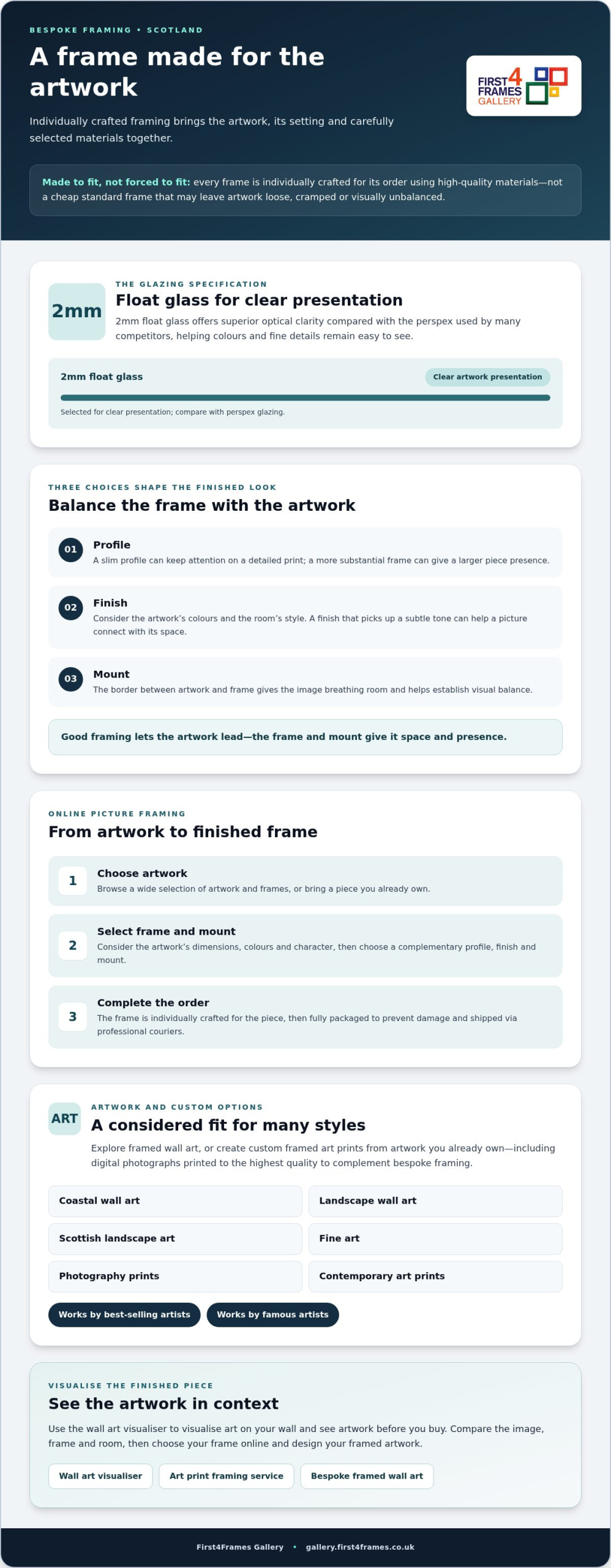
A frame’s profile, finish and mount influence how artwork sits in a room and how the eye meets the image. A slim profile can keep attention on a detailed print, while a more substantial frame can give a larger piece presence. First4Frames Gallery crafts every frame individually for its order, so the choices can suit the artwork instead of being limited by a cheap, standard fit.

How do you choose a frame and mount for a picture?

Start with the artwork’s colours and dimensions, then consider the room’s style. A finish that picks up a subtle tone in a landscape can help the picture connect with the space. A simple profile may suit contemporary art without distracting from its lines. A mount creates separation between the artwork and frame, giving the image breathing room and helping establish visual balance.

Good framing lets the artwork lead, while the frame and mount give it space and presence. For more background on professional framing levels, explore the Fine Art Trade Guild standards.

What does 2mm float glass contribute?

Each frame is glazed with 2mm float glass, selected for its clear presentation of the artwork. Float glass offers superior optical clarity compared with the perspex used by many competitors, helping colours and fine details remain easy to see through the glazing. Consider it alongside the frame profile and mount when planning the finished look.

These details matter whether you are framing a coastal scene, Scottish landscape art or a contemporary print. Explore the framed artwork gallery to find options for your piece and interior.
Bespoke Picture Framers in Scotland: Frames Made for Your Art

How to Design Bespoke Framed Wall Art Online in Scotland

Online picture framing gives you a straightforward way to bring artwork and a frame together from anywhere in Scotland. Choose your artwork, select a frame and mount, then complete your order. Each frame is individually crafted for the piece, rather than relying on a cheap standard size that may not fit well.

How can you visualise art on your wall before ordering?

Use the wall art visualiser to visualise art on your wall and consider how the image, frame and room work together. Compare the artwork’s colours and style with the space where you plan to display it. Seeing the framed design in context can help you make a more confident choice before ordering.

Browse framed wall art in coastal, landscape and contemporary styles, including works by best-selling artists and famous artists. Then choose your frame online, considering how its profile and mount support the artwork. For background on the wider UK art and framing sector, visit the Fine Art Trade Guild.

Can you print and frame a digital photograph?

Yes. First4Frames offers a print-and-frame service for digital photographs, with each image printed to the highest quality to complement its bespoke framing. It is a convenient way to turn a favourite photograph into finished wall art, with the print and frame brought together as one considered piece. Finished frames are fully packaged to prevent damage and shipped via professional couriers.

Whether you are planning custom framed art prints or choosing from the gallery, the online process helps you create a piece for your space. Explore the online photo printing and framing service, or browse framed artwork and start choosing your piece.

Choose First4Frames for Bespoke Picture Framing Across Scotland

Based in Falkirk, First4Frames Gallery offers bespoke picture framing to customers across Scotland through an online service. Every frame is individually crafted for its order using high-quality materials, providing a considered alternative to cheap standard frames that may not fit artwork properly. For those comparing bespoke picture framers scotland, extensive frame and artwork choices make it easier to find a finish suited to the piece and the home.

What makes the First4Frames Gallery service convenient?

Online picture framing lets you explore a wide selection and make considered choices from home. Browse Scottish landscape art, photography prints and contemporary art prints, then decide how a frame and mount can bring your chosen work together. The art print framing service makes the process from selecting artwork to creating a finished framed piece straightforward. Finished frames are fully packaged to prevent damage and shipped via professional couriers.

Where can you explore artwork and begin choosing?

Browse the online gallery to explore framed art and a wide choice of artwork. Whether you are drawn to a Scottish scene, a striking photograph or a contemporary print, take time to find a piece that suits your space. Customers searching for bespoke picture framers scotland can explore the options and choose a frame to complement their artwork.

Explore framed art and choose your frame

Give Your Artwork a Frame That Feels Like Its Own

The right frame does more than finish a picture. A considered profile and mount help artwork sit comfortably in your home, while a made-to-measure fit avoids the compromises of a standard frame. When comparing bespoke picture framers Scotland, look for individual craftsmanship and materials chosen to present the work clearly.

At First4Frames Gallery, each frame is crafted for its order and glazed with 2mm float glass for clear viewing. From choosing artwork and framing online to receiving the finished piece, each stage is designed to make the process straightforward. Frames are fully packaged to prevent damage and shipped via professional couriers.

Your artwork has its own character. Give it a frame and mount that bring that character forward, whether you are choosing framed art or creating a bespoke finish for a treasured piece. Explore framed art and choose your frame to start designing a more personal space.

Frequently Asked Questions

What is bespoke picture framing?

Bespoke picture framing means creating a frame for an individual artwork or photograph instead of relying on a standard size. Select a frame, mount and finish to suit the piece and where you plan to display it. At First4Frames, each frame is individually crafted for its order, helping the finished artwork feel balanced, personal and ready to display.

Can I choose a frame online in Scotland?

Yes, you can explore artwork and frame choices online, then design framed artwork around the piece you want to display. Consider its colours and dimensions, as well as the room where it will hang, to guide your selection. Based in Falkirk, First4Frames Gallery offers customers across Scotland an online route to bespoke framing and ready-to-hang framed art.

What glazing does First4Frames use for bespoke frames?

First4Frames uses 2mm float glass for glazing. Its clarity helps present artwork clearly and is superior to perspex used by many competitors. Consider glazing alongside your frame and mount choices, as each contributes to the finished look. This applies whether you are planning custom framed art prints or choosing a frame for a photograph.

Can I have a digital photograph printed and framed?

Yes, First4Frames offers a print-and-frame service for digital photographs. Your photograph is printed to the highest quality to complement its bespoke frame, creating a finished piece ready to display. As you plan your design, consider the image’s dimensions and colours, along with the room where it will hang. A well-matched frame helps bring these details together.

How are framed pictures delivered safely?

Careful packaging prepares your framed artwork for delivery, alongside the choices you make about the image, frame and mount. Once it arrives, place it in your chosen spot and enjoy a piece made for your space.
Posted on

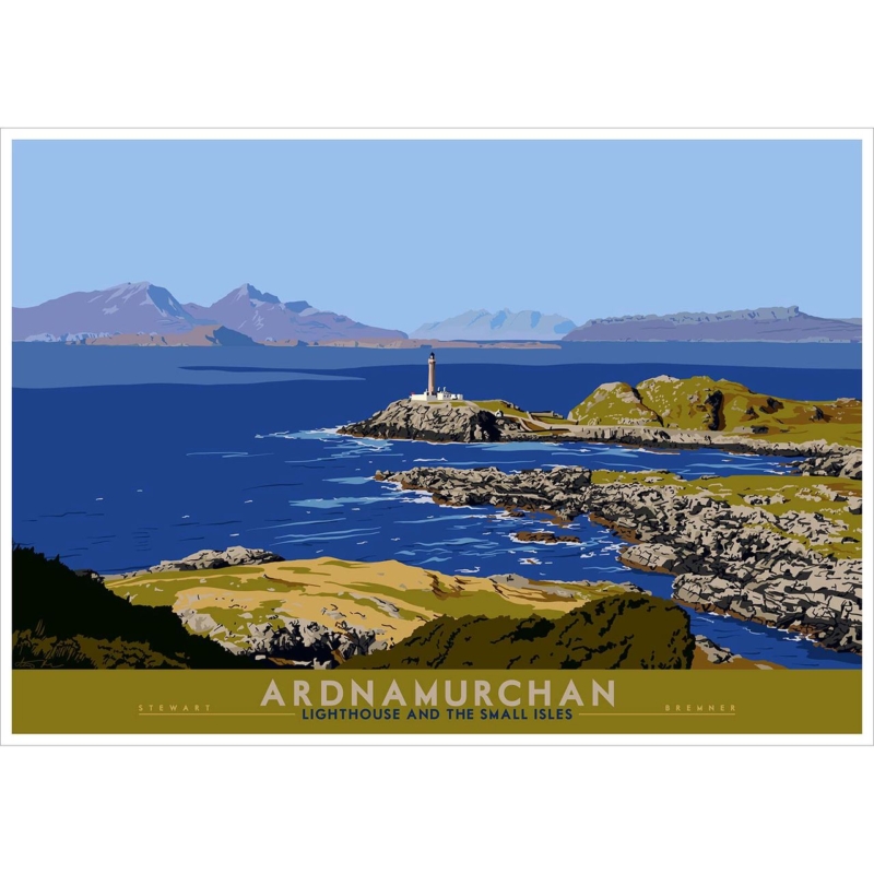
Wall Art for Home Office Focus: A Clear View From Ardnamurchan

Image of Ardnamurchan: Lighthouse and Small Isles by Stewart Bremner

Wall art for home office spaces should contribute something that a screen cannot. Ardnamurchan: Lighthouse and Small Isles by Stewart Bremner opens a view towards a lighthouse, sea and distant islands. That long horizon can give the eyes a restorative place to settle between tasks, while the graphic composition adds Scottish identity without relying on corporate slogans.

wall art for home office - Ardnamurchan: Lighthouse and Small Isles

Place wall art for home office viewing beyond the monitor

Across from the desk

This position makes the landscape a genuine distance break. Hang it above low furniture so the horizon remains visible rather than hiding behind files, lamps or a second monitor.

On a side wall

A side placement can work in a smaller office. Turn slightly to view it and check that daylight from the window does not create a persistent reflection across the sea.

The 594 × 420 mm print makes a useful landscape focal point above a cabinet or compact meeting table. At 840 × 594 mm, it can hold a broader office wall. Measure the finished framed outline and confirm that it will not collide visually with shelving or video-call backgrounds.

A useful office focal point should reward a pause without becoming another source of information to process.

Keep nearby objects functional and few. A chart, calendar and several framed certificates on the same wall would break the open horizon into fragments. Let the lighthouse scene provide the principal visual direction.

Retain the horizon through clear print and framing

A graphic coastal landscape needs clean shapes, controlled colour and enough tonal separation for the distant islands to remain legible. Colour-managed Giclée production supports that clarity. Bespoke in-house framing can then give the wide image a firm boundary and a professional finish suited to a working room.

To learn about the real landmark and its far-west setting, visit the Ardnamurchan Lighthouse visitor site. Browse the Stewart Bremner collection, or view the exact Ardnamurchan: Lighthouse and Small Isles product.

Well-chosen wall art for home office use can alter how the working day feels. Ardnamurchan: Lighthouse and Small Isles supplies a long view, a clear landmark and a calm Scottish horizon—a welcome counterpoint to the close range of a desk and screen.

Posted on

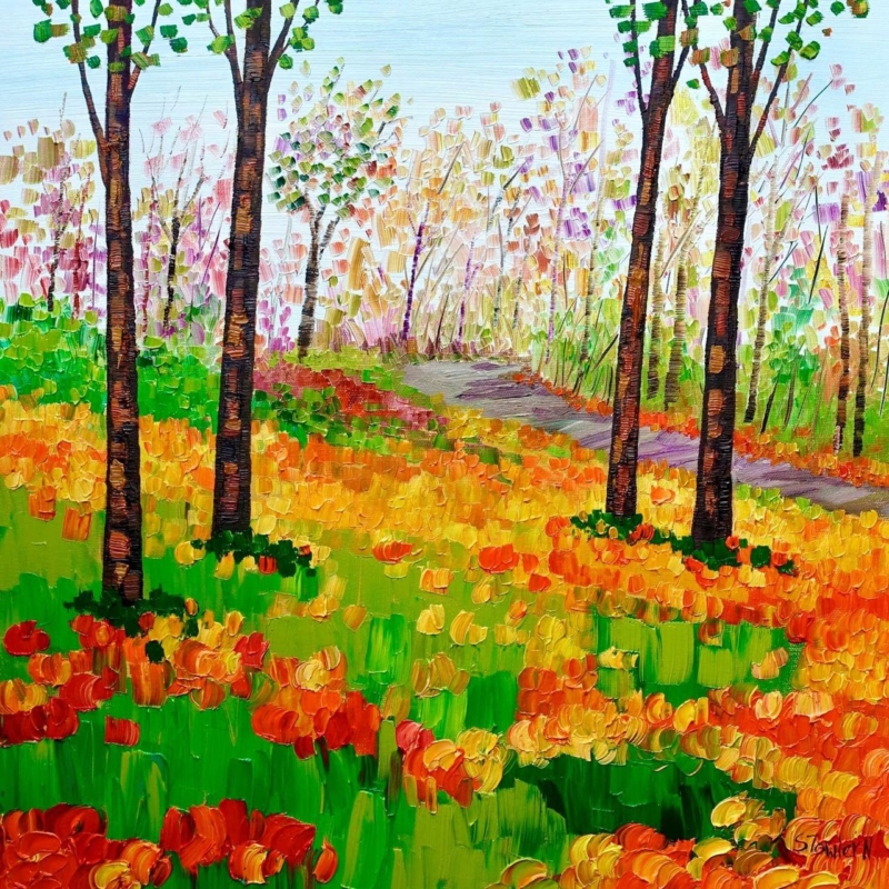
Art for Maple Furniture: Let Autumn Colours Add Definition

Image of Autumn Colours by Sheila Fowler

Art for maple furniture should give pale timber enough definition without making its clean, natural character feel heavy. Sheila Fowler’s Autumn Colours concentrates seasonal colour inside a square composition. It can bring warmth to a breakfast area, bedroom or light living space while the furniture continues to provide visual calm.

art for maple furniture - Autumn Colours

Pair art for maple furniture through tonal difference

  • Keep the brightest autumn colour inside the artwork rather than repeating orange across every accessory.
  • Use off-white, oatmeal or soft grey textiles to preserve the lightness of maple.
  • Choose a frame that separates warm picture colour from warm timber furniture.
  • Leave clear wall between the framed square and the furniture below it.

The 265 × 265 mm print can complete a narrow wall, bedside area or compact dining corner. The 500 × 500 mm option has enough presence above a chest or two-seat table. In both cases, the square format is useful because it creates a stable focal point beside furniture with long horizontal lines.


Do not assume a natural timber frame is the only answer. If its tone is too close to the maple, the whole arrangement may blur together. A soft white, muted dark or deliberately contrasting wood can give the image a clearer edge. Compare samples under both daylight and evening lamps.

Keep seasonal colour rich rather than overpowering

Autumn colour works through differences between brighter leaves, quieter passages and the underlying structure of the scene. Colour-managed Giclée production helps preserve those relationships. A bespoke frame, hand-finished in-house, supplies enough separation from pale furniture to make the picture feel intentional rather than simply warm on warm.

For ideas about when and where seasonal woodland colour appears across Scotland, explore the Forestry and Land Scotland autumn colour guide. Browse the Sheila Fowler collection, or view the exact Autumn Colours product.

As art for maple furniture, Autumn Colours works best through concentration and restraint. One square field of strong autumn colour can deepen a pale room while the timber, textiles and surrounding wall remain fresh and uncluttered.

Posted on

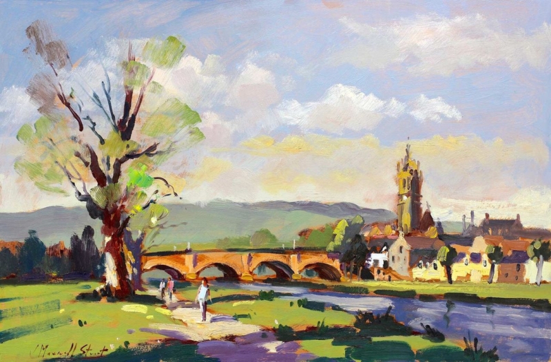
Wall Art for a Room With Picture Windows: Look Beyond the River Tweed

Image of By the River Tweed, Peebles by Josepth Maxwell Stuart

Wall art for a room with picture windows should hold its own beside a real outlook. It does not need to imitate the exact trees, weather or season outside. By the River Tweed, Peebles by Joseph Maxwell Stuart offers a distinct journey through a Peebles riverscape. Its landscape format can extend the room’s sense of distance while remaining clearly framed as an artist’s view.

wall art for a room with picture windows - By the River Tweed, Peebles

Position wall art for a room with picture windows off-axis

Choose the side wall

A side wall lets the eye move between the real outlook and the painted river. Directly opposite the glass, reflections may replace the quieter detail with a bright rectangle.

Keep the horizon at a comfortable level

Relate the composition to seated viewing height rather than aligning it mechanically with the window frame. The picture should remain comfortable when curtains or blinds are closed.

The available 550 × 365 mm and 350 × 230 mm print sizes support different roles. The larger size can balance a generous glazed area, while the smaller option suits a return wall or reading corner. Always mark the complete framed dimensions before ordering.

Should the frame match the window frames?

It can relate to them, but an exact match is unnecessary. A frame should first support the artwork. A natural timber or quiet dark moulding may connect with the architecture while still giving the River Tweed scene its own identity.

Protect the quieter view from changing daylight

River, foliage and atmospheric distance depend on subtle tonal steps. Colour-managed Giclée production helps retain those layers. Bespoke framing completed in-house can then account for the wall colour and the room’s unusually strong daylight, with a finish that gives the painted landscape definition beside the brighter live view.

For more context on the town and surrounding Borders landscape, visit the VisitScotland guide to Peebles. Browse the Joseph Maxwell Stuart collection, or view the exact By the River Tweed, Peebles product.

Thoughtful wall art for a room with picture windows creates a second kind of looking. By the River Tweed, Peebles brings a composed place, a chosen season and an artist’s emphasis, giving the interior something rewarding even after the daylight fades.

Posted on

Art for Terrazzo Floors: Balance Pattern With Blue Washing

Blue Washing captures a rural coastal landscape with white cottages, red roofs among green hills beside a blue sea and swirling sky, evoking the serene effect of blue washing across the scene.

Art for terrazzo floors needs enough character to hold its own beside a patterned surface, yet it should not compete chip for mark. Fiona Matheson’s Blue Washing brings expressive northern landscape and a materials-led sensibility shaped by her textile background. Its cool blue presence can steady a room where the flooring already supplies lively detail.

art for terrazzo floors - Blue Washing

Choose art for terrazzo floors by contrast, not imitation

Read the floor from standing height

Terrazzo often appears calmer across a whole room than it does in a close sample. Judge its dominant temperature first: cool grey, warm cream or something more colourful.

Give the wall one contained area of texture

The artwork can be expressive because a clean frame provides a pause. Avoid adding patterned wallpaper and several textured accessories to the same sightline.

Connect with one colour only

If the floor contains a blue-grey chip, let that be the subtle bridge. There is no need to match every colour in either surface.

Two patterned elements can share a room when scale, colour and the space between them are deliberately different.

Hang the work where it can be seen from the doorway as well as from a seat. The composition should draw the eye upward and give the hard floor a visual counterweight. A rug may soften acoustics, but it should not be asked to repeat the picture.

Use the frame as a quiet boundary

Matheson’s experimental marks need clarity without becoming harsh. Colour-managed Giclée production supports the changes in blue, atmosphere and surface. A bespoke hand-finished frame can separate that movement from the wall and floor, creating a controlled edge that allows the materials to speak without merging into one busy field.

Matheson’s materials-led approach has roots in textile design; the V&A guide to textile techniques offers wider context on textile processes and surface-making. Browse the Fiona Matheson collection, or view the exact Blue Washing product.

The best art for terrazzo floors does not try to out-pattern the room. Blue Washing adds a distinct scale of mark, a cooler visual horizon and a crafted boundary, so the floor and wall remain interesting for different reasons.

Posted on

How to Choose a Frame for Artwork With Movement: Concorde

Minimalist illustration of the Concorde soaring upward with dark clouds in the background, CONCORDE printed below, and British and French flags side by side underneath. Ideal for Concorde fans. Product Name: Concorde.

How to choose a frame for artwork becomes a more interesting question when the subject is moving decisively through the composition. Peter McDermott’s Concorde shows the aircraft climbing against dark cloud. The frame must contain that energy, but it should not make the aircraft feel boxed in or interrupt the sense of ascent.

how to choose a frame for artwork - Concorde

How to choose a frame for artwork with a strong diagonal

  1. Identify the direction of travel before looking at mouldings.
  2. Preserve clear visual space in front of the aircraft and around its nose.
  3. Compare a narrow dark edge with a lighter neutral frame beside the actual wall colour.
  4. Judge the full framed size from the intended desk, doorway or reading chair.

A dark frame

A slim charcoal or black moulding can connect with the cloud and sharpen the silhouette. Keep it narrow so the dark boundary does not close down the sky.

A pale or natural frame

A lighter edge can separate the moody image from a deep wall. It also gives the upward aircraft a little more visual air, especially in a compact study.

Aviation memorabilia nearby should be edited carefully. One model or technical book can support the subject. A wall of signs, clocks and aircraft objects would turn a precise image into part of a theme display.

Test finish and reflection before committing

The aircraft silhouette and subtle cloud need clean definition. Colour-managed Giclée production retains both crisp edges and quieter tonal changes. In-house bespoke framing also allows the moulding, mount and glazing to be considered together. That is especially valuable in a study, where window and monitor reflections can otherwise obscure the darker sky.

For the engineering and social history behind the aircraft, explore the Science Museum history of Concorde. Browse the Peter McDermott collection, or view the exact Concorde product.

Learning how to choose a frame for artwork is partly about respecting the picture’s internal movement. With Concorde, a measured border, enough space around the aircraft and controlled lighting will keep the climb feeling open and purposeful.

Posted on

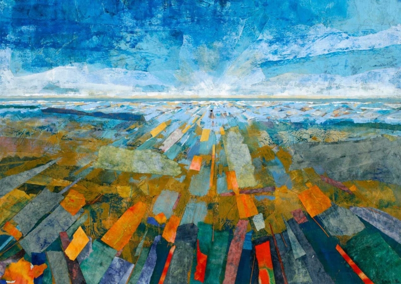
Extra Large Framed Wall Art: Give Colourscape I Room to Expand

Image of Colourscape I by Emily Little

Extra large framed wall art earns its scale when it helps organise a room, rather than merely filling the biggest empty surface. Colourscape I by Emily Little is available up to 840 × 594 mm as a print. Its broad landscape format and layered colour can establish one clear visual centre in an open-plan living space without the busyness of several unrelated pictures.

extra large framed wall art - Colourscape I

Scale extra large framed wall art from the whole room

What to measureWhy it matters
The complete furniture widthThe framed work should relate to the sofa or sideboard beneath it, not float as an isolated rectangle.
The proposed outer frameA mount and moulding increase the final footprint beyond the 840 × 594 mm print.
The main viewing distanceBroad colour relationships become clearer when the work has enough space to be seen as a whole.

Mark the outer dimensions with low-tack tape before choosing the final size. Then walk through the room from each entrance. The work should feel connected to the main seating zone without crowding door frames, shelving or light fittings.

Abstract colour does not need to be repeated everywhere. Choose one quieter tone from the image for a cushion, ceramic or rug, then stop. This controlled link allows the artwork to lead while the rest of the room remains usable and calm.

Frame broad colour with a precise edge

Large colour areas reveal weak printing and imprecise presentation quickly. Colour-managed Giclée production helps preserve transitions and smaller surface details across the full image. Bespoke framing completed in-house can then provide the structural edge that a generous format needs, while keeping the moulding restrained enough for the artwork to remain dominant.

For a useful explanation of how non-representational work can be read through colour, shape and gesture, see the Tate introduction to abstract art. Browse the Emily Little collection, or view the exact Colourscape I product.

As extra large framed wall art, Colourscape I can do the work of several decorative objects. Give it sufficient wall, a measured relationship to furniture and a carefully finished frame, and the room gains order as well as colour.

Posted on

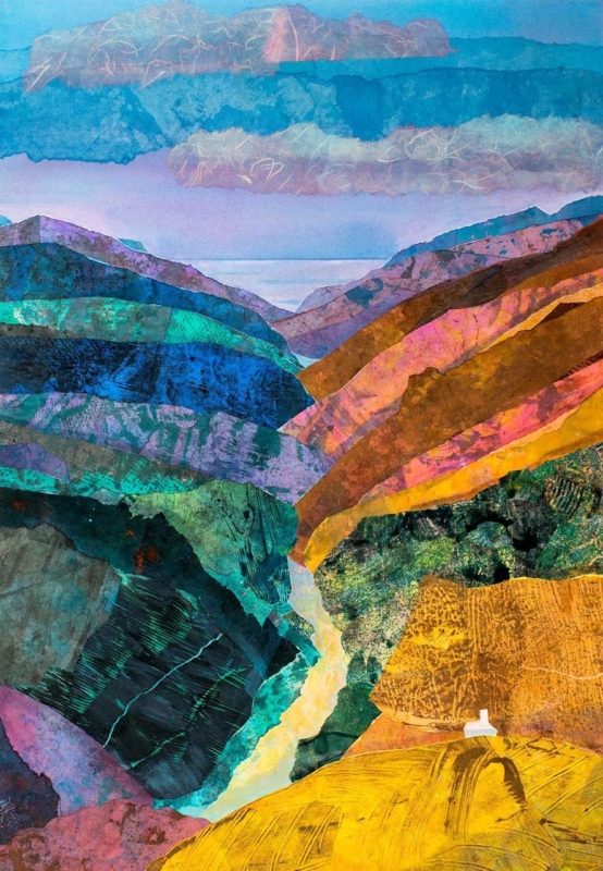
Avant Les Ténèbres: Art for a Room With Ochre Furniture

Image of Avant Les Ténèbres by Emily Little

art for a room with ochre furniture should carry a warm upholstery colour into the room without making every surface yellow, brown, or gold. Avant Les Ténèbres by Emily Little offers a more layered route. Ochre rises through the foreground and right-hand hillside, while teal, violet, blue, and green open the landscape around it. The result can connect a strong furniture choice to a broader, calmer palette.

art for a room with ochre furniture: Avant Les Ténèbres by Emily Little

What art for a room with ochre furniture needs to balance

Ochre furniture has warmth and presence. A sofa, armchair, or upholstered bench in this colour can anchor a room, yet it can also pull nearby creams and timbers towards the same warm register. Artwork is an opportunity to widen the scheme. Cooler colour and visual distance prevent the interior from feeling dense or overly coordinated.

In Avant Les Ténèbres, the warm slope does not sit alone. Deep blue-green landforms create weight on the opposite side, a pale route leads towards the centre, and cooler water and sky recede beyond the hills. Fine drawn marks and translucent-looking layers keep the broad shapes active. These relationships make the print useful as a bridge between warm seating and cooler walls or textiles.

Build the palette in three measured steps

LayerRoom elementPurpose
Warm anchorOchre sofa, chair, or benchGives the room weight and welcome
Cool counterpointTeal, blue, or violet artwork passagesStops the palette becoming too warm
Quiet groundSoft neutral wall, rug, or curtainAllows both colour families to breathe

Repeat colours sparingly. A small teal ceramic or one muted violet cushion can link the picture to the room. Avoid matching every passage with a separate accessory. The artwork should organise the palette, not become a checklist that fills every shelf and chair.

Use the portrait format to add height

The vertical composition makes the piece useful above a low ochre chair, beside a bookcase, or on the shorter wall at the end of a sitting area. Its rising hills lead the eye upwards, while the distant opening keeps the image from feeling closed. This can help a room with substantial furniture feel lighter and more spacious.

Measure the clear wall rather than the full elevation. The frame should relate to the furniture below but retain a visible margin on each side. Test a paper template from the main doorway and seat. From farther away, the warm and cool landforms should balance; closer viewing reveals the scratches, lines, and layered textures.

Check colour in daylight and lamplight

Warm evening lamps can intensify ochre upholstery and pull orange notes forward. Cooler daylight may strengthen the teal and violet. View the intended wall at both times. A soft wall wash can preserve the darker detail after dusk, but the light should not create glare across the glazing.

A mount can provide a calm interval between the richly layered image and the room. A dark slender moulding may sharpen the composition, while a quieter timber can connect naturally to warm furniture. Compare the actual print, wall, upholstery, and flooring before making the final framing decision.

Colour-managed detail and hand-finished framing

Layered colour depends on controlled reproduction. First 4 Frames uses colour-managed Giclée production and completes bespoke framing in-house at its Falkirk workshop. The process supports the shifts between dense blue-green, glowing ochre, pale distance, and fine surface marks while giving the finished piece a polished presence.

Emily Little studied drawing and painting at Edinburgh College of Art, and her semi-abstract work explores colour, memory, emotion, and landscape. Learn more on Emily Little’s official website, or browse the Emily Little collection at First 4 Frames.

Good art for a room with ochre furniture should expand the palette rather than simply repeat the upholstery. View the framed Avant Les Ténèbres print for a portrait landscape that brings warmth, cooler depth, and a clear route through the room’s colour.

Posted on

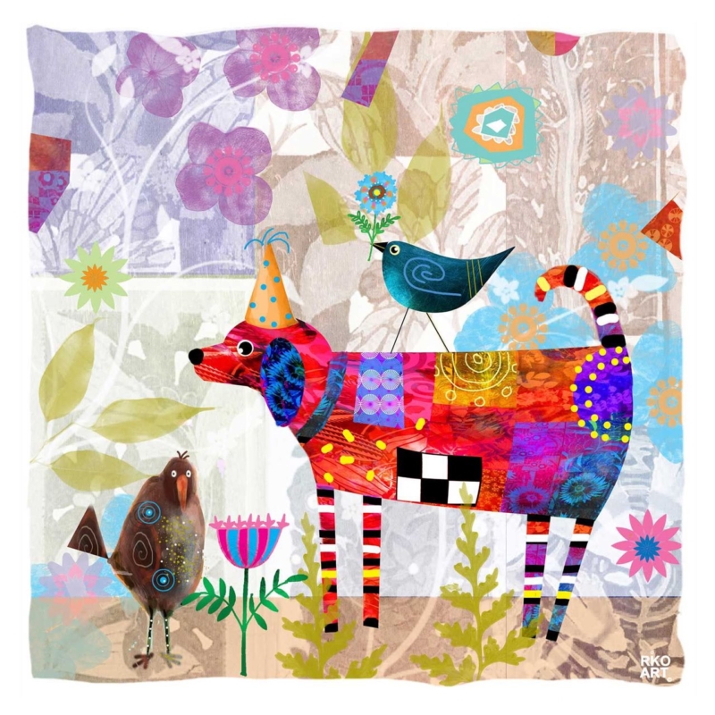
Bird Dog: A Colourful Gift for a Dog-Loving Gardener

Image of Bird Dog by Rikki O'Neill

A gift for a dog-loving gardener can reflect two parts of someone’s life without resorting to a slogan, novelty mug, or another practical tool. Bird Dog by Rikki O’Neill brings a lively dog into a garden-like scene filled with flowers and birds. Its patchwork colour and gentle humour make the subject personal, while the framed presentation gives it a lasting place in the home.

gift for a dog-loving gardener: Bird Dog by Rikki O'Neill

Why this gift for a dog-loving gardener feels personal

The most thoughtful gifts connect to real routines and interests. A gardener may spend hours noticing shape, colour, changing plants, and visiting birds. A dog owner also recognises the alert posture, mischief, and companionship that give an animal its character. This print gathers those familiar pleasures into one imaginative scene rather than illustrating either hobby too literally.

The dog’s long striped legs, patterned body, pointed hat, and curled tail create the first focal point. A dark blue bird balances the figure above, while softer flowers and foliage spread through the background. Smaller birds and plants reward a closer look. That layered composition feels celebratory, but the pale ground prevents the square image from becoming visually heavy.

Match the present to the person, not an occasion formula

  • For a birthday: choose it for someone whose dog and garden are central to everyday life.
  • For a new home: use the print to bring character to a breakfast area, hall, or garden room.
  • As a thank-you: make it a lasting alternative to flowers for someone who has helped with a dog or garden.

A short handwritten note can explain why the two subjects made you think of the recipient. That detail matters more than adding several themed extras. The print already carries plenty of colour and story, so simple wrapping and a sincere message are enough.

Choose a wall where the detail can be enjoyed

The square format can sit above a small console, beside a reading chair, or on a shorter wall near a view of the garden. It also suits a kitchen-dining corner where the recipient will see it regularly. Avoid placing it among many small dog signs or botanical prints. Clear space around the frame lets the collage-like detail remain distinct.

Use a paper template based on the finished frame size before hanging. Check the position from the doorway and from the main seat. The red dog should read clearly from a distance, while the birds, flowers, patterns, and line work should invite a second look at closer range.

Let one or two colours connect it to the room

The artwork includes red, turquoise, violet, orange, blue, and fresh green. There is no need to repeat the whole palette. One turquoise plant pot or a deep red cushion can form a quiet link. Keep larger furniture and wall areas calmer so that the picture remains the cheerful focal point rather than one pattern among many.

A pale timber frame can support the garden feeling, while a slim dark moulding can pick up the stronger outlines and checked details. First 4 Frames uses colour-managed Giclée production and completes bespoke framing by hand at its Falkirk workshop. That in-house process gives the playful illustration a polished, ready-to-hang finish.

Illustration made for repeated looking

Rikki O’Neill is a self-taught illustrator, cartoonist, photographer, and digital artist whose work is known for colour, story, and character. Explore more on Rikki O’Neill’s official Riko Art website, or browse the Rikki O’Neill collection at First 4 Frames.

A well-chosen gift for a dog-loving gardener should feel specific to the recipient and good enough to keep. View the framed Bird Dog print for a bright meeting of canine personality, garden life, and hand-finished presentation.

Posted on

Understanding Art Print Edition Numbers: A Clear, Practical Guide

Understanding Art Print Edition Numbers: A Clear, Practical Guide

A lower number on an art print doesn’t automatically make it better or more valuable. If you’ve looked at a mark such as 7/50 and wondered what the two numbers mean, you’re not alone. Understanding art print edition numbers starts with separating what the mark records from what it can’t tell you: the first number usually identifies the print’s place in the edition, while the second gives the edition’s stated size. Practices vary, so the surrounding artwork information matters too.

This guide explains how to read the numerator and denominator, what edition size tells you, and how limited editions differ from open editions. You’ll also learn why a number alone can’t establish a print’s quality or value, and which other details to consider when choosing artwork. With a clearer picture of the edition, you can explore fine art prints with more confidence and plan how the artwork will look in your home.

Key Takeaways

  • Understanding art print edition numbers helps you interpret edition details, but the number isn’t a measure of quality or value.
  • Distinguish limited editions from open editions, and remember that different sizes or print processes may have separate edition counts.
  • Read edition numbers alongside other artwork details. Signatures and proof marks provide different information, and conventions can vary.
  • Choose artwork that speaks to you, then use edition details as context while exploring themes such as Scottish landscape art, coastal wall art and contemporary art prints.

What Do Art Print Edition Numbers Mean? Read the Mark at a Glance

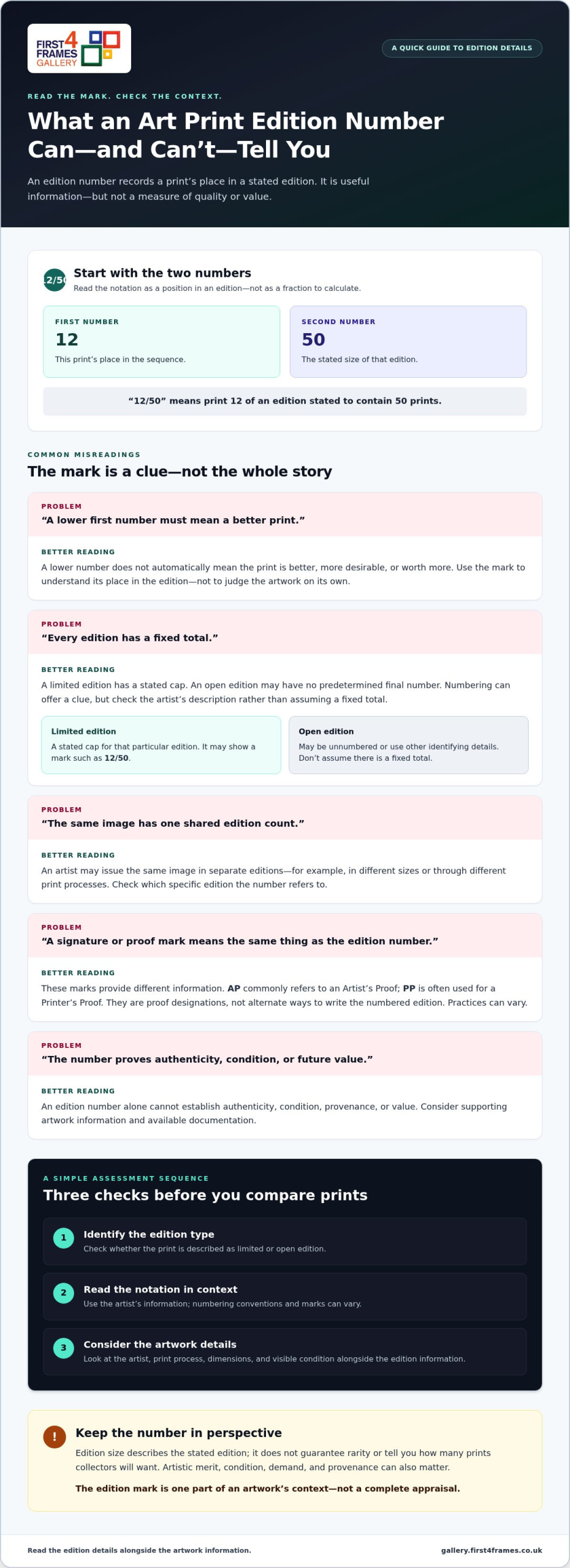
Edition numbers identify a print’s position within a stated edition. A mark such as 12/50 commonly means that the print is number 12 in an edition of 50. The first number identifies its place in the sequence; the second gives the stated edition size.

Edition size is the total number of prints stated as belonging to a particular edition. It describes the edition, but doesn’t guarantee rarity or tell you how many prints collectors will want. A lower first number doesn’t automatically mean the print is better, more desirable or worth more. Understanding art print edition numbers helps you read the notation, not judge the artwork by the mark alone.

How to read a number such as 12/50

If a print is numbered 12/50, read it as “print 12 of an edition stated to contain 50 prints”, not as a fraction to calculate. The artist’s information provides the best context for interpreting the number. If the mark is unclear or uses a different format, look for the accompanying artwork details rather than assuming the usual convention applies.

Where edition details may appear

Numbering is often written in the print’s margin, the unprinted border around the image. Edition information may also appear on an accompanying label, certificate or artwork description. Signatures and other marks are separate details. For example, an Artist’s Proof is a distinct printmaking designation, not another way of writing the edition fraction.

Artists and printmaking practices vary, so the placement, wording and marks aren’t universal. Read the number alongside the artist’s description to understand what the stated edition covers. This provides useful context, while print quality and personal appeal should be considered on their own merits.

Limited Edition vs Open Edition Prints: What the Number Tells You

A limited edition has a stated cap for that particular edition. An open edition may have no predetermined final number, so it can be produced without the same declared limit. Numbering can offer a clue, but the artist’s description is important because practices and ways of presenting edition details vary.

Edition type
Numbering clue
Sensible interpretation
Limited edition
May show a fraction such as 12/50
The stated edition has a defined cap
Open edition
May be unnumbered, or use other identifying details
Don’t assume there’s a fixed total

Does a smaller edition mean a more valuable print?

Not by itself. A smaller edition may mean fewer prints were made in that particular run, but scarcity is only one part of a print’s context. Artistic merit, condition, demand and provenance can all matter. No edition number guarantees authenticity or future resale value. Christie’s collecting guide offers further context on prints and multiples, including the idea of an original print. Treat the edition mark as useful information, not a promise of price.

Can one artwork have more than one edition?

Yes. An artist may issue the same image in separate editions, for example in different sizes or through different print processes. Don’t assume that the numbers belong to one shared count. Check the details for the specific print to see which edition its number refers to.

Once you understand what an edition label can tell you, explore artwork that suits your space and taste in the online art print gallery.

Understanding Art Print Edition Numbers: A Clear, Practical Guide

How to Assess Art Print Edition Details Before You Choose

Use this sequence to assess edition information without reading too much into the number:

  • Identify the edition type. Check whether the print is described as limited or open edition.
  • Read the notation. Interpret the number using the artist’s information, rather than assuming every mark follows the same convention.
  • Check the artwork details. Consider the artist, print process, dimensions and visible condition alongside the edition information.

Signatures, proof marks and edition numbers are different details. A signature may identify or be attributed to the artist, while a proof mark describes a print’s relationship to the edition or production process. Their use can vary between artists and printmaking practices. Christie’s collecting guide offers further background on limited editions and how prints are made.

What do AP, PP or other proof marks mean?

AP commonly refers to an Artist’s Proof, while PP is often used for a Printer’s Proof. These are proof designations, not alternative ways of writing the numbered edition. Interpret them alongside the specific artwork information. Their meanings, use and numbering practices can differ, so don’t assume a universal quantity or significance from the letters alone.

What edition numbers cannot prove on their own

An edition number by itself doesn’t establish authenticity, condition, provenance or value. It tells you something about a print’s place in a stated edition, but it can’t provide a complete account of the artwork. Look for supporting information that identifies the artist, process and edition, and consider any available documentation. This broader context makes understanding art print edition numbers more useful when comparing prints.

An edition number is one part of an artwork’s context, not a complete appraisal. Keep that in mind as you browse the art print and framed art gallery, weighing the edition details alongside the image that feels right for your space.

Choose and Display an Art Print with Confidence

Choose a print because you enjoy looking at it, then use its edition details as context. Understanding the number can inform your decision, but it needn’t outweigh the image or how it will look in your home. Explore fine art, Scottish landscape art, coastal wall art, photography prints and contemporary art prints. A wall art visualiser can help you visualise art on your wall and see artwork before you buy.

Pair a print with a considered frame

A well-chosen frame completes an artwork’s presentation without changing what its edition number means. First4Frames Gallery creates bespoke framed wall art, with each frame individually crafted to order from high-quality materials. Unlike cheap, standard frames that may not fit artwork properly, a bespoke frame is made for the individual order. With Online picture framing, you can Choose your frame online and Design your framed artwork to suit the print and your space. The Art print framing service uses 2mm float glass, offering superior clarity to the perspex used by many competitors.

Explore artwork and plan the finished display

Browse an extensive online selection of artwork and frames, including framed wall art featuring works by best-selling artists and famous artists. Find Custom framed art prints and consider how the frame will complement the image. For digital photographs, the online photo printing and framing service combines high-quality printing with bespoke framing. Finished framed orders are fully packaged to help prevent damage and shipped via professional couriers.

Explore the framed art and print gallery to find an image that feels right for your space.

Choose a Print That Feels Right for Your Space

Understanding art print edition numbers gives you a useful starting point: the first figure commonly shows a print’s position, while the second indicates the stated edition size. The mark alone doesn’t prove a print’s quality, authenticity or future value. Read it alongside the artwork information, and remember that edition practices can vary.

Use those details as context, then let the image, artist and the way it will look in your home guide your choice. First4Frames Gallery offers Giclée fine art prints from a range of artists, primarily from Scotland, with bespoke frames individually crafted for each order using high-quality materials. Thoughtful framing helps the chosen artwork feel at home on your wall.

Ready to find an image that speaks to you? Explore framed art prints in the gallery and discover artwork you’ll be glad to display.

Frequently Asked Questions

What does 12/50 mean on an art print?

12/50 commonly means print number 12 in a stated edition of 50. The first number identifies the print’s place in the edition, and the second gives the edition size. Read the notation alongside the artist’s description because numbering practices can vary. The mark provides edition context, but it doesn’t by itself tell you about the print’s quality or value.

Is a lower-numbered art print more valuable?

No. A lower number doesn’t automatically make a print more valuable. A number such as 2/50 records its position in the edition, not its quality or desirability compared with 28/50. Value can depend on factors such as the artist, demand, condition and provenance. Treat the number as one piece of information, not a guarantee of a particular price or future resale value.

What is the difference between a limited edition and an open edition print?

A limited edition has a stated cap for that particular edition. An open edition may not have a predetermined total, so it can be produced without the same declared limit. The artwork’s description should clarify which type it is. Artists may also issue separate editions for different sizes or print processes, so don’t assume all versions share one edition count.

Do all art prints have edition numbers?

No, not all art prints are numbered. Open editions may be unnumbered, and artists or printmaking practices can use different ways to identify a work. You may find information in an artwork description or accompanying documentation instead. If a print has no edition number, that alone doesn’t establish its quality, authenticity or value. Consider the artwork details as a whole.

What does AP mean beside an art print edition number?

AP commonly stands for Artist’s Proof, a proof designation associated with the artist and distinct from the numbered edition. It may appear beside a print rather than as a fraction such as 12/50. Proof practices and meanings can vary by artist and print process, so interpret the mark using the accompanying artwork information. An AP mark alone doesn’t prove greater quality or value.