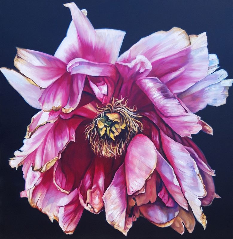
Floral wall art for dark painted walls works best when the flower has enough scale and contrast to meet the depth of the colour behind it. Final Flourish/ Peony by Greer Ralston focuses closely on lush pink peony petals edged with gold against a dark ground. It introduces light from within the image rather than asking the whole room to become pale.
Use floral wall art for dark painted walls as controlled illumination
Deep green, navy, charcoal, and plum walls absorb more light than pale paint. A close floral study can create a luminous focal point, but only if its placement avoids the darkest corner. Try the picture beside a lamp, opposite a window, or above furniture with a lighter top surface. Check both daytime and evening views before fixing it.
Build tonal depth
Let the dark ground of the image connect with the wall while the pink petals move forward. A narrow mount can provide separation if the two dark tones are very close.
Repeat gold sparingly
One warm lamp base or small brass detail can acknowledge the petal edges. Too many metallic objects would compete with their delicacy.
This is a strong option above a console, dressing table, or compact sofa where the flower can be seen at close enough range to appreciate its structure. Avoid surrounding it with several small botanical prints. The enlarged bloom already has the authority of a complete statement piece.
Retain the distinction between velvet shadow and petal edge
Close botanical work depends on nuanced transitions. Colour-managed Giclée printing preserves the separation between pink, gold, and deep shadow. A carefully selected bespoke frame then prevents the image from disappearing into the painted wall. The hand-finished, in-house result has presence without losing softness.
As floral wall art for dark painted walls, Final Flourish/ Peony brings sculptural colour and a measured glow while allowing a rich interior scheme to remain confidently dark.
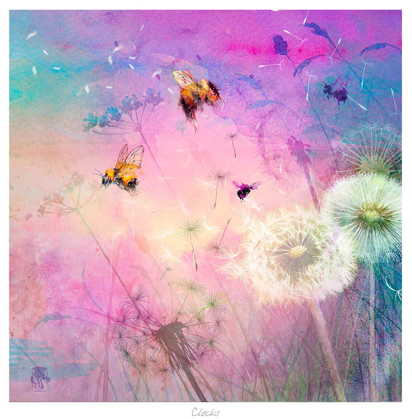
Botanical wall art for a creative workspace can provide a useful visual pause without telling anyone to work harder. Clocks by Lee Scammacca combines dandelions, wildflowers, bees, and dreamlike clocks against soft pink and purple colour. Its subject acknowledges time while offering something gentler than a deadline chart or motivational slogan.
Position botanical wall art for a creative workspace beyond the screen
Create a distance change for the eyes
Hang the picture where it can be seen by looking up and beyond the monitor, not directly behind it. That position encourages a brief shift in focus during concentrated work. If the desk faces a wall, place the image slightly above normal screen height and keep the area around it clear.
Let imagination replace instruction
The floating timepieces and natural details suggest ideas rather than spelling out a message. That ambiguity suits designers, writers, makers, and anyone whose work benefits from association. It can stimulate thought without becoming a visual task list.
Use soft task lighting that does not reflect in the glazing.
Repeat one mauve, green, or warm neutral note in a practical desk object.
Keep cables and pinboards from crossing the framed outline.
Allow enough blank wall for the delicate forms to register.
Protect the softer colour and fine natural detail
Bees, seed heads, flowers, and translucent-looking colour need controlled reproduction. Colour-managed Giclée production keeps those details from becoming muddy, while bespoke framing gives the dreamlike composition a crisp place within a working room. Everything is completed in-house at the Falkirk workshop.
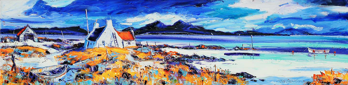
Coastal wall art for tongue-and-groove walls should add depth and colour without turning every panel into part of a seaside set. Boats on the Rocky Shore by Jean Feeney brings together white cottages, boats, orange-yellow grass, blue water, and distant mountains. The scene supplies a complete west-coast atmosphere, so the surrounding room can stay simple.
Place coastal wall art for tongue-and-groove walls with the boards
Vertical boards create a strong repeated rhythm. A horizontal coastal image can interrupt that rhythm usefully, especially above a bench, console, or dining table. Centre the frame on the furniture or activity zone rather than counting individual boards. This prevents minor asymmetry in the panelling from dictating the whole composition.
Choose contrast deliberately
On white panelling, a darker or warm timber frame can stop the image floating.
On green or blue boards, use a restrained frame so the sea colour is not overmatched.
On natural timber, allow a mount to separate the printed colour from visible grain.
Keep metal fixings properly anchored rather than relying on a thin board alone.
Edit the seaside references
The boats and shoreline already establish the setting. Plain cushions, woven texture, and useful ceramics can complement it without anchors, shells, rope, or slogan signs. This keeps the room connected to the coast but not trapped inside a decorative theme.
This limited-edition image relies on clear layers from rock and grass to water, cottages, mountains, and sky. Colour-managed Giclée printing maintains those shifts, while in-house bespoke framing gives the lively scene a stable boundary against linear panelling. The result is colourful, substantial, and ready to hang.
As coastal wall art for tongue-and-groove walls, Boats on the Rocky Shore adds light, distance, and place while leaving nautical clichés safely at sea.
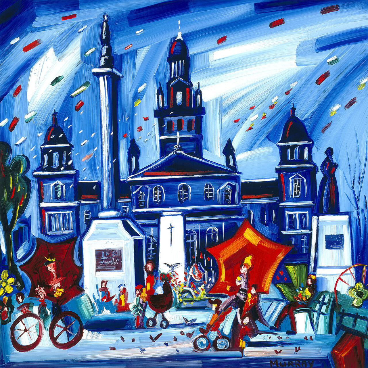
Colourful city wall art for an open-plan dining area can give the table its own identity without using a screen, shelving unit, or change of flooring. Autumn Square (George) by Raymond Murray supplies a busy civic square, moving people and vehicles, a grand clock tower, and a sky alive with colour. That energy naturally supports a social part of the room.
Use colourful city wall art for an open-plan dining area as a visual boundary
Room element
How the artwork can connect it
Pendant light
Centre the composition on the table and light together, not on the entire open-plan wall.
Dining chairs
Repeat one blue, rust, or neutral tone rather than matching every vivid passage.
Kitchen units
Let a calm cabinet colour act as a visual rest beside the energetic image.
Living zone
Carry one frame or timber finish across both areas to maintain continuity.
Scale should relate to the table beneath it. A piece that is too narrow can make the dining furniture look disconnected, while an oversized frame may visually push into the kitchen or sitting zone. Use paper to mock up the outside dimensions, then look from the entrance, sofa, and cooking area before hanging.
The composition already offers conversation and movement. Keep the sideboard surface below it relatively clear. One lamp or low bowl will support the arrangement more effectively than a row of small ornaments competing with the painted crowd.
Preserve vivid colour without losing detail
Dynamic work depends on clean separation between saturated colour and finer architectural marks. Colour-managed Giclée production keeps both qualities legible. Bespoke, hand-finished framing then gives the activity a disciplined edge, helping the picture hold an open room with confidence.
As colourful city wall art for an open-plan dining area, Autumn Square (George) defines where people gather while keeping the wider floor plan open and connected.
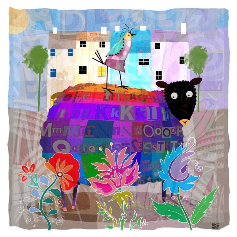
Sheep wall art for a cottage breakfast room can bring warmth and humour without requiring the rest of the space to follow a farmyard theme. Alphie Baa by Rikki O’Neill has a compact square format and a clear individual presence. It can greet the day beside a small table while leaving worktops and shelves visually uncluttered.
Keep sheep wall art for a cottage breakfast room fresh, not themed
Give the character one clear wall
Choose a position visible from the table, such as above a slim bench or on the return wall beside a window. The square proportion is useful where doorways, cabinets, or beams reduce the available width. Mark the full framed outline before deciding on height.
One characterful animal picture can feel personal; a room full of farm motifs can quickly feel staged.
Pair the print with honest materials already common in a cottage kitchen: painted timber, plain linen, stoneware, or a scrubbed wood table. Resist adding sheep ornaments and novelty wording. A small vase of seasonal stems is enough to soften the arrangement without repeating the subject.
Check the seated sightline from every place at the table.
Keep the lower edge safe from chair backs and passing shoulders.
Test reflections during bright breakfast light.
Use one restrained frame tone to connect with furniture or hardware.
Give a compact square print confident definition
Small artwork benefits from exact presentation because there is nowhere for weak detail to hide. Colour-managed Giclée printing maintains the image’s character, while bespoke framing creates a clean edge against plaster, panelling, or stone. The in-house hand finish makes the piece feel considered rather than merely decorative.
As sheep wall art for a cottage breakfast room, Alphie Baa adds an easy smile and a polished focal point while allowing the room to remain practical and grown-up.
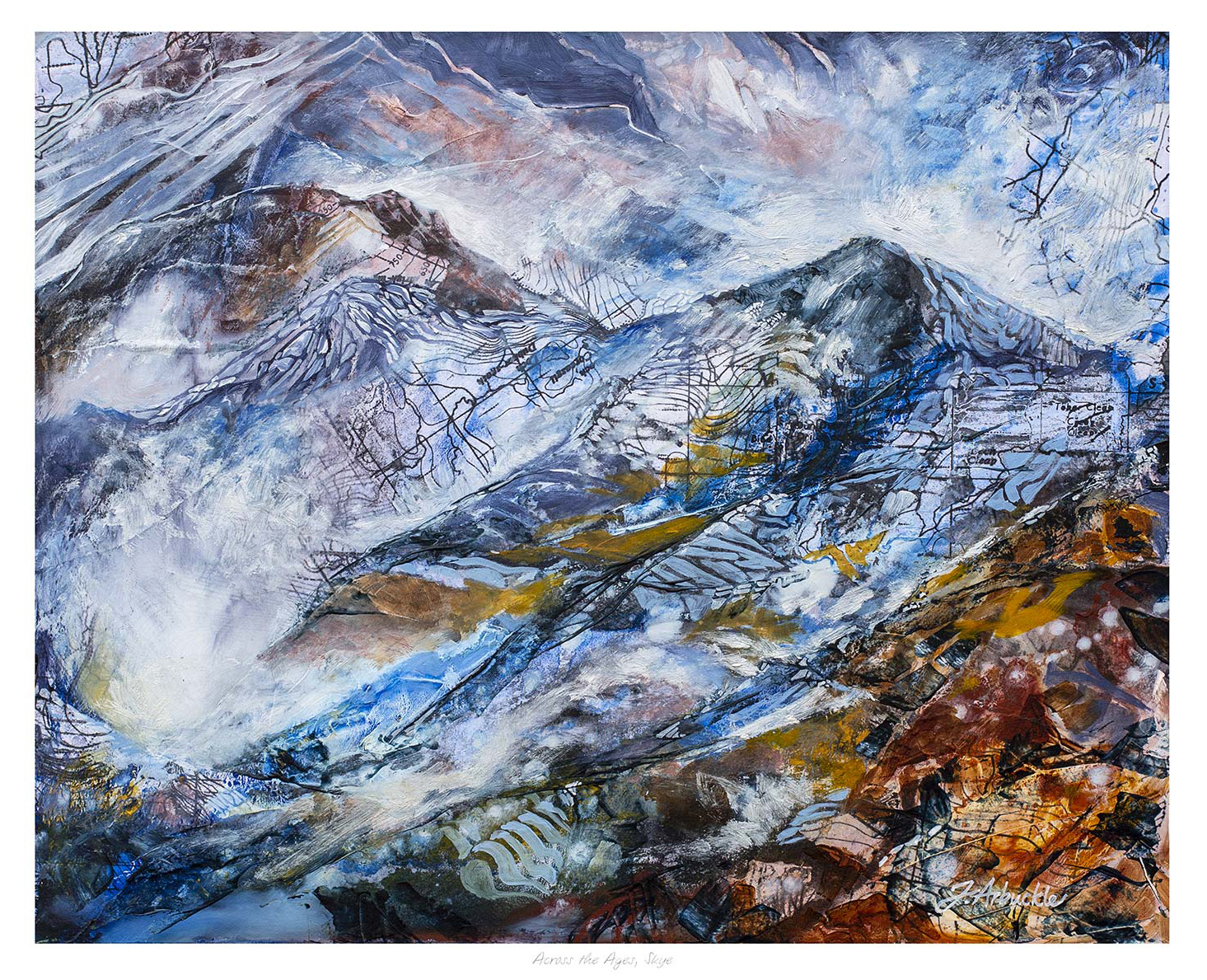
Abstract Scottish wall art for exposed stone needs enough texture to answer the wall, yet enough colour to keep the room from becoming heavy. Across the Ages, Skye by Julie Arbuckle meets that challenge through a layered response to Skye. Maps, metals, gathered rock pigments, and expressive marks turn landscape into something more personal than a literal view.
Balance abstract Scottish wall art for exposed stone with quieter surfaces
Stone already carries irregular edges, mineral colour, and strong shadow. Placing a highly detailed room arrangement beside it can create visual competition. Instead, let the artwork act as the main interpreted landscape, then keep nearby upholstery and lighting simple. Chalky white, warm grey, indigo, and weathered brown can repeat selected tones without copying every colour.
On a full stone wall
Use enough scale and a clear outer frame so the image is not lost in the masonry. Avoid mounting across a strongly projecting joint.
On an adjacent plaster wall
Hang the work where it can visually connect the stone to cleaner contemporary furniture. This gives both surfaces breathing room.
Test the position in daylight and under warm evening lamps.
Keep the frame clear of damp or unusually cold masonry.
Choose one timber or metal finish already present in the room.
Leave generous wall around this limited-edition composition.
Let the frame mediate between artwork and architecture
A bespoke frame gives this energetic image a calm, precise boundary. Colour-managed Giclée production protects the separation between blue, white, earth, and metallic-looking passages. First 4 Frames completes the presentation in-house in Falkirk, so the finish can feel contemporary while respecting the rugged source landscape.
As abstract Scottish wall art for exposed stone, Across the Ages, Skye connects landscape, material, and modern interior design without reducing Skye to a conventional scenic view.
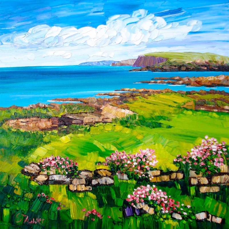
An Orkney leaving gift can carry a familiar place into the next chapter of someone’s life. The best choice feels specific enough to stir real memories, but polished enough to work in a new room. Brough of Birsay, Orkney by Sheila Fowler offers that balance. Its island subject is unmistakably rooted in Orkney, while the square composition makes it practical to display in many kinds of home.
What makes an Orkney leaving gift meaningful
A move away may be exciting, necessary, or bittersweet. A place-led artwork acknowledges that complexity better than a generic farewell present. It does not ask the recipient to pack another practical household item, and it will not disappear after a celebration. Instead, it gives them a familiar view to live with over time.
The Brough of Birsay is a particularly resonant subject. It speaks of coastline, weather, history, and the distinctive scale of the islands. Those associations can matter to someone who grew up nearby, worked in Orkney, studied there, or built an important period of life around the place.
Match the picture to the person’s connection
Recipient
Why the subject works
Message to add
Someone relocating for work
Keeps an island landmark present in a new city
Wish them confidence in the move
A family moving to the mainland
Creates one shared reminder of home
Recall a walk, visit, or favourite season
A retiring colleague
Marks years connected to Orkney
Thank them for their contribution
A student leaving to study
Fits more easily than a large keepsake
Offer encouragement for what comes next
A short handwritten note can make the artwork more personal. Mention why this place was chosen rather than trying to write a long formal dedication. The picture should hold the memory; the note only needs to provide the connection.
A square format that adapts to a new home
The print is available at 265 x 265 and 500 x 500 millimetres before framing. The smaller size is useful when the recipient does not yet know how much wall space they will have. It can fit above a compact console, beside a bookcase, or on a short wall between doors. The larger option has enough presence for a living room, dining area, or generous hallway.
Square art is flexible because it does not need the broad wall demanded by a panorama. It can also join a future collection without losing its identity. If other pictures are added later, leave a consistent gap around each frame and use the Birsay image as the visual anchor rather than crowding every edge.
Choose framing that lets Orkney remain the focus
The landscape already brings colour, texture, and movement. A restrained frame will give it definition without turning the present into souvenir-style decor. Light timber can suit a relaxed coastal interior. A narrow darker moulding can add contrast in a modern flat. The best choice should also work with the recipient’s likely furniture, not only the colours within the print.
First 4 Frames produces colour-managed Giclée prints and completes bespoke framing in-house in Falkirk. That careful finish turns the gift into something ready to hang after the move. It also supports the subtler coastal colour and expressive marks that give the scene its atmosphere.
A successful Orkney leaving gift should feel rooted without becoming a novelty. It should be personal, display-worthy, and able to settle naturally into a different home. View the framed Brough of Birsay, Orkney print for a farewell present that keeps a distinctive island place close.
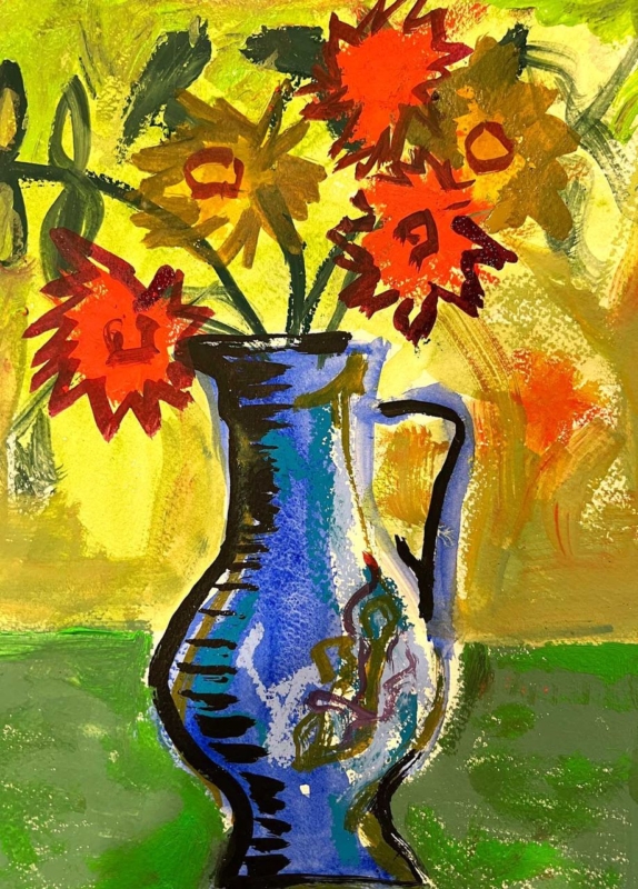
A thoughtful gift for a ceramicist should recognise how closely they look at shape, surface, and colour. Buying pottery can be difficult when the recipient already has strong preferences about clay bodies, glazes, and firing methods. Blue Jug with Flowers by David Short offers another route. It celebrates a familiar vessel and a generous arrangement of flowers, yet leaves the maker free to enjoy it as art rather than judge it as a tool or material.
Why this gift for a ceramicist feels relevant
Ceramicists spend time considering the relationship between a vessel’s outline, its opening, its handle, and the space around it. A still life built around a blue jug speaks naturally to that visual awareness. The subject is connected to their craft, but it does not rely on a slogan, a novelty mug, or specialist equipment that may not suit the way they work.
The flowers add another layer. Their softer, irregular shapes contrast with the solid jug, while the colour gives the whole arrangement energy. That conversation between a made object and natural forms is part of what makes the image rewarding. It can appeal to someone who throws functional ware, builds sculptural pieces, or simply loves good studio pottery.
Choose art instead of guessing at studio supplies
Clay, tools, brushes, and glazes are personal choices. Even an experienced buyer can choose the wrong specification. Artwork avoids that practical uncertainty while still showing that the recipient’s creative life has shaped the gift. It is also something they can enjoy away from the bench, wheel, and kiln.
For a new studio: mark the move with a finished piece that makes the workspace feel established.
For an exhibition milestone: celebrate the work involved without trying to select more materials.
For a birthday or retirement: choose something lasting that reflects a lifelong interest in objects and making.
For a tutor or mentor: acknowledge their creative influence with a subject that feels considered.
Find the right scale and place
The available print sizes are 189 x 275, 350 x 500, and 560 x 780 millimetres before framing. The smallest can suit a quiet wall beside a desk or a compact creative corner. The middle size has enough presence for a kitchen or dining room. The largest can become a confident focal point in a studio reception, living room, or open-plan space.
In a working studio, keep framed art away from clay dust, splash zones, and direct heat from a kiln. A clean office wall, customer consultation area, or home display space will make care easier. In a domestic setting, relate the finished dimensions to the furniture below it and leave enough clear wall for the jug’s outline to read properly.
Let the colour complement handmade objects
A blue vessel can sit comfortably with many ceramic collections. It can sharpen pale stoneware, cool down warm terracotta, or connect with blue-and-white tableware. Avoid arranging every blue object directly beneath the picture. A smaller echo in a bowl, cushion, or book cover is enough to make the relationship feel intentional.
A simple frame is usually the most respectful partner for a colourful still life. Light timber can connect to studio shelving and natural materials. A slim dark moulding can add definition in a brighter room. First 4 Frames can guide that decision and completes bespoke framing in-house at its Falkirk workshop.
The print is produced with colour-managed Giclée methods and presented with hand-finished framing. That combination gives the vivid subject a polished, lasting form. If you need a gift for a ceramicist that feels observant, creative, and easy to display, view the framed Blue Jug with Flowers print.
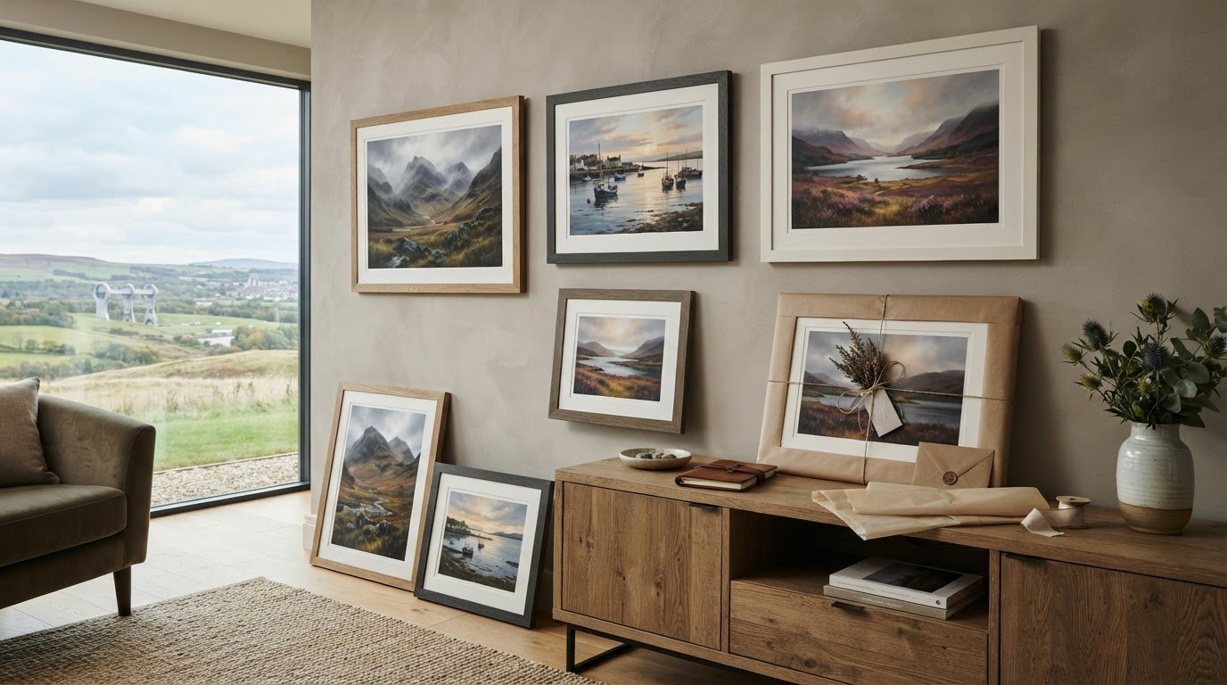
The most unforgettable gifts don’t simply decorate a room; they anchor treasured memories to a physical sense of place. Yet searching for meaningful Scottish art gift ideas often comes with genuine hesitation. You want a piece that evokes the mist-shrouded peaks of Glencoe or the light along the Fife coast, but you worry about choosing a moulding that clashes with their living room, receiving cloudy perspex instead of real glass, or opening a parcel to find cracked glazing.
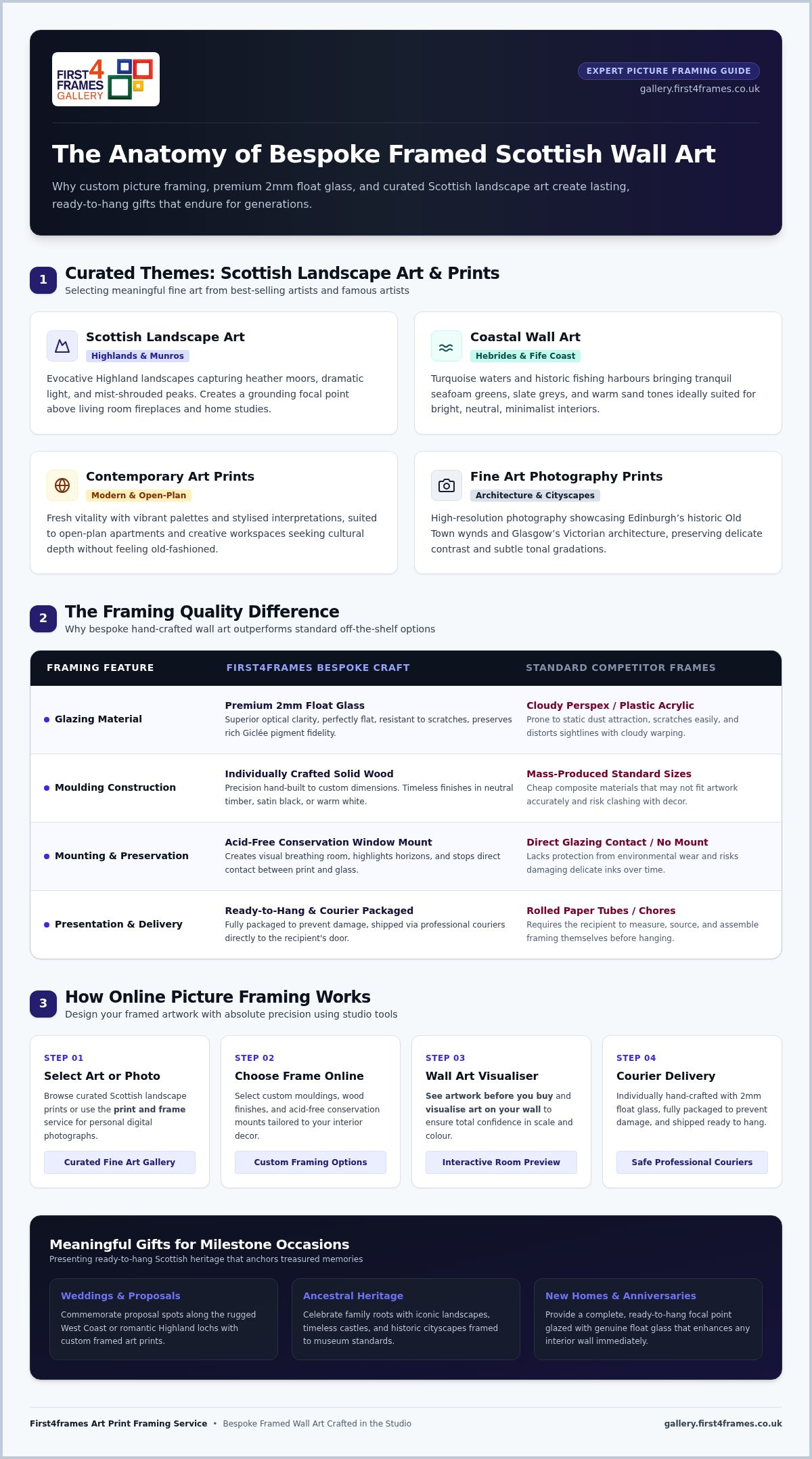
You shouldn’t have to gamble on quality when celebrating someone’s heritage. In this guide, discover inspiring selections ranging from wild Highland landscapes to bespoke framed Giclée prints crafted to last generations. We’ll explore timeless regional styles, unpack why hand-built framing and 2mm float glass make all the difference, and show you how online tools let you preview the finished artwork before it arrives safely at their door.
Key Takeaways
Explore thoughtful Scottish art gift ideas that celebrate ancestral heritage, proposal spots, and favourite destinations through Highland landscapes and serene coastal prints.
Discover why individually hand-crafted frames glazed with premium 2mm float glass provide superior clarity and lasting protection compared to standard off-the-shelf alternatives.
Use interactive online visualisation tools to customise mouldings and preview finished artwork with total confidence before ordering.
Present a ready-to-hang tribute for milestone weddings, anniversaries, or new homes that arrives fully packaged and protected for secure courier delivery.
Inspiring Scottish Art Gift Ideas: Choosing the Perfect Theme
Standard souvenir shops often reduce Scotland’s visual culture to predictable tartan novelties and cartoonish Highland cows. Yet exploring the rich history of Scottish art reveals a dynamic tradition of evocative landscape painting, expressive colour, and dramatic natural light. Choosing inspired Scottish art gift ideas means moving past temporary trinkets to find bespoke framed wall art that genuinely complements your recipient’s interior aesthetic. Curating the right theme ensures the artwork feels intentionally selected rather than bought on impulse. For a deeper look at how to select unique Scottish art gifts that truly reflect the country’s heritage, expert guidance on bespoke framing and regional styles can help you choose with confidence.
To see how authentic keepsakes capture genuine regional character, watch this helpful guide:
Highland Scenery and Coastal Scenes for Nature Lovers
Atmospheric Scottish landscape art transforms traditional rooms by capturing deep emotional ties to windswept heather moors, misty Munros, and mirror-still lochs. These dramatic wilderness scenes establish grounding focal points above living room fireplaces or within quiet home studies. For brighter, minimalist interiors, coastal wall art depicting the turquoise waters of the Outer Hebrides or Fife’s historic fishing harbours introduces a tranquil atmosphere. These seascapes introduce soft seafoam greens, slate greys, and warm sandy tones that easily match neutral furnishings.
Contemporary Prints and Urban Cityscapes for Modern Homes
Modern interiors often call for a sharper, more energetic perspective. Stylised contemporary art prints breathe fresh vitality into classic themes, delivering vibrant colour palettes suited to open-plan apartments and creative workspaces. Striking fine art photography prints featuring Edinburgh’s historic Old Town wynds or Glasgow’s dramatic Victorian architecture celebrate Scottish culture without feeling old-fashioned. Showcasing pieces inspired by famous artists and contemporary printmakers ensures your gift feels both culturally rich and effortlessly stylish.
Why Ready-to-Hang Bespoke Framed Art Makes a Superior Gift
Handing someone a rolled paper tube inadvertently passes along a chore. Unframed prints require the recipient to measure, source, and purchase their own framing before they can enjoy the piece. Choosing bespoke framed wall art transforms thoughtful Scottish art gift ideas into complete, ready-to-hang presentations. Custom picture framing pairs museum-grade Giclée fine art prints with individually crafted solid wood mouldings, protecting rich pigment fidelity for decades while eliminating awkward assembly.
The Quality Advantage: 2mm Float Glass vs Plastic Perspex
Glazing quality fundamentally determines how artwork looks on the wall. Many commercial retailers rely on lightweight acrylic plastic or perspex, which easily statics dust, scratches during light cleaning, and distorts sightlines through cloudy warping. In contrast, genuine 2mm float glass provides superior optical clarity, ensuring pigment-rich landscapes appear vibrant and sharp without optical distortion. Crucially, genuine glass sits perfectly flat against the mount, protecting delicate Giclée inks from environmental wear while preserving the subtle tonal gradations seen across historic masterworks in the National Galleries of Scotland.
Selecting Timeless Mouldings and Mounts That Complement Any Decor
Worries about clashing with a friend’s interior often dissolve when you select versatile, high-grade finishes. Neutral wooden profiles, satin black mouldings, and warm white timber adapt effortlessly to both historic stone tenements and crisp new-builds. Acid-free conservation window mounts create visual breathing room between the glazing and the print, preventing direct contact while highlighting rich horizon details. If you feel uncertain about specific dimensions or finishes, explore our curated fine art prints to view harmonious moulding pairings designed to elevate any room seamlessly.
How to Choose and Customise Scottish Art Gifts Online
Ordering bespoke framing online used to feel like a gamble. Today, our four-step studio workflow removes that guesswork, letting you design your framed artwork with absolute precision:
Select your artwork: Explore evocative originals and prints across our curated online fine art gallery.
Choose your frame online: Pair the image with premium natural woods, warm metallics, or sleek contemporary mouldings.
Visualise art on your wall: Test colours, mount widths, and scale against realistic room backgrounds.
Customise specifications: Finalise your exact mount margins, fine art papers, and 2mm float glass glazing.
This streamlined process makes evaluating Scottish art gift ideas effortless, giving you total creative control from your screen.
Using the Wall Art Visualiser to See Artwork Before You Buy
Digital preview tools bridge the imagination gap. Rather than guessing how a frame looks over a sofa, our wall art visualiser lets you see artwork before you buy by projecting custom framed art prints directly into virtual room settings. You can switch moulding profiles instantly and test finishes against dark navy, soft plaster, or exposed stone walls. This eliminates scale errors and ensures proportions feel balanced before our Falkirk workshop cuts a single length of timber.
Personalised Photo Printing and Framing for Cherished Scottish Memories
Sometimes the most evocative Scottish landscape art comes from your own adventures. Scotland’s striking architecture and rugged terrain have inspired generations of creative icons trained at institutions like The Glasgow School of Art, and your personal holiday photos deserve equal care. Through our professional photo printing and framing online service, our art print framing service transforms high-resolution travel snapshots into archival Giclée prints. Each piece is hand-fitted behind genuine float glass, fully packaged to prevent transit damage, and delivered via tracked courier.
Gifting Scottish Art for Weddings, Anniversaries, and Housewarmings
Registry gifts like kitchen appliances often wear out or get replaced within a few years. In contrast, framed landscape wall art establishes an enduring emotional tribute that gains personal value over time. Scottish art gift ideas shine brightest during milestone celebrations because they root significant memories in iconic places. Whether celebrating an outdoor engagement on the Isle of Skye or honouring multi-generational clan roots, ready-to-hang artwork turns fleeting moments into permanent household fixtures. Exploring timeless framed prints as Scottish art gifts is an ideal way to find a piece that resonates deeply with the occasion and the recipient’s personal connection to Scotland.
Milestone Celebrations: Weddings, Anniversaries, and Retirements
Pairing fine art with life events creates an immediate emotional connection. For couples who honeymooned along the North Coast 500 or exchanged vows near Loch Lomond, an evocative mountain panorama captures that shared history effortlessly. For anniversaries and retirements, custom-inscribed window mounts or discreet title details add personal historical context beneath the image. These thoughtful touches elevate Scottish landscape art from simple decor to an everyday reminder of shared commitments and lifetime achievements.
Safe Packaging and Professional UK Courier Delivery
Sending glazed artwork through the post can naturally cause anxiety about transit damage. To guarantee your gift arrives pristine, our Falkirk framing team uses specialist multi-layered packing systems:
Impact-absorbing cushioning: Dense interior barriers suspend the float glass glazing away from carton walls.
Rigid outer cartons: Puncture-resistant outer packaging prevents crushing or flexing during transit.
Tracked courier shipping: Handled by professional delivery networks specialising in fragile, high-value goods.
Whether sending a piece directly to newlyweds or ordering in advance for a housewarming, you can buy with total confidence. If you need bespoke advice on sizing or custom dimensions, you can readily contact First4Frames Gallery to discuss your requirements with an artisan framer.
Bring Authentic Scottish Craftsmanship into Their Home
Finding meaningful Scottish art gift ideas doesn’t have to involve guesswork or flimsy materials. Choosing bespoke framing gives an enduring emotional connection to Scotland’s wild beauty, whether you’re celebrating ancestral heritage, a romantic wedding, or an unforgettable holiday journey across the Highlands.
Every piece is individually handcrafted in our Falkirk, Scotland workshop, pairing archival Giclée prints with solid, custom-cut mouldings. We fit premium 2mm float glass as standard for superior clarity, ensuring rich landscape pigments shine through without the cloudiness or surface scratches typical of cheap perspex. Protected by reinforced, damage-resistant packaging and delivered safely across the UK via tracked couriers, your artwork arrives pristine and ready to hang immediately.
Why is framed art considered a meaningful Scottish gift?
Framed art is considered a meaningful Scottish gift because it permanently connects the recipient to a specific memory, ancestral root, or beloved destination. Unlike disposable gifts or mass-produced trinkets, thoughtfully selected Scottish art gift ideas celebrate cultural heritage through stunning visual storytelling. A professionally framed piece transforms sentimental milestones into permanent focal points that bring daily joy and evoke lasting memories for decades to come.
What is the advantage of 2mm float glass over perspex in gift frames?
Premium 2mm float glass provides superior optical clarity, scratch resistance, and structural rigidity compared to lightweight perspex. Perspex tends to attract static dust, scratches easily during routine cleaning, and can bow slightly over time, distorting fine art details. Real glass lies perfectly flat against the mount, protecting delicate Giclée inks while allowing the genuine colours and deep tones of the print to be viewed with crystal-clear fidelity.
How do I choose an art frame if I do not know their home decor style?
When you don’t know someone’s exact interior palette, select timeless, neutral mouldings like natural oak, satin black, or soft white profiles. These understated finishes adapt seamlessly to both traditional period properties and modern minimalist homes. Adding a wide, acid-free conservation mount in off-white provides a clean visual separation between the art and the moulding, ensuring the finished piece harmonises effortlessly with virtually any wall colour or existing decor.
Can I turn my own holiday photo of Scotland into a framed gift?
Yes, you can easily turn personal travel photography into bespoke artwork through our dedicated online photo printing and framing service. High-resolution digital files from your smartphone or camera are reproduced as archival Giclée prints on premium fine art paper. Your image is then custom-framed with your choice of solid wood moulding and 2mm float glass, creating an authentic, ready-to-hang gift that immortalises your favourite Scottish holiday moments.
How is fragile framed glass art safely shipped across the UK?
Fragile glass artwork is protected using a multi-tiered packaging system designed specifically to prevent transit shocks. Each custom frame receives reinforced corner protectors, dense shock-absorbing wrapping to cushion the float glass, and a puncture-resistant heavy-duty outer carton. Shipments are handled across the UK by trusted courier partners specialising in fragile goods, providing comprehensive tracking from our Falkirk workshop straight to your recipient’s front door.
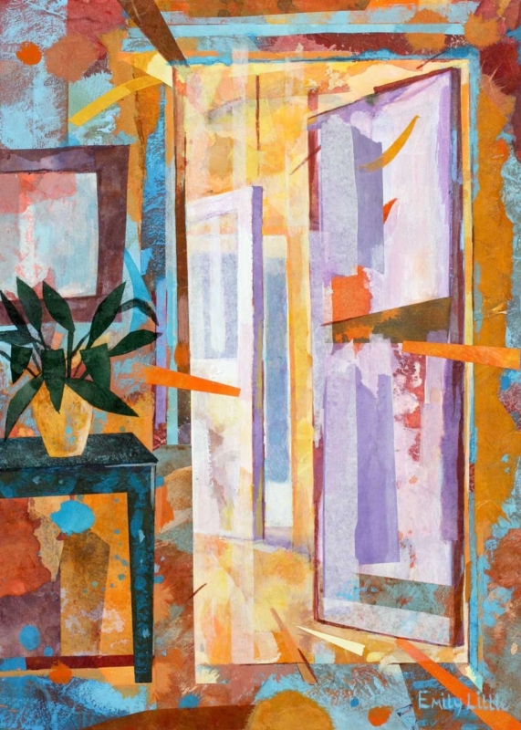
Interior scene wall art for a quiet landing can give an in-between space a purpose beyond circulation. The Other Room by Emily Little is especially apt because its title already suggests a place just beyond immediate view. On a landing, that implied space can create depth and a small moment of discovery between bedrooms or floors.
Let interior scene wall art for a quiet landing slow the journey
Find the natural pause
Stand where someone finishes climbing the stairs or turns toward the next room. That is often a stronger position than the middle of a long wall. The artwork can meet the eye at the point where movement already slows.
Protect the route
Keep the frame away from tight corners and doors that open toward it. The portrait format can use a narrower section of wall, but it still needs physical clearance and enough distance to be understood as a complete scene.
Use evening light as part of the experience
Landings are often seen under artificial light. A lamp or wall light placed to one side can reveal the image without placing a hard reflection over it. Test the view from both the stairs and the nearest doorway.
Atmospheric interior work depends on controlled tonal separation. Colour-managed Giclée printing keeps quieter passages visible, while a bespoke frame defines the image against the surrounding wall. The in-house, hand-finished process gives the piece presence without making a calm landing feel overdecorated.